UX & Product Design

NAVI

An app and wearable mobility system for visually impaired (VI) users and their caretakers.
  • Mobile Design
  • UX Research
  • Accessibility
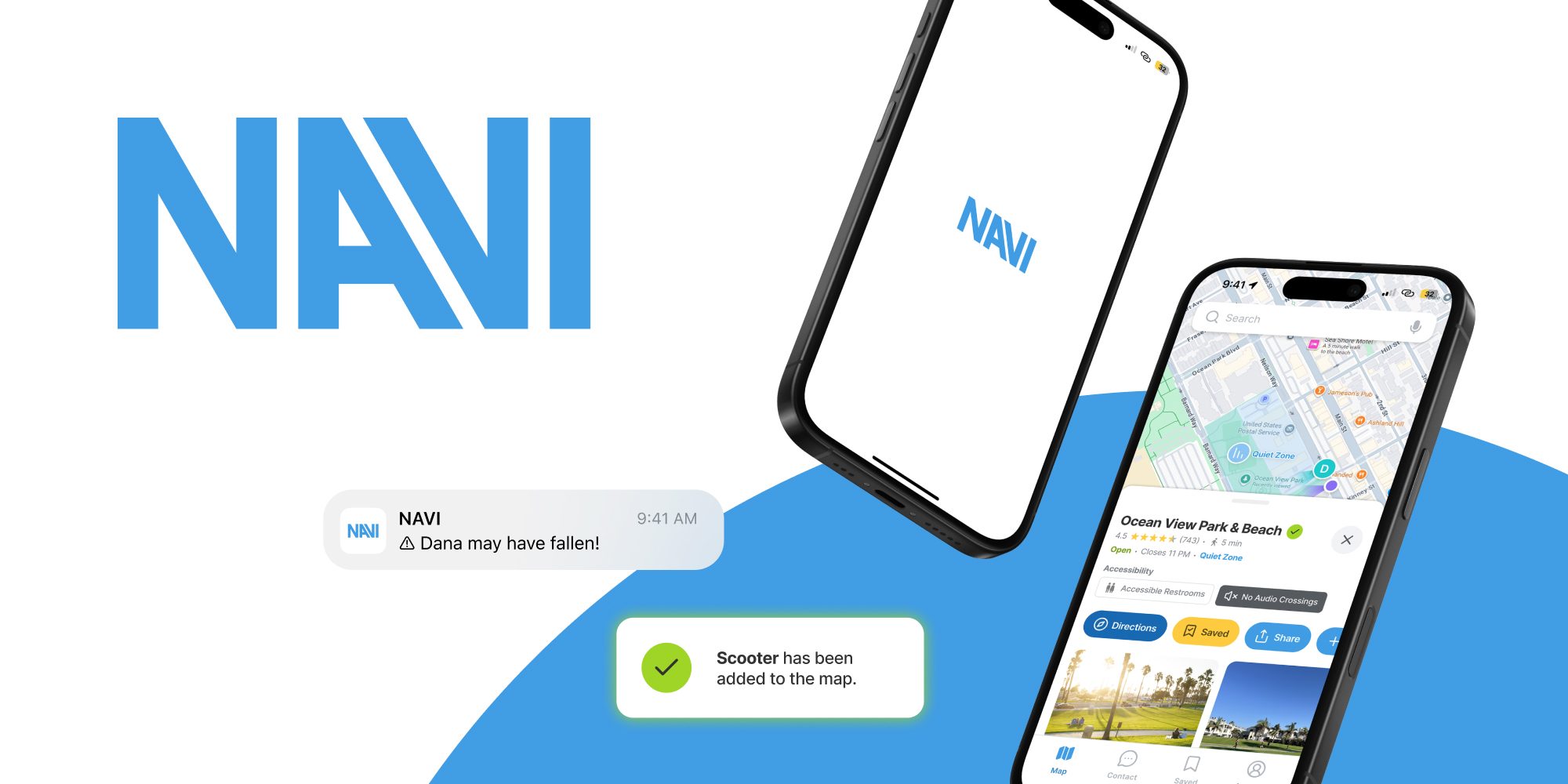
NAVI wordmark beside two phones: the app splash screen and the Ocean View Park place page, with alerts for a possible fall and a scooter added to the map.
Timeline
Fall 2025 · 16 weeks
Type
Academic · IxD, Santa Monica College
Role
Design Lead · App & Concept
My contribution

Originated the concept, defined the interactions between wearable and app, and designed the app prototype.

Manual Prototyping · No AI
Context

A 16-week brief: design a site-specific solution to a mobility challenge in Los Angeles. We chose Santa Monica's Ocean View Park and its beach, focusing on visually impaired (VI) visitors. The screen-based requirement inspired an app for the caretakers who navigate with them.

Snapshot

The caretaker is half of every trip and none of the products

Problem

Many visually impaired (VI) users rely on a caretaker to get around, and the assistive tech aimed at them rarely delivers. Nothing at all supports the caretaker sharing the trip.

Solution

NAVI is one system in two parts: a conceptual AI wearable guiding the VI user, and a caretaker app for shared awareness. They reframe accessibility as collaborative rather than solo, and we hope Google Maps someday builds these features in.

Outcomes
  • Design leads at BMW Designworks saw it as future-looking and marketable
  • Caretaker testers said the app would lower their mental load
  • A caretaker-first framing the market overlooks
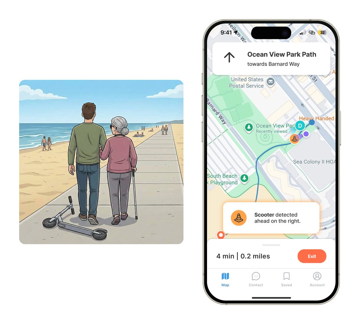
A storyboard panel of Josh and Dana walking the beach path past a fallen scooter, beside the app showing "Scooter detected ahead on the right" on the route.
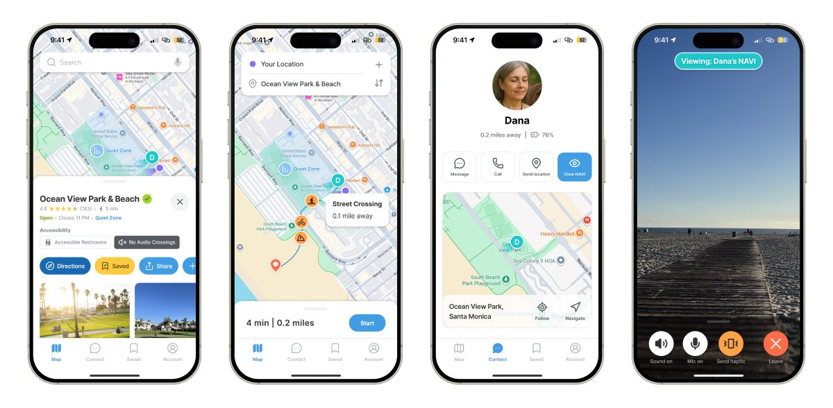
Four finished app screens: the Ocean View Park trip details, the route preview, Dana's contact card, and the NAVI camera view.
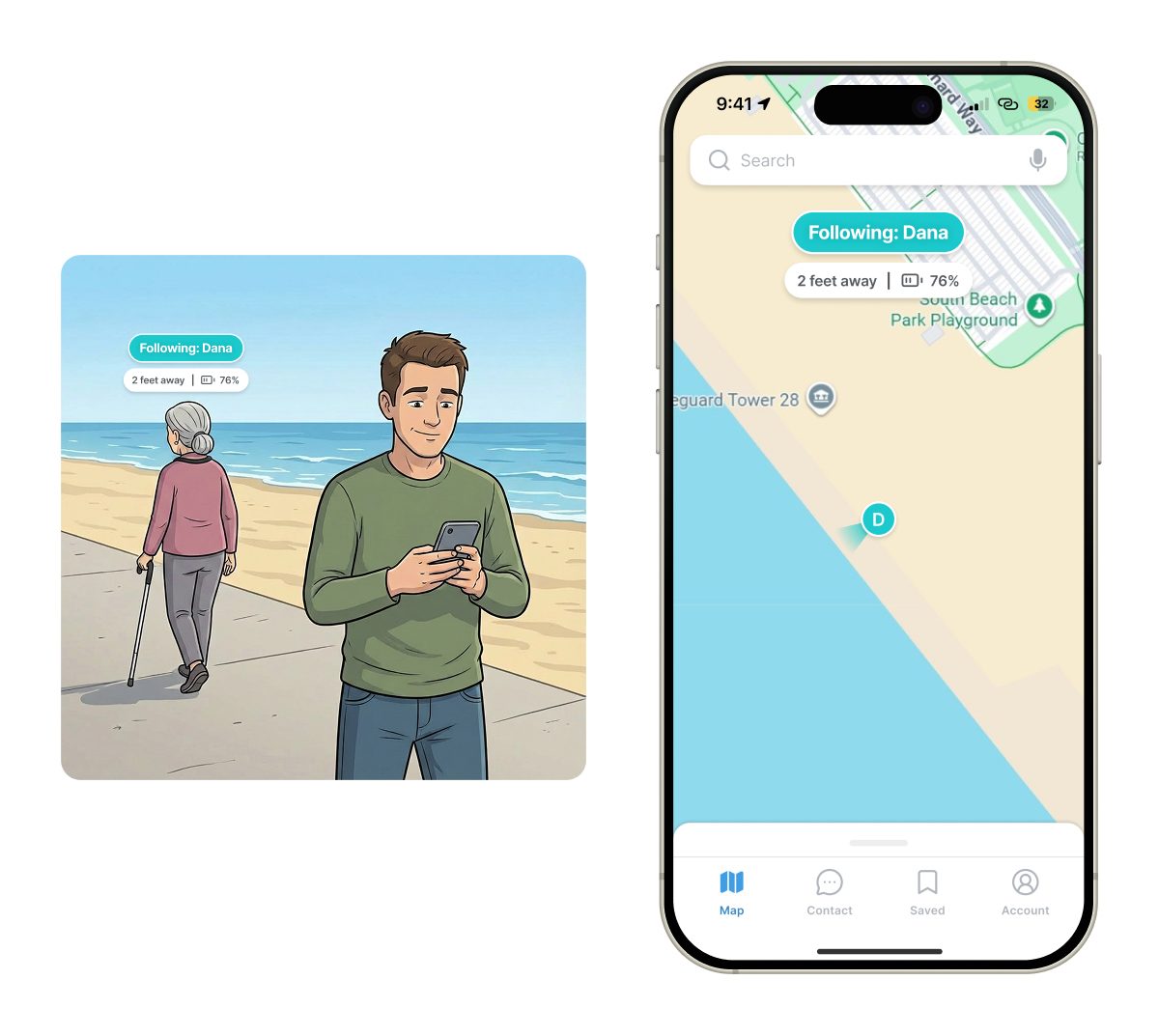
A storyboard panel of Dana walking ahead with her cane while Josh follows on his phone, beside the app in follow mode showing her two feet away at 76 percent battery.
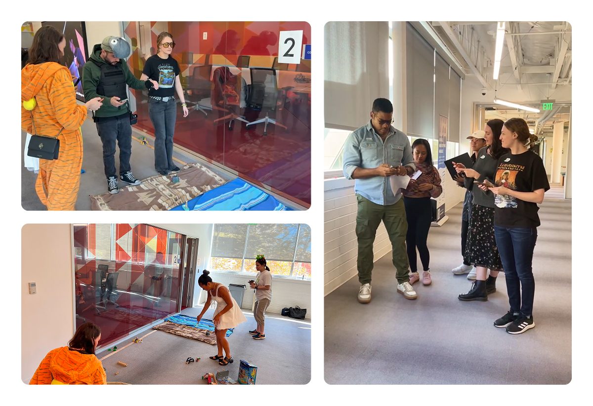
Four photos of an internal test: a college hallway laid with blankets and props standing in for the beach, testers walking it in costume, and the team watching and taking notes.
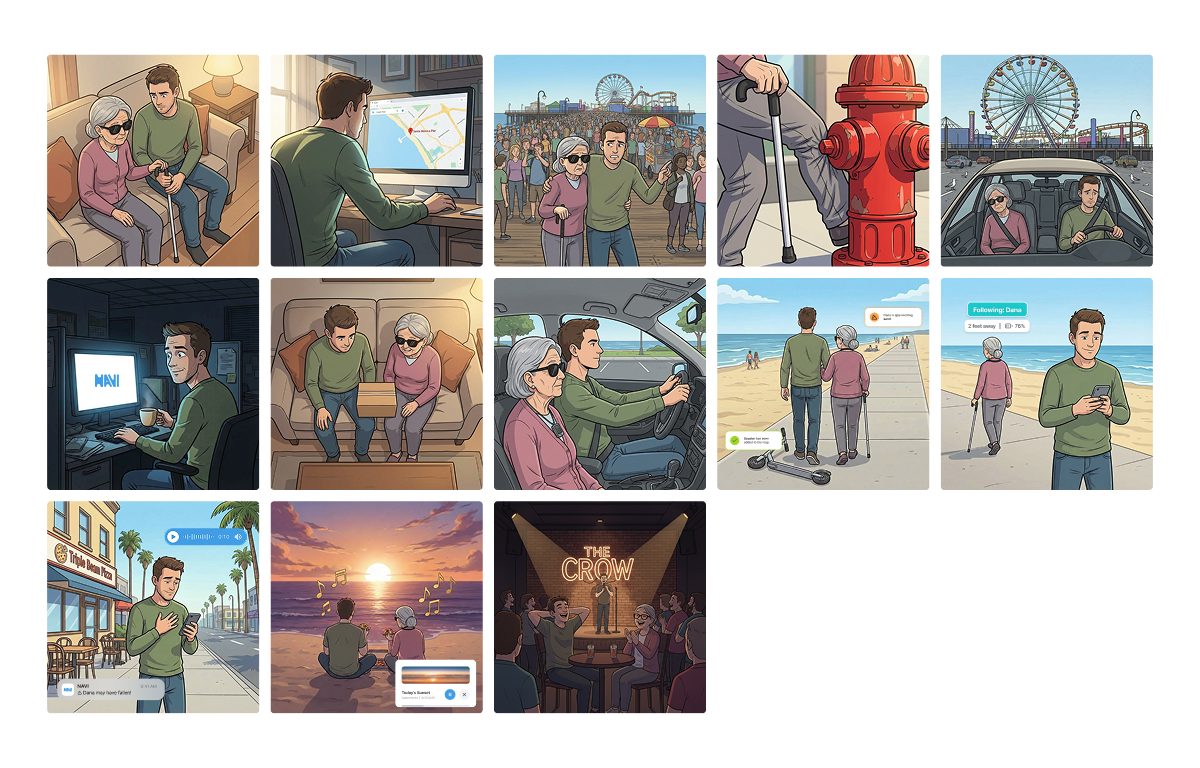
Thirteen illustrated panels following a caretaker and a woman with a white cane through a day out, from planning at home to a comedy club.
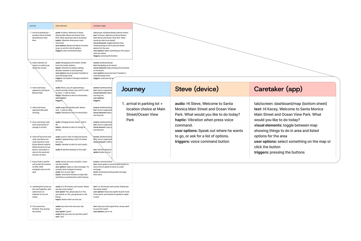
A nine-step journey map in three columns — the journey step, what the device does, and what the app shows — with the first row enlarged.

Research

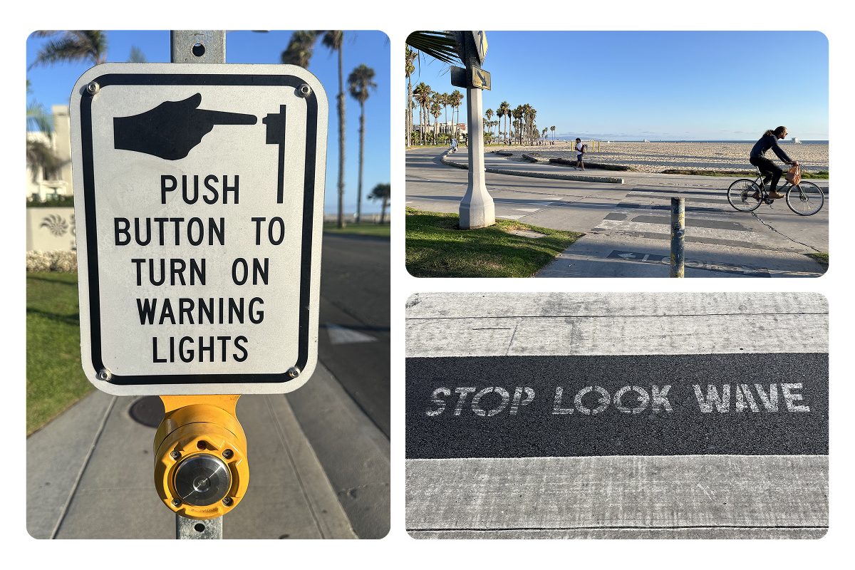
A roadside sign reading "push button to turn on warning lights" above a yellow button, the beach bike path crossing the walkway with a cyclist riding through, and "STOP LOOK WAVE" stenciled across the pavement.
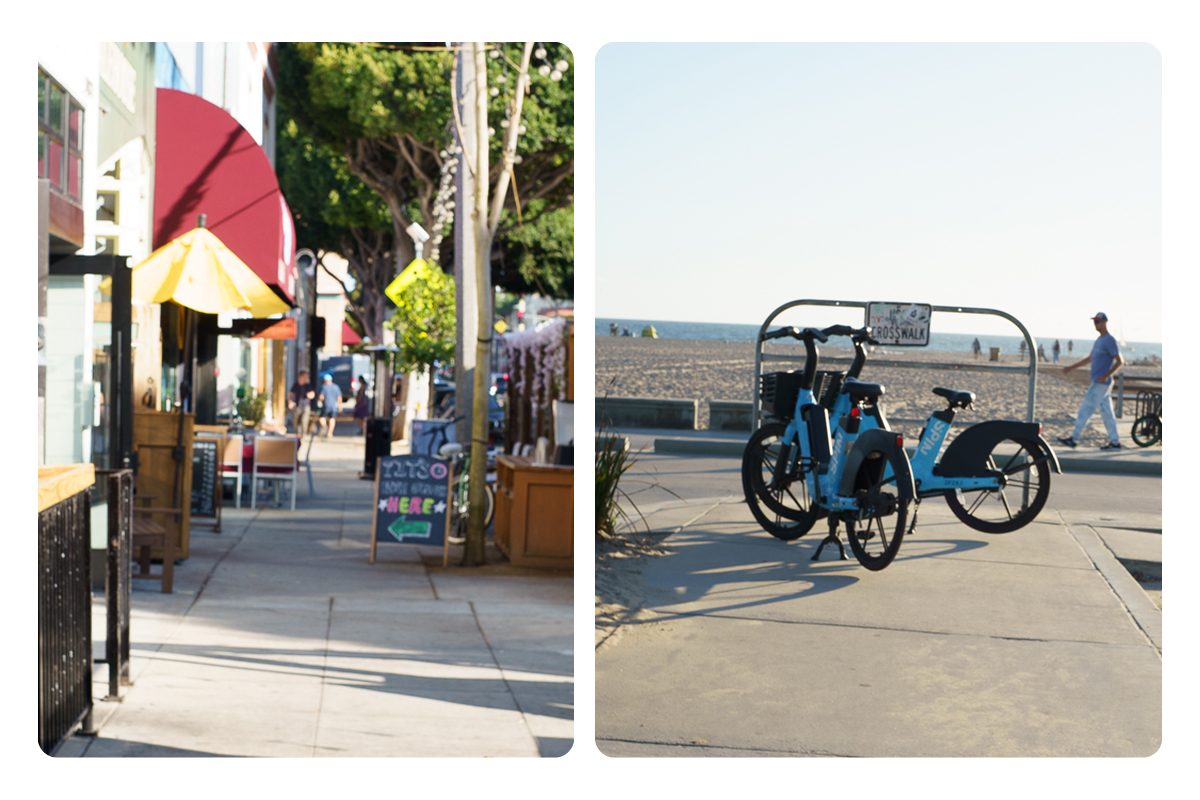
A Main Street sidewalk narrowed by cafe railings, planters, and a sandwich-board sign, and two rental bikes parked across the beach path beside a crosswalk sign.
Fieldwork · Santa Monica

Designed for sighted convenience, not VI safety

  • Sighted visitors had complaints, none of them about moving through the site, so we turned toward VI visitors.
  • Without sight the same paths stop working: signage, scooters, and rental bikes block the walkways, while the crossings give no sound signal.
  • Where the beach bike path crosses foot traffic, one crosswalk is marked only "stop look wave."
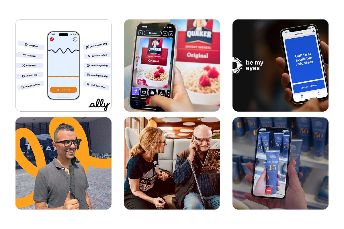
Six images in two rows. Above, the app screens for Ally, Envision, and Be My Eyes. Below, each in use: a man wearing Ally Solo glasses, an Envision user with a companion, and a Be My Eyes volunteer call reading a sunscreen label.
Ally, Envision, and Be My Eyes
3 app reviews · desk research

Caretakers take on measurable work, yet no tool supports them

  • Ally, Envision, and Be My Eyes serve the VI user only, and the most dependable of them works by calling in a sighted volunteer: the role a caretaker already fills.
  • Seven million people in the US are visually impaired, projected to double by 2050.
  • The National Study of Caregiving compared caregivers of older adults with and without VI; the VI side carried more on all three measures below.
+36%
More hours providing care
+61%
More valued activities affected
+46%
Greater odds of emotional difficulty
3 interviews · VI & caretakers

Both sides are protecting independence, and it is social as much as physical

  • Independence varies across the VI community: losing vision later in life makes adapting harder, and those who do rely on a caretaker often depend on them heavily.
  • For those pairs, real-time guidance and reassurance make every trip a shared one.
  • Tools that interrupt a conversation or draw attention were described as isolating.

For me, sunsets are about connecting with people. […] I still want to do things and be part of the community.

Steve Athlete with macular degeneration
The world is not built for blind people.
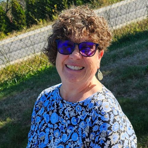
Kacey Wife & caretaker of Steve
As my mom aged, she became increasingly dependent on me, even to places we'd been a million times before. I'd have to tell her every direction to take, every single time we went.
Cheryl Caretaker of her aging VI mother

Prototyping

The wearable concept came first, with the app as its companion. The more we tested, the more the app carried: it was the half we could make real, and the caretaker was the user nobody had designed for. The prototype became one trip through Santa Monica, told from the caretaker's side.
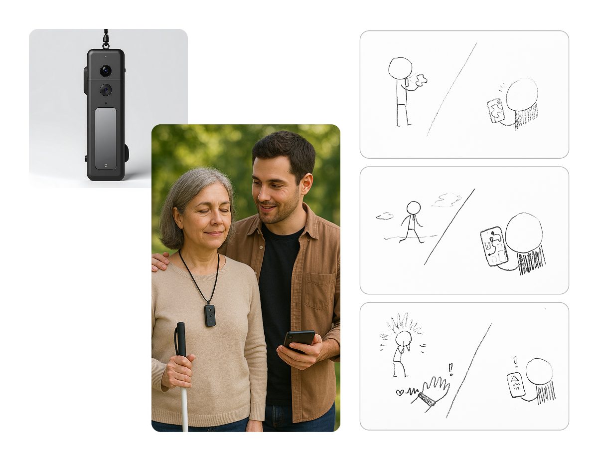
A wearable camera pendant, a photo of a caretaker walking with a woman who uses a white cane and wears the pendant, and three sketches pairing what she hears with what he sees on his phone.
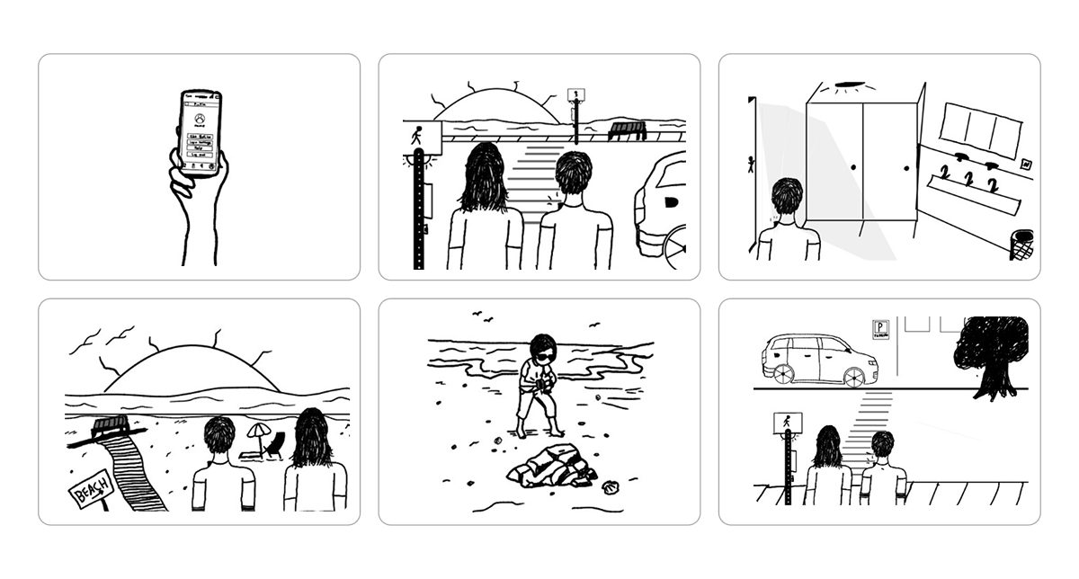
Six hand-drawn panels: picking a destination on a phone, a street crossing, a locker room, the beach at sunset, a fall on the sand, and a parking lot.
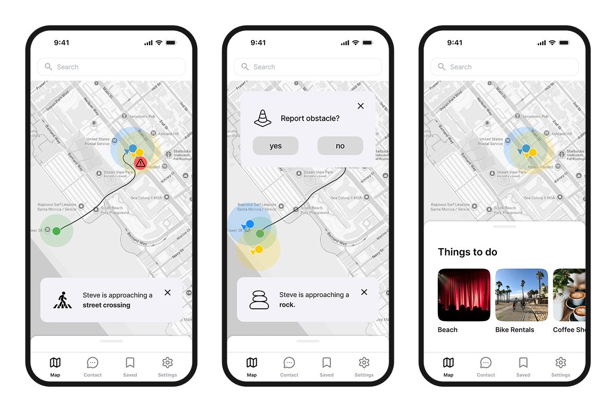
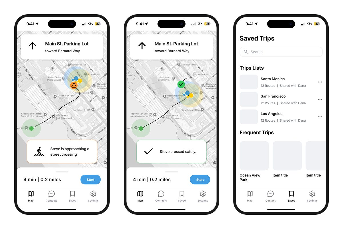
Three low-fidelity screens: a route with a street-crossing alert, a prompt asking whether to report an obstacle, and a list of things to do nearby.
Three mid-fidelity screens: a crossing alert on the route, a confirmation that the crossing was safe, and a saved trips list.
Thirteen illustrated panels following a caretaker and a woman with a white cane through a day out: planning at home, the pier, a car ride, the beach, a scooter reported on the path, follow mode, a fall alert, sunset, and a comedy club.
Key decisions
A nine-step journey map in three columns — the journey step, what the device does, and what the app shows — with the first row enlarged to show its audio, haptic, user options, and triggers spelled out.

One journey map settled the roles

We weren't sure of the exact roles: what the wearable handles, what the app shows, and how the two complement each other at every moment. So I proposed mapping the full journey across device, app, and user. The map settled the roles and set the prototype's scope.
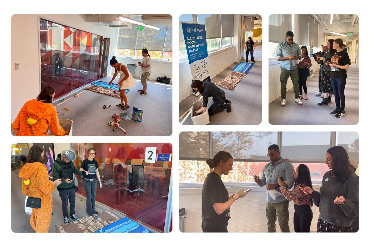
Six photos from an internal test: a college hallway laid with blankets and props standing in for the beach, testers walking the route in costume, and the team watching and taking notes on their phones.

Testing two halves at once tested neither

Early tests ran a Figma prototype, a narrated story, a simulated wearable, and roleplaying testers. People were overwhelmed, few could relate to either role, and feedback landed on the script instead of the design. We cut the test down to the caretaker app alone.

Final Design

Familiar by design, and parts of it could live in map apps today
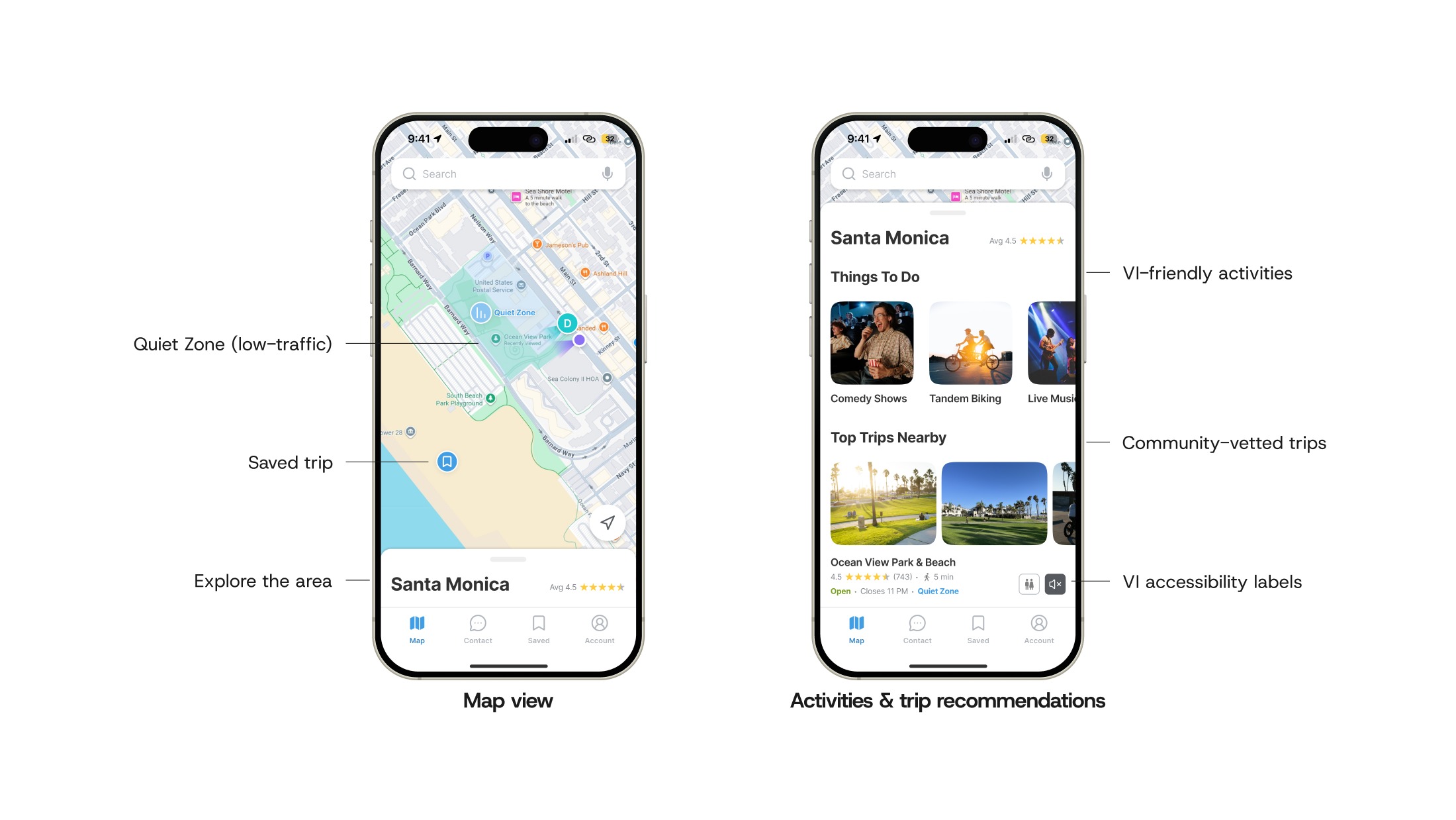
Two screens. The map view marks a quiet zone, a saved-trip pin, and the area rating, labeled Quiet Zone (low-traffic), Saved trip, and Explore the area. The activities view lists comedy shows, tandem biking, and live music under Things To Do, with community-vetted Top Trips Nearby and their accessibility labels.
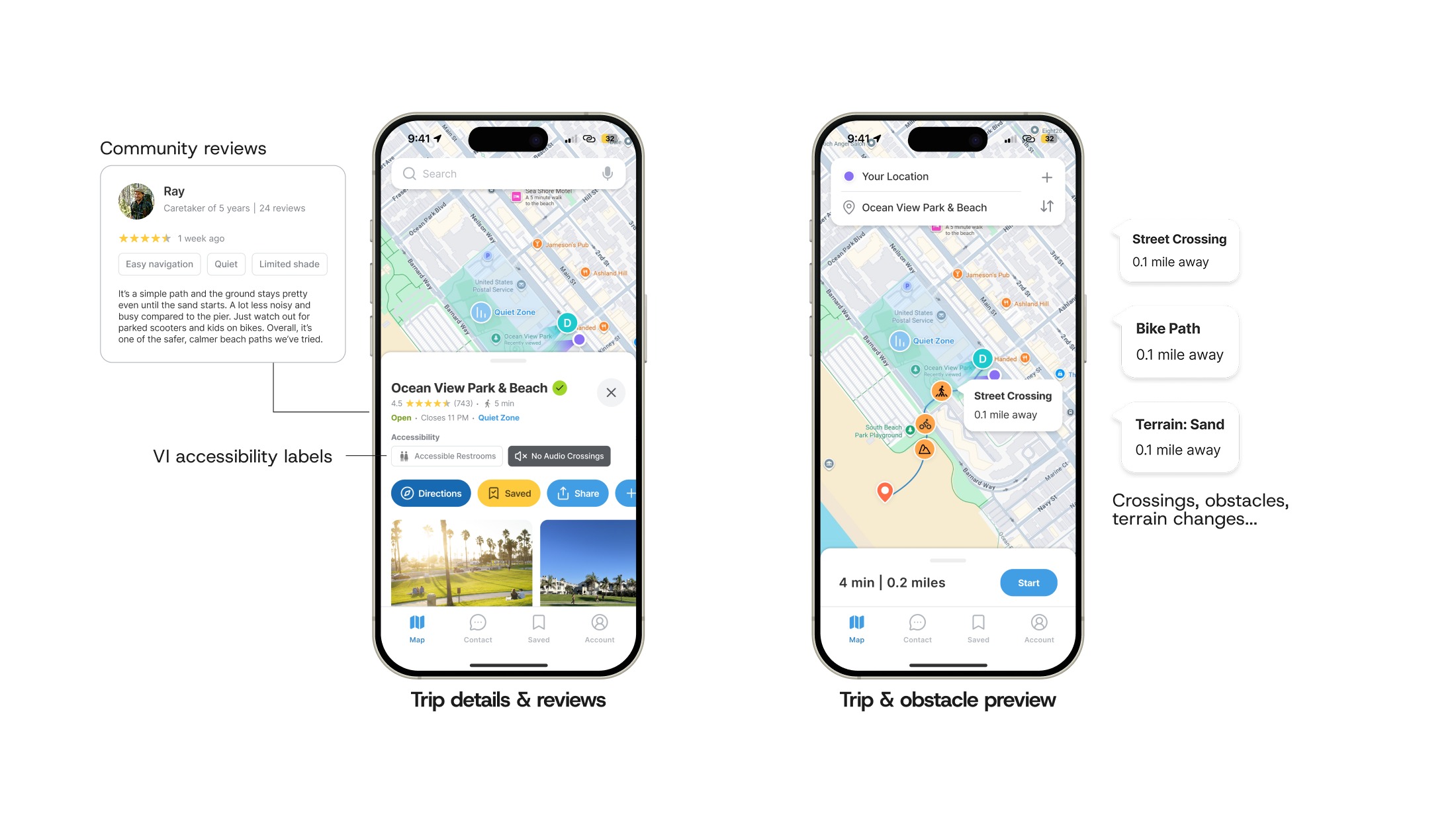
Two screens. The trip detail page for Ocean View Park & Beach carries a five-star review from a caretaker of five years, accessibility labels reading Accessible Restrooms and No Audio Crossings, and Directions, Saved, and Share buttons. The route preview marks a street crossing, a bike path, and sand, each 0.1 mile away.
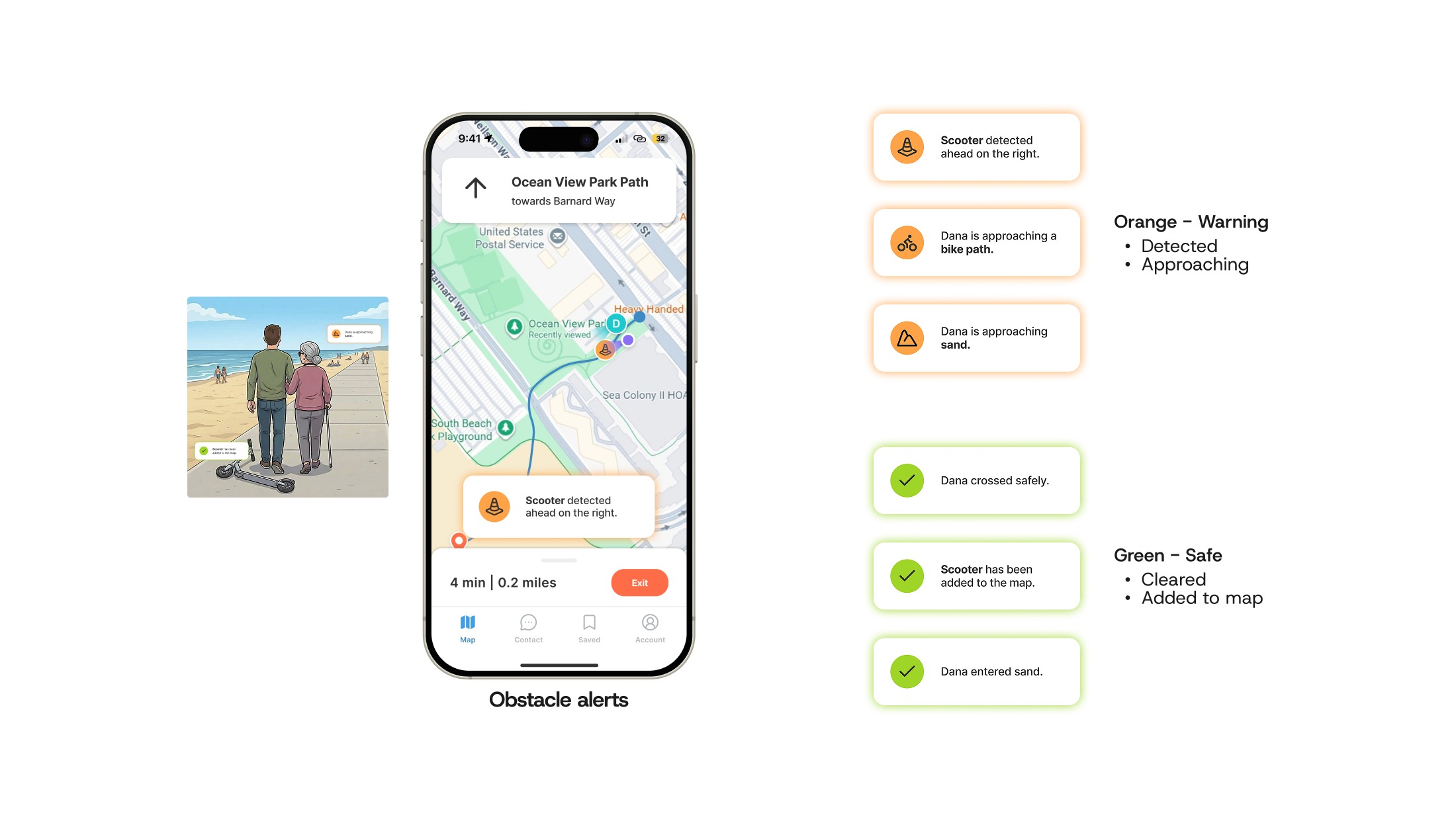
A storyboard panel of Josh and Dana walking the beach path past a fallen scooter, beside the obstacle alerts screen showing "Scooter detected ahead on the right". The alert types are listed out: orange warnings for hazards detected and approaching, green confirmations for cleared and added to map.
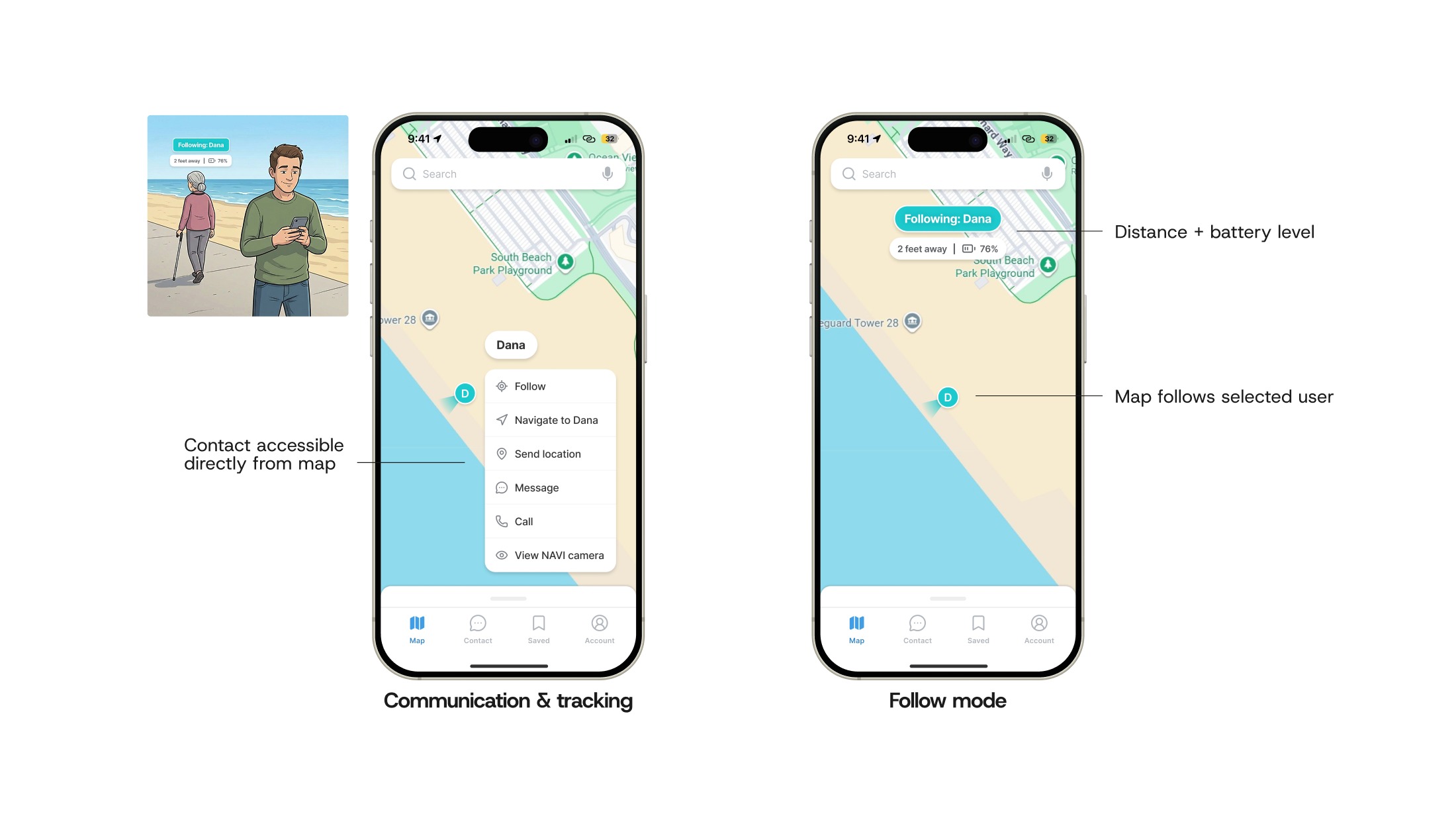
A storyboard panel of Dana walking ahead with her cane while Josh follows on his phone, beside two screens. Tapping Dana's pin opens Follow, Navigate to Dana, Send location, Message, Call, and View NAVI camera. Follow mode centers her on the map with her distance and battery level.
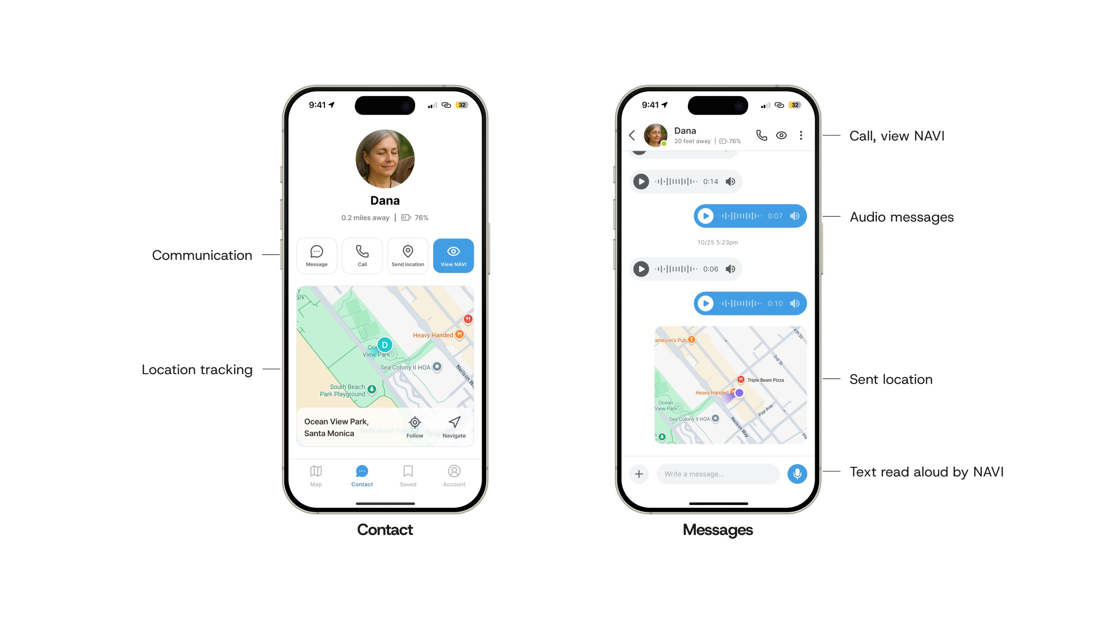
Two screens. Dana's contact card shows her distance and battery above Message, Call, Send location, and View NAVI buttons, with a map of where she is. The message thread carries audio messages both ways, a sent location, and a text field NAVI reads aloud.
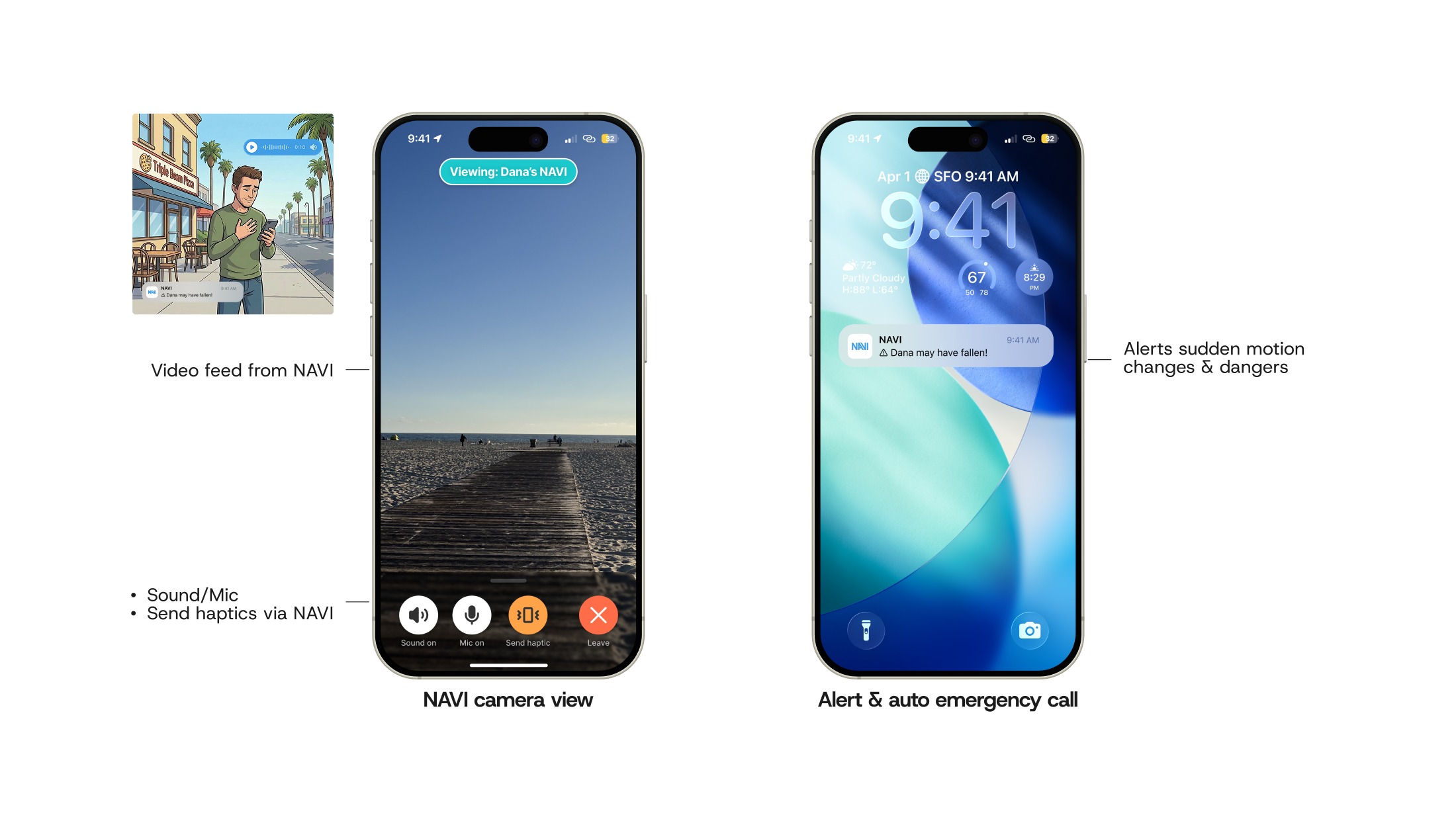
A storyboard panel of Josh outside a pizza place, alarmed, holding his phone, beside two screens. The NAVI camera view streams the boardwalk with Sound, Mic, Send haptic, and Leave controls. A lock screen shows the notification "Dana may have fallen!".
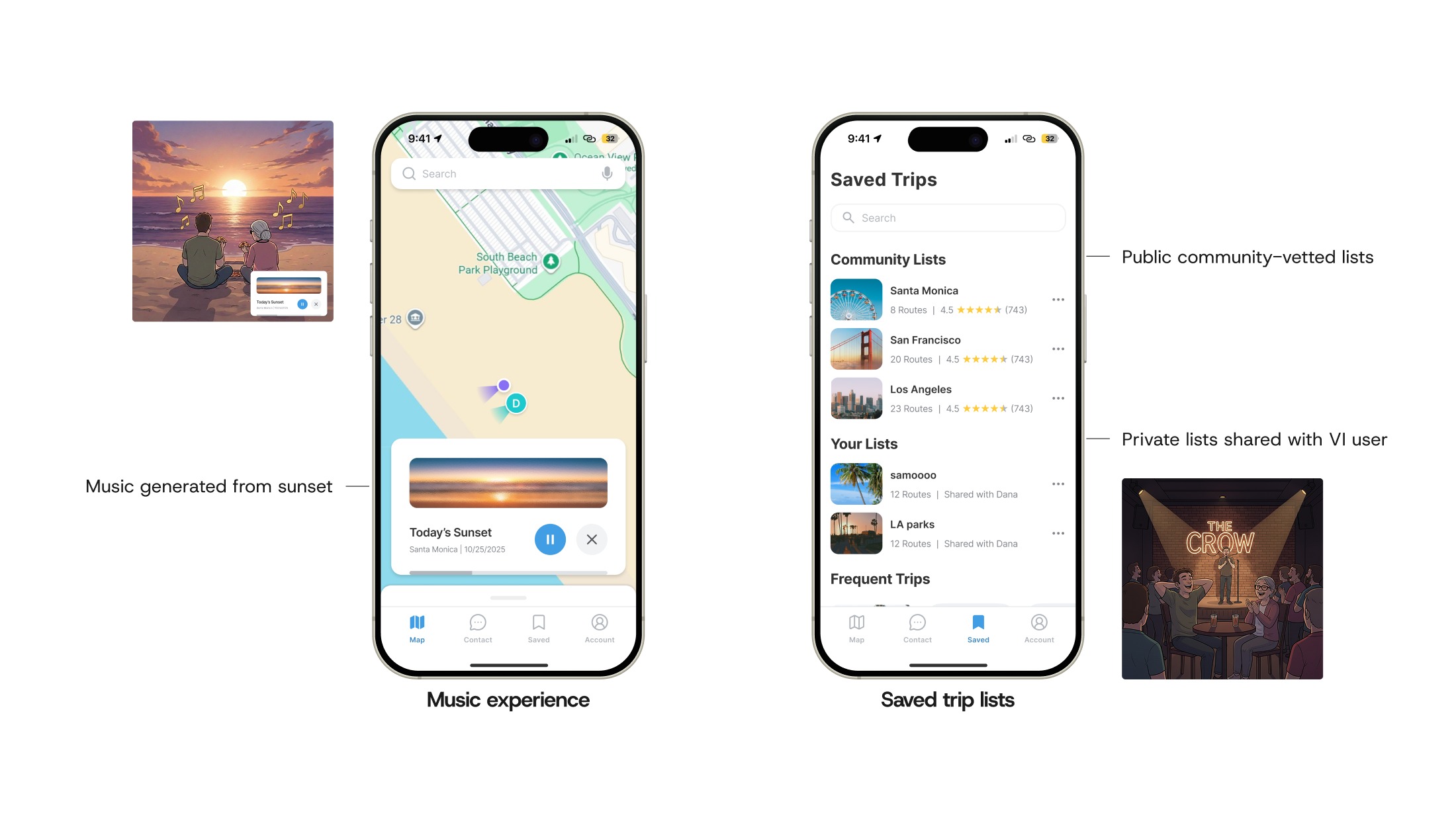
Two storyboard panels, Josh and Dana sitting on the sand at sunset and the pair at a comedy club, beside two screens. The music player is playing Today's Sunset, generated from the view. The saved trips tab lists public community lists and private lists shared with Dana.
01 Exploring the area The map shows both sides of the trip at once: Dana, the VI user, and Josh, the caretaker going with her. It marks quiet zones, the blue inverse of the yellow Google Maps puts on busy areas, alongside saved trips, VI-friendly activities nearby, and community-vetted trips with their accessibility labels.
02 Previewing the route Opening a community-vetted route gives Josh reviews from other caretakers and VI users, accessibility labels, and a preview of what's ahead: crossings, bike paths, terrain changes, and obstacles.
03 Alerts on the way As the wearable detects hazards, Josh's app mirrors them: orange for an obstacle or crossing ahead, green once Dana is safely past or it is added to the map for others. She hears the same alerts through the wearable, so the two stay in step even when apart.
04 Stepping away Follow mode keeps Dana centered on the map while Josh steps away, her distance and battery in view. From the same screen he can message, call, or navigate to her.
05 Talking without interrupting Her contact card gathers the same options in one place, and everything Josh sends plays aloud through her wearable, audio messages and typed ones alike.
06 When something goes wrong The wearable detects a sudden motion change and asks Dana if she is okay; if she doesn't answer, it calls Josh automatically. He can then watch the live feed, speak through the device, or send a gentle haptic cue, all on permissions Dana grants and can revoke.
07 The rest of the day NAVI generates music from environmental cues, like the color and brightness of the sunset, and Dana can ask for an audio description of anything around her. They end the night at a comedy show. Trips are saved in public community-vetted lists and private ones shared between the pair, for easy repetition and independent exploration.

Storyboard by Sunni Monday, generated with Gemini

Results & Reflection

Results

BMW design leads saw something worth pitching, and caretakers wanted it

  • Presented to BMW Designworks, who saw a marketable application of AI, grounded in real human needs and distinct from existing novelty wearables
  • Caretaker testers said the app would lower their mental load
  • Caretakers felt seen for the first time, and enthusiastically pitched features of their own
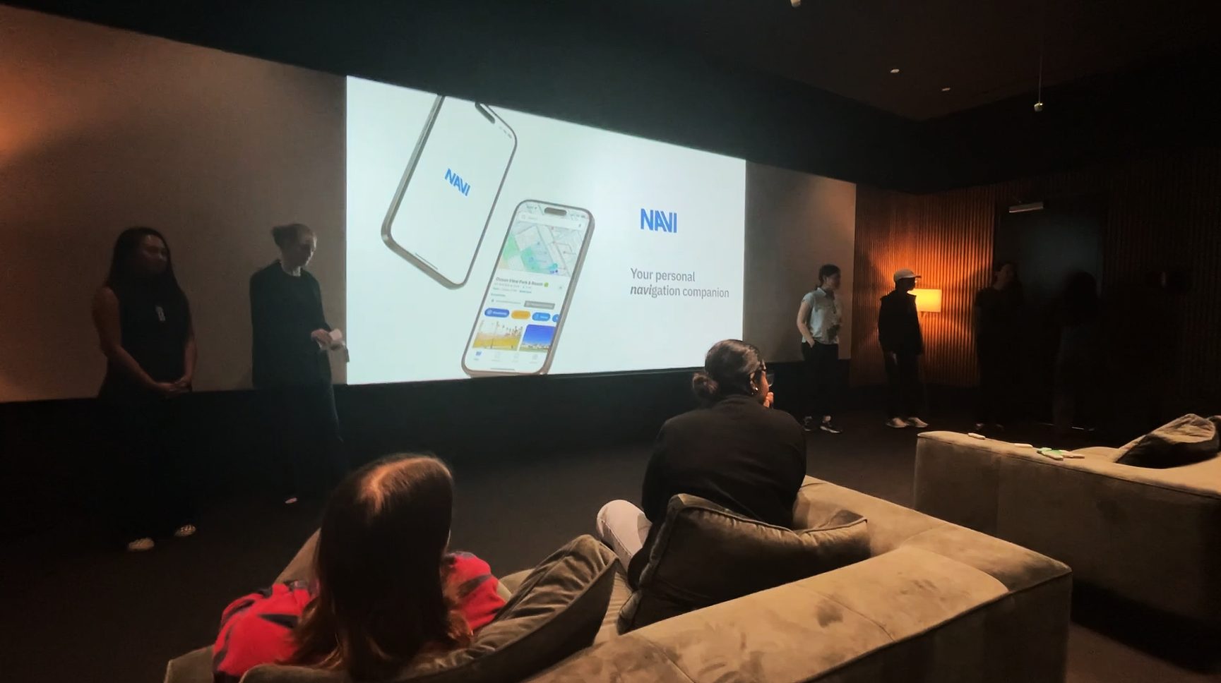
The team presenting NAVI at BMW Designworks, the title slide on a large screen reading "Your personal navigation companion", with the audience seated in front.
This is a real thing to pitch. Very future-looking.
Michael De Bono Lead Design Strategist, BMW Designworks
So useful, so marketable, so necessary!
Gillian Grebler Anthropology professor, Santa Monica College
Reflection

The project only worked once we narrowed it to the caretaker

The hardest problem was definition. Until the journey was written out step by step, the wearable and the app kept absorbing each other's jobs. Every testing round measured how well people followed our overambitious script. Narrowing to one surface, one story, and one role is what made the feedback usable.

Follow mode and the camera feed hand the caretaker real power over the VI user, and only caretakers were available to test them. The next step is designing the consent flow with VI users themselves.

We designed NAVI to fit the tools people already use, especially since a tool that draws attention can isolate its user. Quiet zones, community lists, obstacle reporting, and safer, sound-signaled walking routes all belong in something like Google Maps. Our vision is accessibility built into the platforms people already have, by companies with the reach to do it.
More projects

UX & Product Design

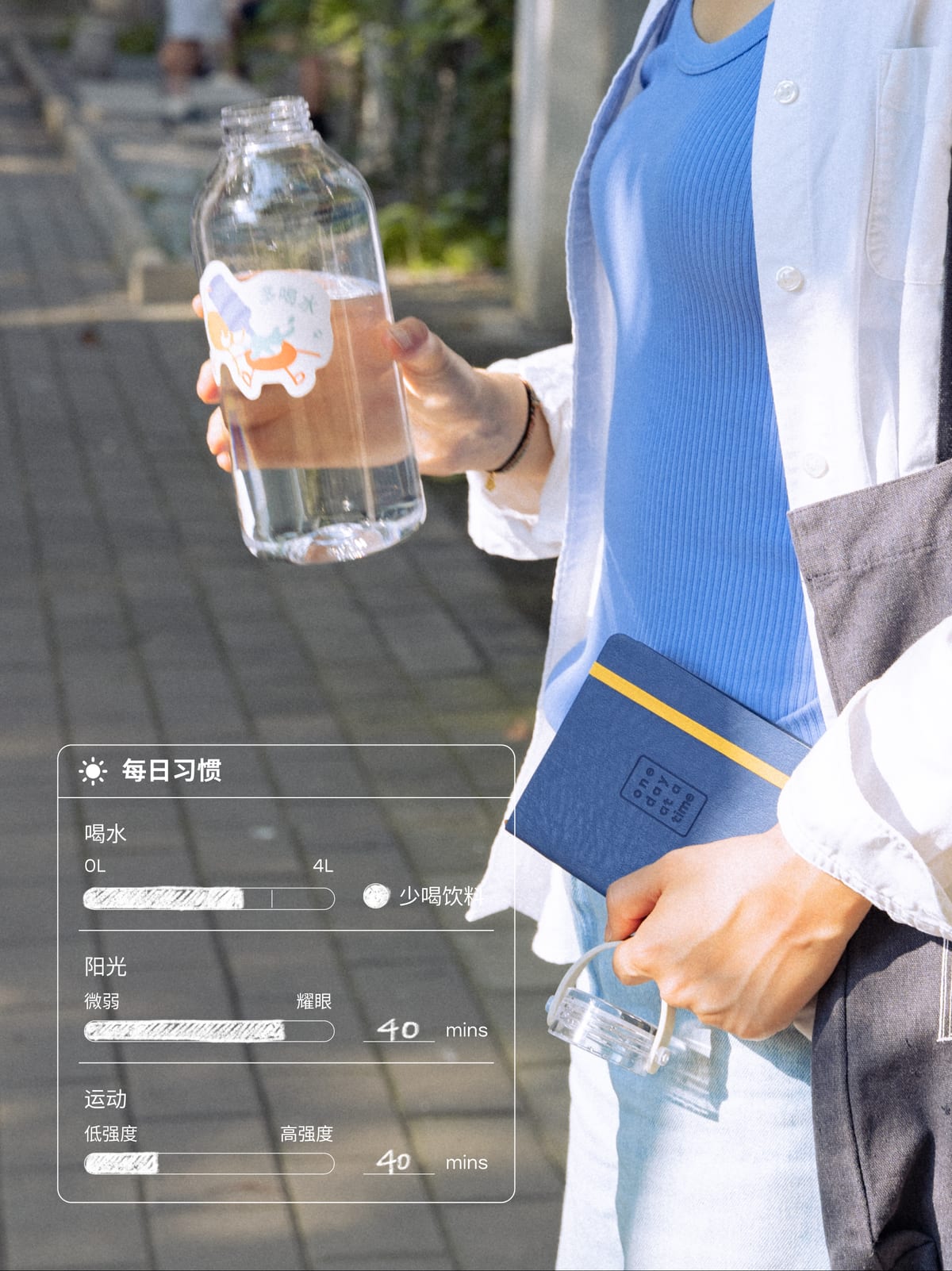
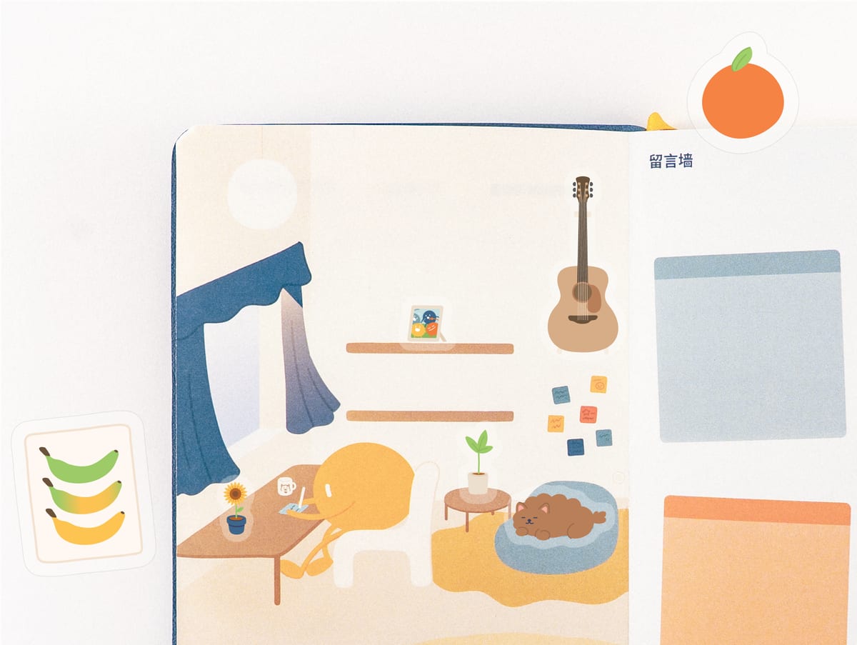
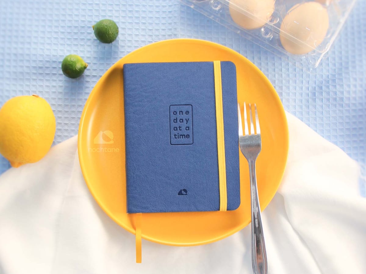
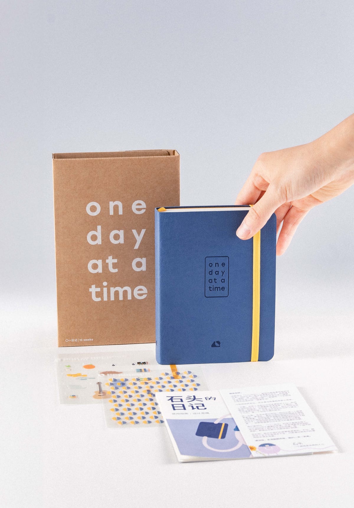
The O1 Journal, closed, on a yellow plate with a fork, beside a lemon, two limes, and a carton of eggs on blue cloth.
Launched Nov 2025

physical product · startup · Apr –⁠ Oct 2025

O1 Journal (Overview)

Everyday health, low-pressure enough to keep up with

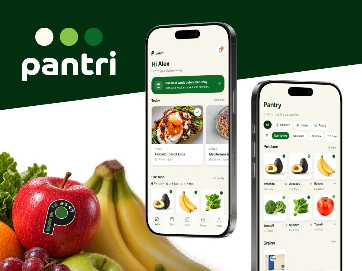
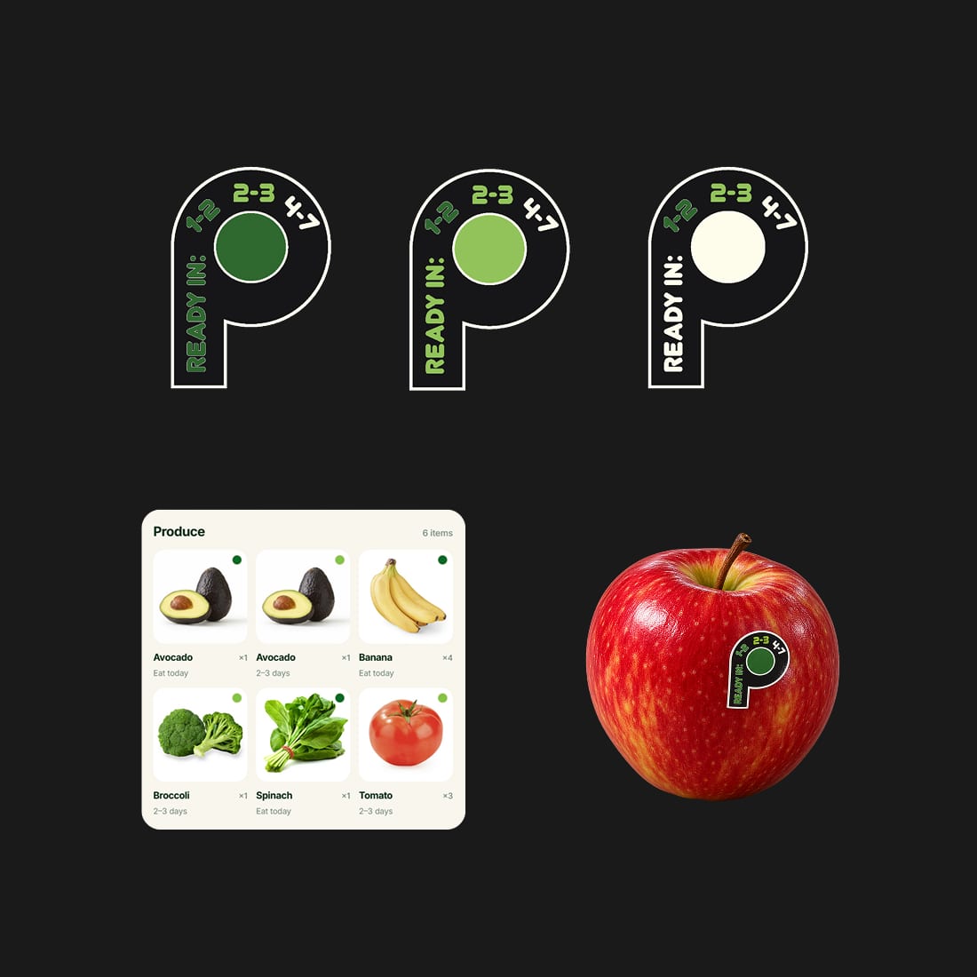
The Pantri wordmark on dark green, a pile of fruit and vegetables where one apple carries the P ripeness sticker, and two phones showing the Home screen and the Pantry grid.

app concept · academic · Spring 2026

Pantri

Timing produce to your meals to reduce waste