UX & Product Design

Pantri

An app and ripeness-sticker system that times produce to your meals and cuts food waste.
  • Mobile Design
  • UX/UI
  • Service Design
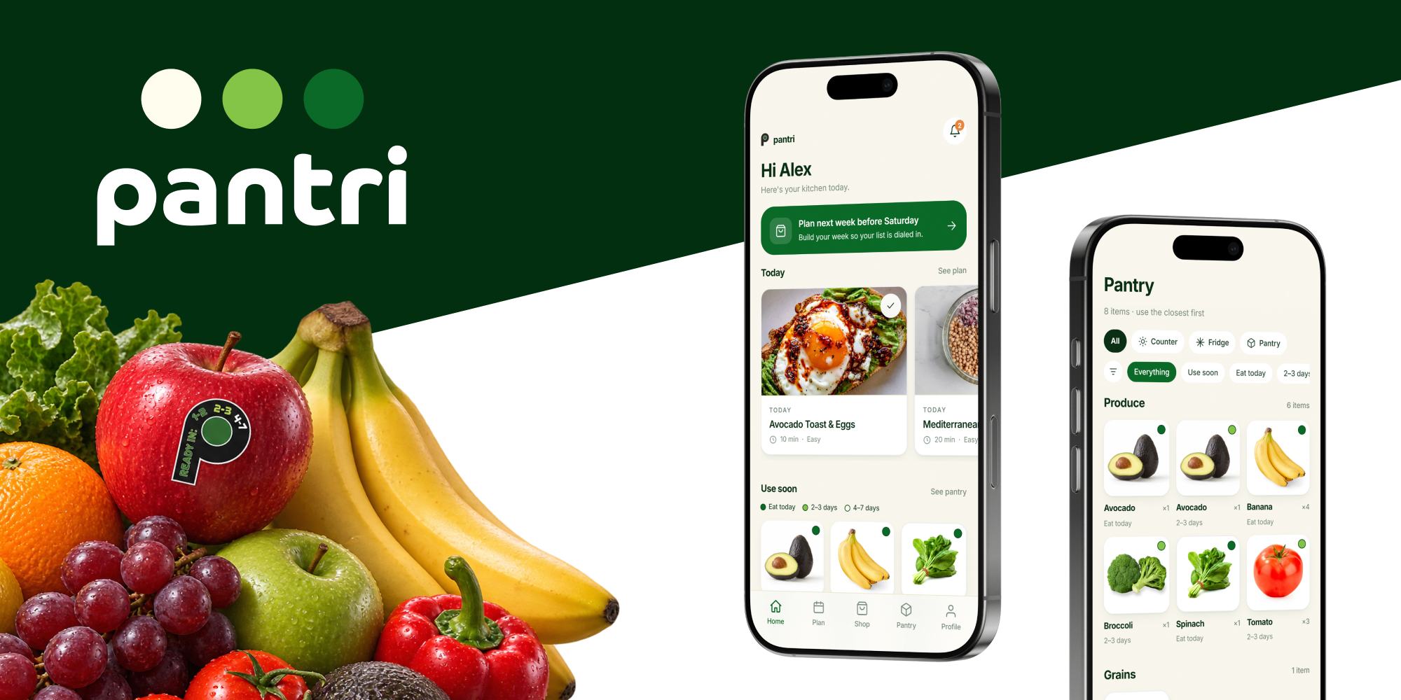
The Pantri wordmark and its three ripeness dots on dark green, a pile of fruit and vegetables where one apple carries the P ripeness sticker, and two phones showing the Home screen and the Pantry grid.
Timeline
Spring 2026 · 5 weeks
Type
Academic · IxD, Santa Monica College
Role
Product Designer · App & Concept
My contribution

Originated the concept, designed the app UX and the interactions between sticker and app, and directed each prototype iteration.

AI-Assisted Prototyping
Context

A five-week brief: design a service pairing a digital and a physical product. We chose produce, one of the most wasted categories in US households. Rafael and I took the app; Cory and Liana took the sticker.

Snapshot

Produce that's ready the day the meal needs it

Problem

The guessing starts before the store and never stops. You plan without knowing what will be ripe when, judge by hand while shopping, then decide at home what to use before it spoils. In most households one person tracks all of it from memory.

Solution

Ethylene-reactive stickers, applied by the store at stocking, deepen from white to dark green as produce ripens. The app plans your meals around those colors and names the one to grab, syncs at checkout, and reminds you before anything spoils.

Outcomes
  • Judges, professors, and classmates wanted it for their own kitchens
  • Less waste on both sides of the shelf, in the store and in the kitchen
  • A colorblind-accessible ripeness scale, built on lightness not hue
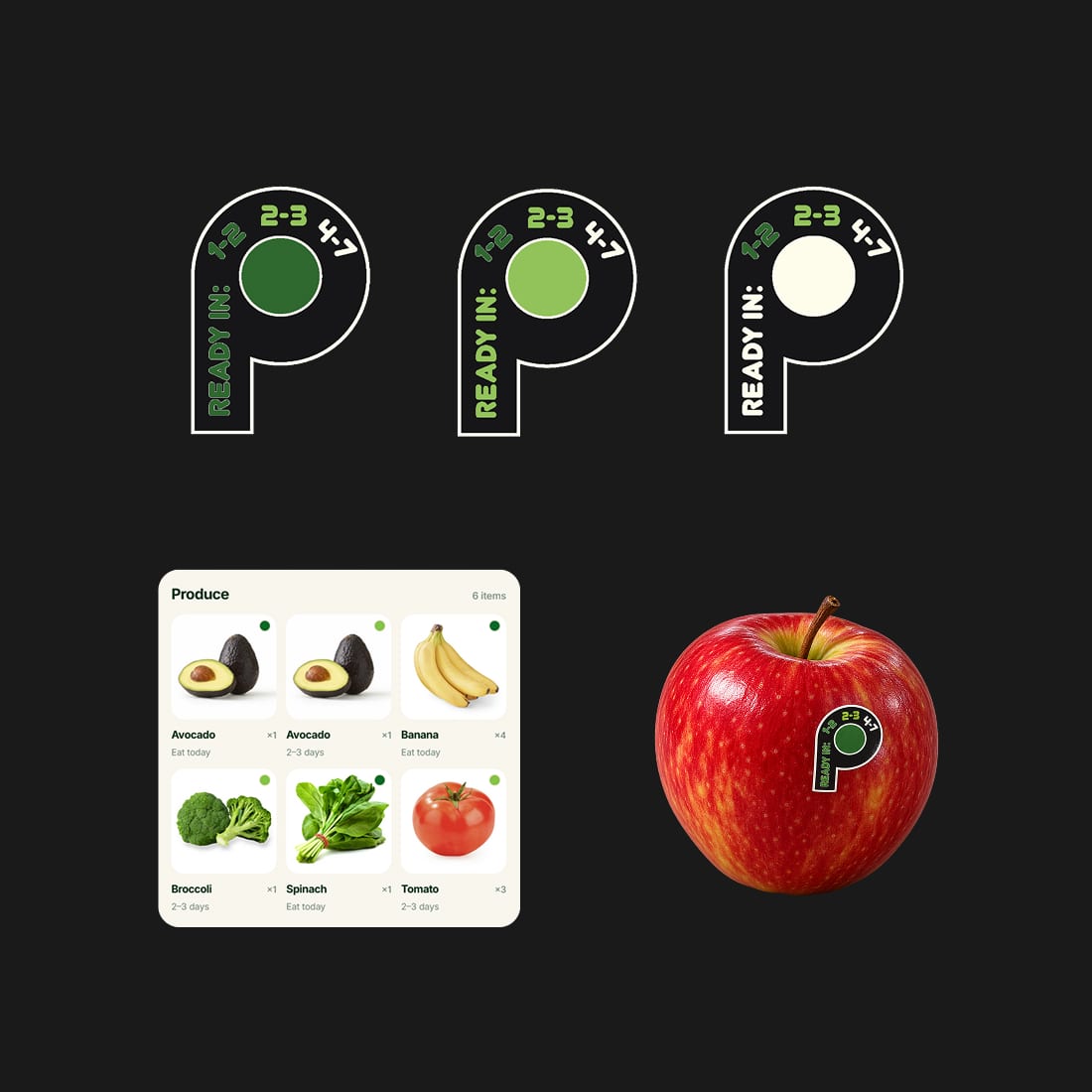
The P sticker in its three ripeness stages on black, above the app's produce grid and a red apple wearing the sticker.
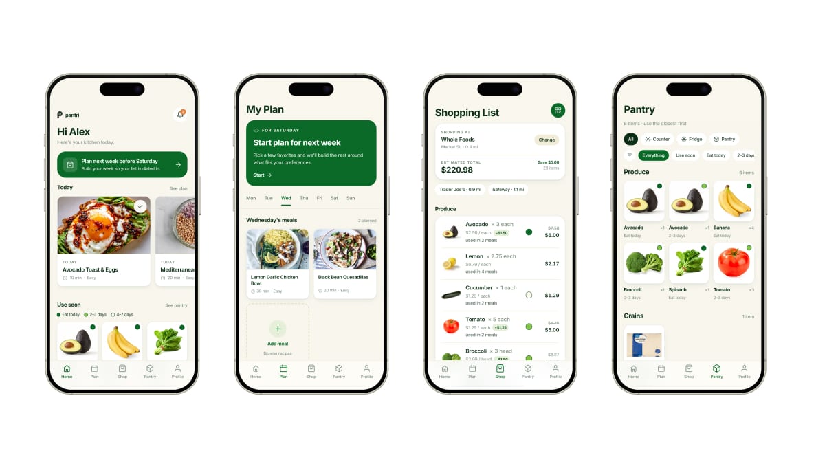
Four finished screens side by side: Home, My Plan, the Shopping List with its ripeness dots and running total, and the Pantry grid.
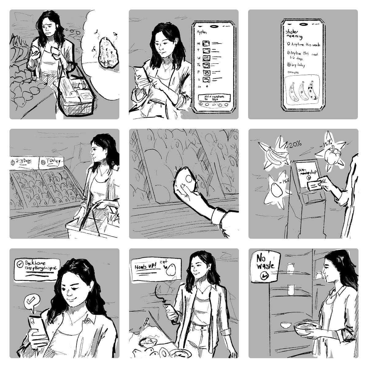
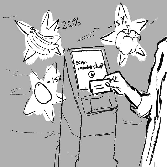
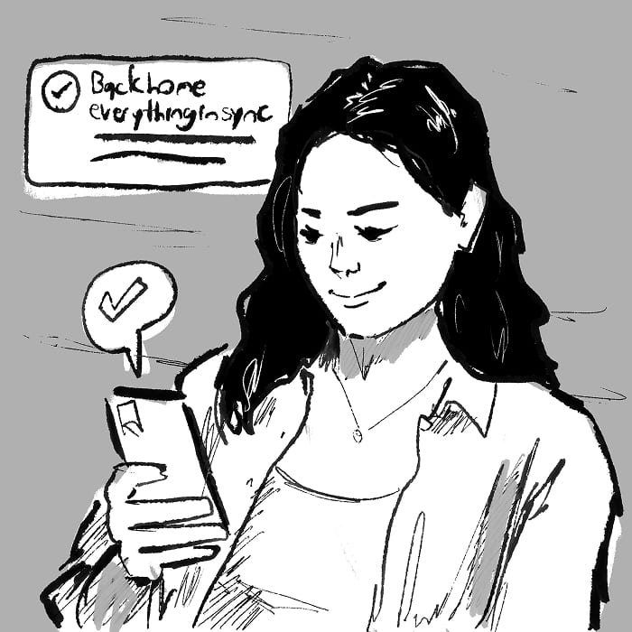
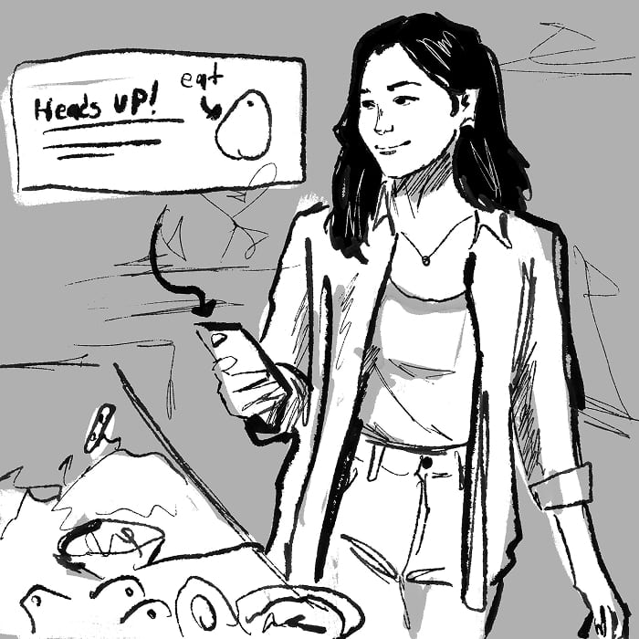
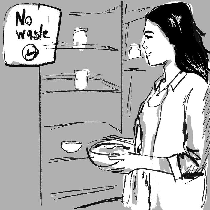
The nine hand-drawn storyboard panels in a grid, following one shopper from the produce aisle through checkout to an empty fridge at the end of the week.
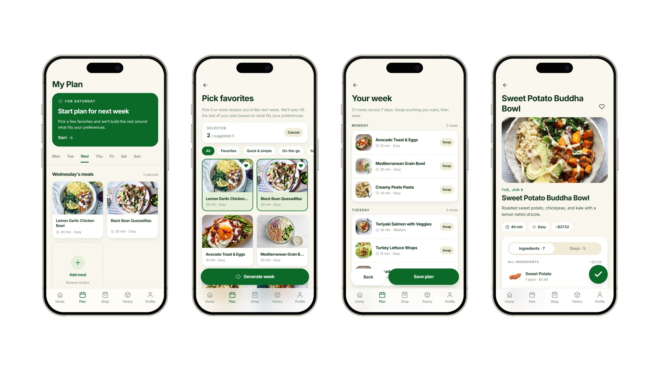
Four planning screens: the plan tab, picking favorite recipes, the generated week day by day, and one recipe open in full.
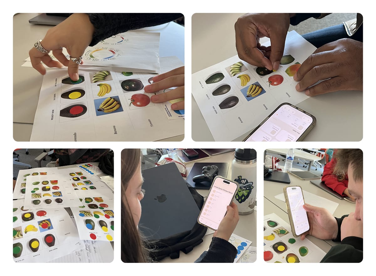
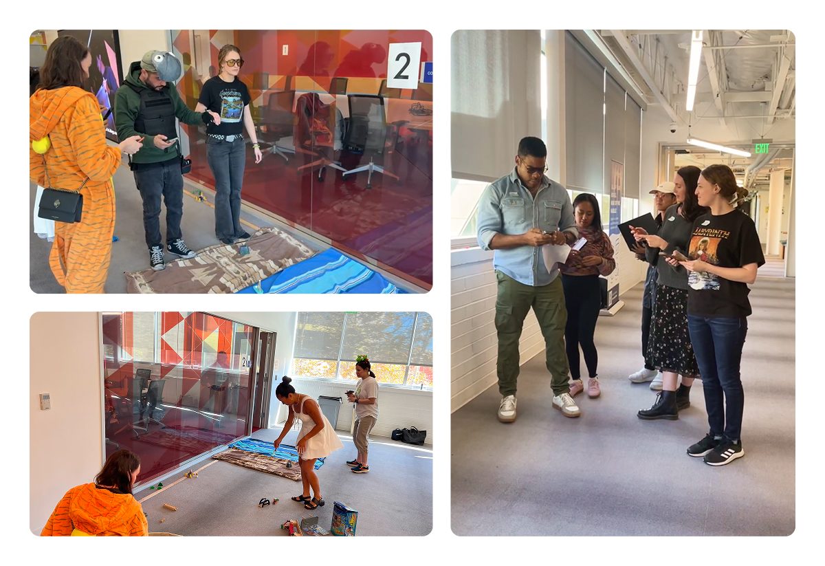
Photographs from a testing session. Participants place colored dot stickers onto printed ripeness sheets and hold a phone running the prototype beside them.

Research

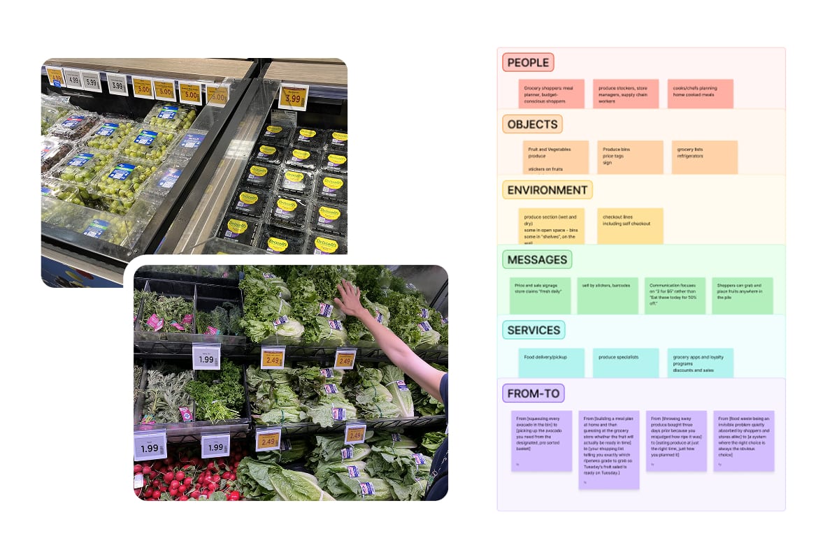
Two produce-aisle photos beside a sticky-note board. The photos show a refrigerated case of packaged grapes and berries under price tags, and a shopper reaching into a shelf of leafy greens and radishes marked 1.99 and 2.49. The board is grouped into six labeled bands: People, Objects, Environment, Messages, Services, and From-To.
POEMS observation · From-To mapping

The store sells price, and the shopper does the timing

  • The aisle talks about price, never timing. Nothing on the sign or the produce says when an item will be ready to eat, which is what a plan for the week depends on.
  • A week of produce ripens at a dozen different rates. Whether you plan the meals first or cook around whatever is ready, the timing gets worked out by hand, and what slips is thrown away or eaten in a hurry.
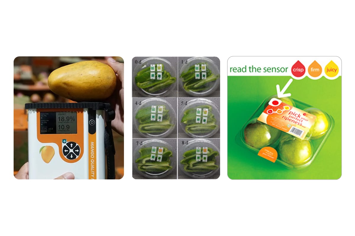
Three panels in a row. A hand holds a mango above a handheld mango quality meter reading 18.9 percent dry matter. A six-frame grid follows sensor labels on cut produce from day zero to day eight, the small squares turning from green to orange. A supermarket pack of apples carries a ripeness sensor and the line "read the sensor: crisp, firm, juicy".
Felix Instruments, Sensors study, and RipeSense
Desk research · existing systems

The technology and the planners exist; nothing connects them end to end

  • Planning, shopping, and what happens at home run as separate systems that do not talk to each other, so ripeness never travels from the shelf into the week's cooking.
  • NIR scanners already grade ripeness for growers and packers, and ethylene stickers exist in research and scattered pilots, but neither reaches everyday shoppers.
31%
Of the US food supply is lost at the retail and consumer levels
63%
Of independent-grocer shoppers expect help toward a healthier lifestyle
1 in 3
US adults already plan most or all of their meals

Prototyping

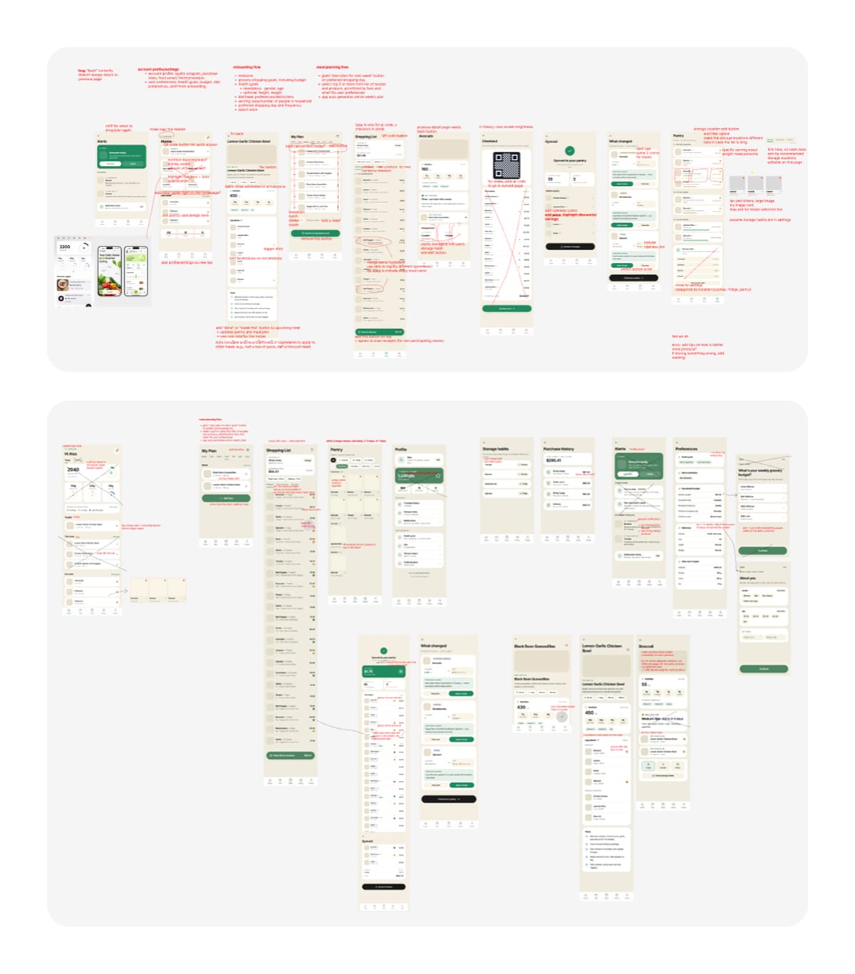
Rafael and I wrote a PRD first, defining the features, the screens, and what the sticker and app each do before the store, in it, and after. Claude Code built from that, then we went through every screen on call, I annotated what had to change, and Rafael re-prompted. A new version came out each week.
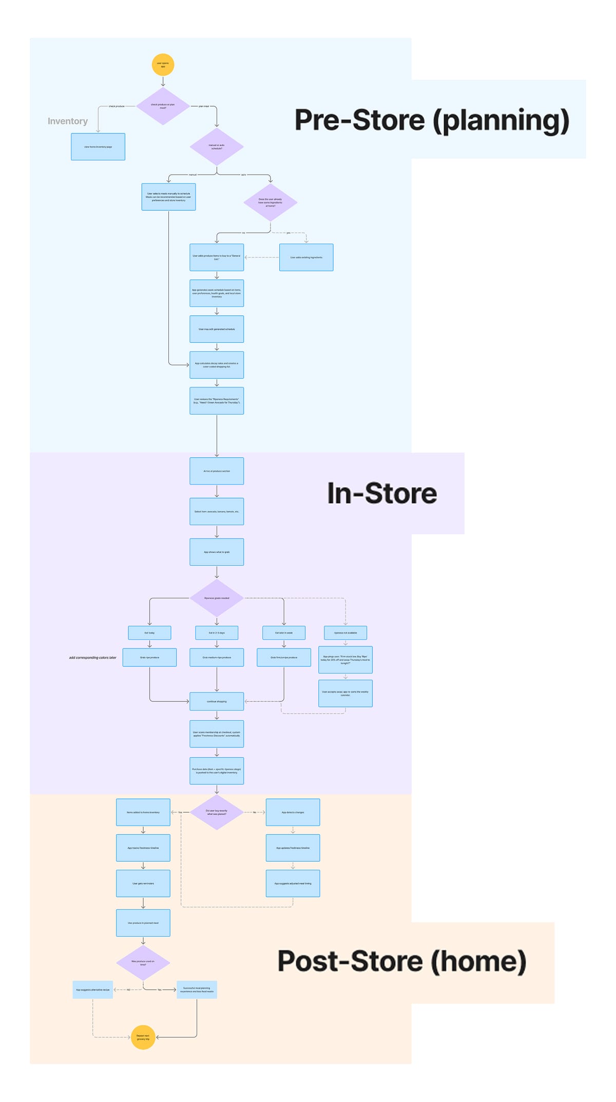
A tall flowchart in three color bands. Pre-Store planning in blue runs from opening the app through generating a week's schedule and a color-coded shopping list. In-Store in purple branches on ripeness grade into eat today, eat in two to three days, and eat later in the week. Post-Store in orange tracks the freshness timeline at home and loops back to the next grocery trip.
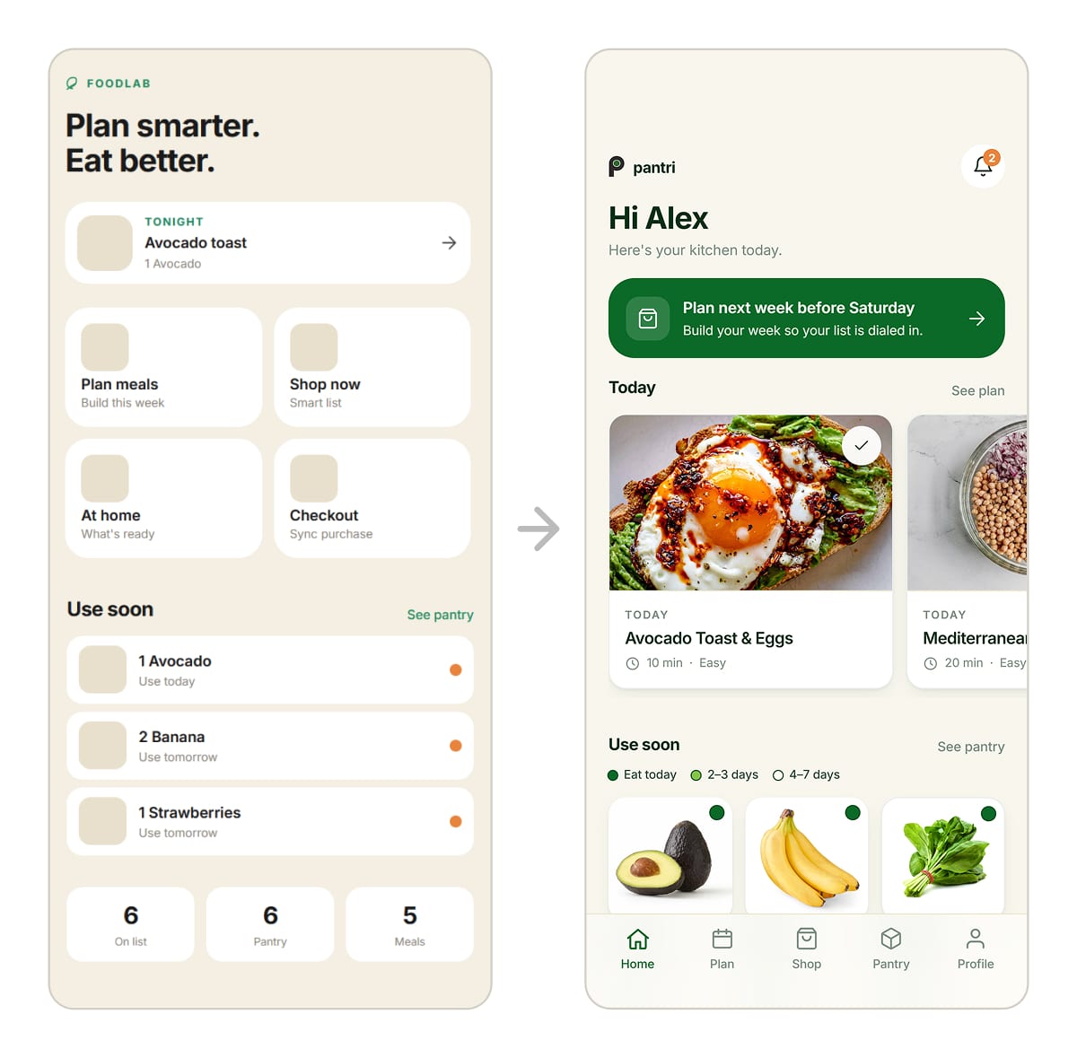
The Home tab, first version beside final. The early screen is headed FOODLAB, "Plan smarter. Eat better.", with gray image placeholders and a row of counters. The final screen is headed pantri, "Hi Alex", with photographed meal cards and a green plan-your-week banner.
Photographs from a testing session. Participants place colored dot stickers onto printed ripeness sheets showing avocados, bananas, and tomatoes, and hold a phone running the prototype beside the sheets.
Two annotation boards holding around thirty app screens, overlaid with handwritten red notes, arrows, and circled areas marking what had to change in the next prompt.
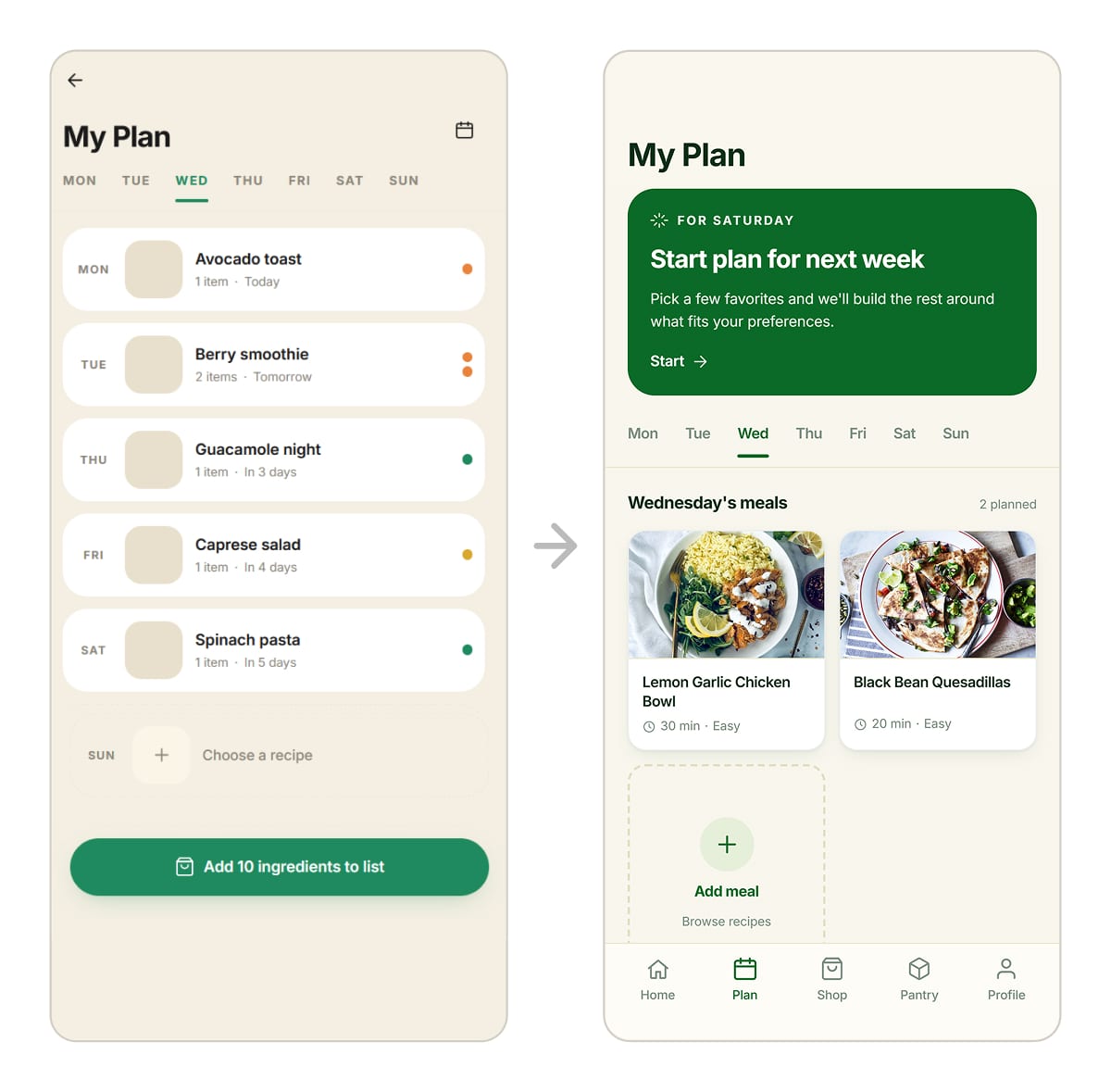
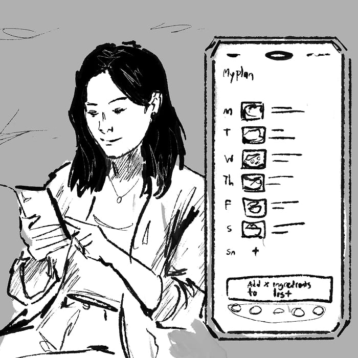
The Plan tab, first version beside final. The early screen is a weekday list of meals with colored dots and an add-ingredients button. The final screen leads with a green start-next-week card above photographed meal cards for the selected day.
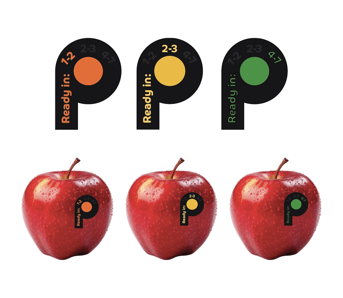
Three P-shaped ripeness stickers in orange, yellow, and green, each reading "Ready in:" above the ranges 1-2, 2-3, and 4-7 days, shown large and again applied to a red apple.
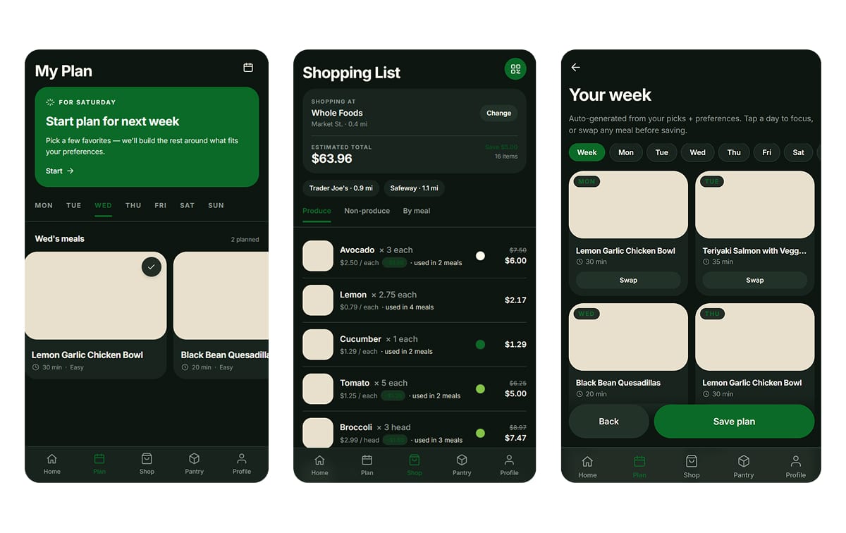
Three screens in the dark direction: My Plan, Shopping List, and an auto-generated week of meals, all on near-black with green accents and cream image placeholders.
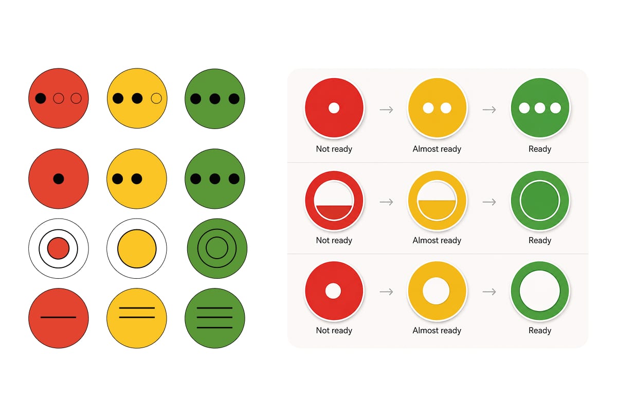
Ripeness markings tested without relying on color. A grid works through dots, filled halves, concentric rings, and bars on red, yellow, and green discs, then three sequences label them Not ready, Almost ready, and Ready.
Key decisions
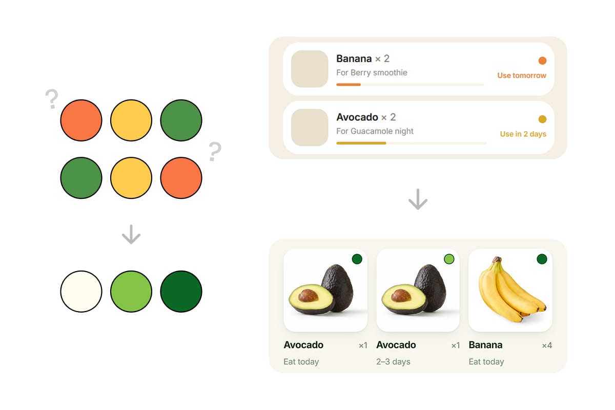
Left, two rows of orange, yellow and green circles in opposite orders, each marked with a question mark, and below them an arrow down to three circles running cream, mid green, dark green. Right, the app's pantry rows with orange and yellow progress bars reading "Use tomorrow" and "Use in 2 days", and an arrow down to produce cards carrying a single green dot each, labeled "Eat today" and "2-3 days".

From three colors to three greens

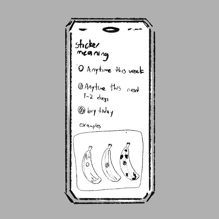
Testing revealed that traffic-light logic makes green ready and red wait, while produce logic makes green unripe and red or orange urgent. After debating the two orders, I proposed three shades of green to sidestep ordering and solve for colorblind accessibility. The app's ripeness bars were ambiguous in the same way, and became color dots with labels.
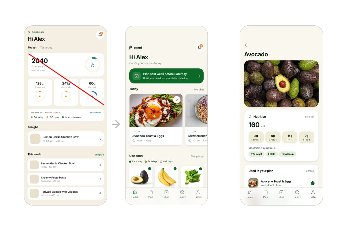
Three screens. The first opens on a calorie dashboard reading 2040 calories left above protein, carb, and fat rings, struck through with a red line. An arrow leads to the final home screen, which opens on the week's plan and produce to use soon. The third is the avocado detail page, where a nutrition panel gives calories, macros, and vitamins.

Ripeness organizes the app, not nutrition

Planning meals around produce led testers to pitch health and nutrition features. We knew the top of the home screen was redundant and had no better idea for it, so we filled it with health tracking. Seeing it there made the scope obvious: I cut it, keeping nutrition in recipes and produce details.

Final Design

Storyboard

One week, and nothing thrown away

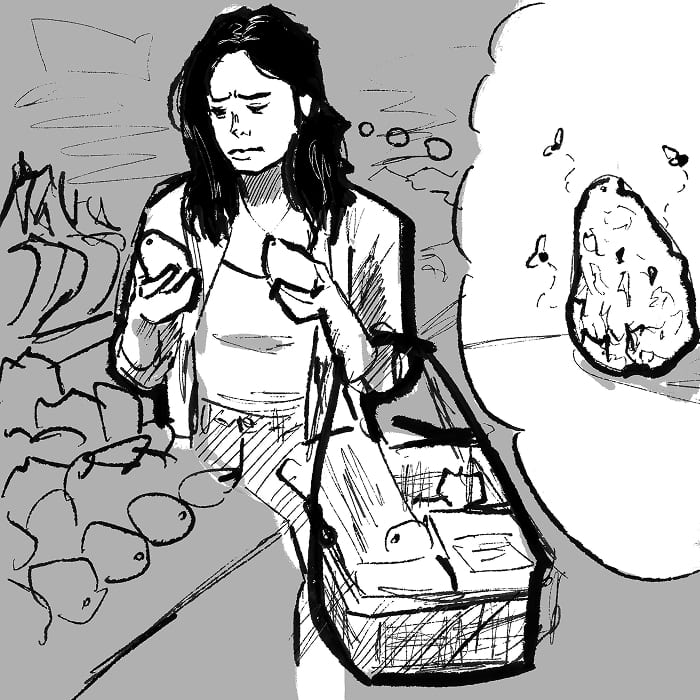
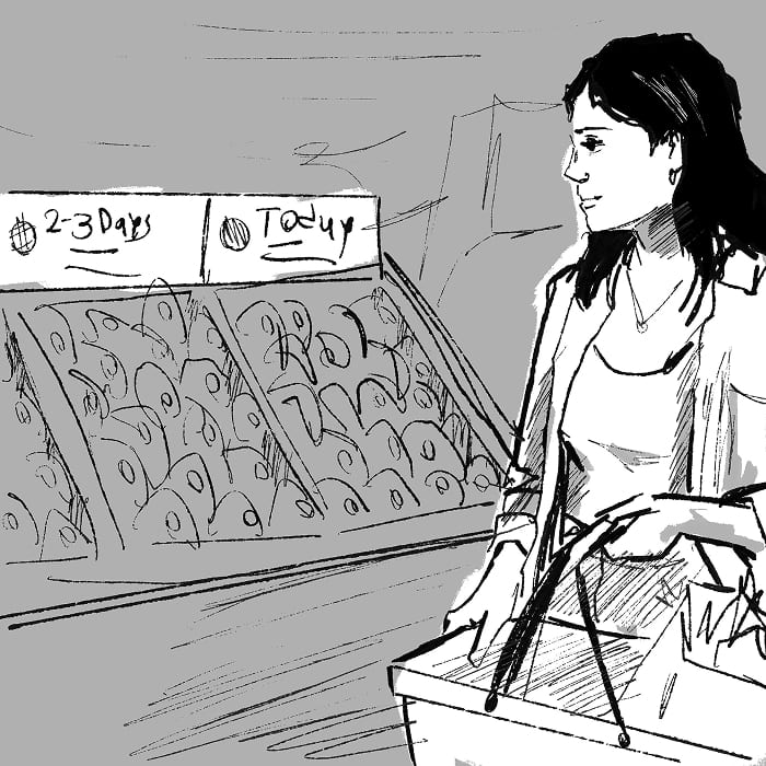
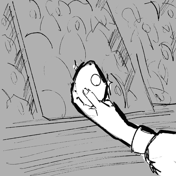
She checks avocado after avocado with no way to tell which will be ready when, forgetting the one already going bad at home.
Now, with Pantri, she picks the week's meals at home and the app builds the shopping list.
Each item carries the color to look for, from light green for Thursday to dark green for tonight.
The store has already applied the stickers, which deepen in color as the produce ripens, matching the colors on her list.
She matches the sticker to the color on her list, with no second-guessing.
Her membership scan prices each item by ripeness, quantity, and what the store has in stock, then saves it all to her profile.
The pantry is already filled in, each item at its stage and matched to the week's meals.
A reminder arrives when the avocados peak, suggesting the guacamole she planned.
By week's end the fridge is empty, and nothing was thrown away.
Deliverables

One color system, on the shelf and in the app

App walkthrough
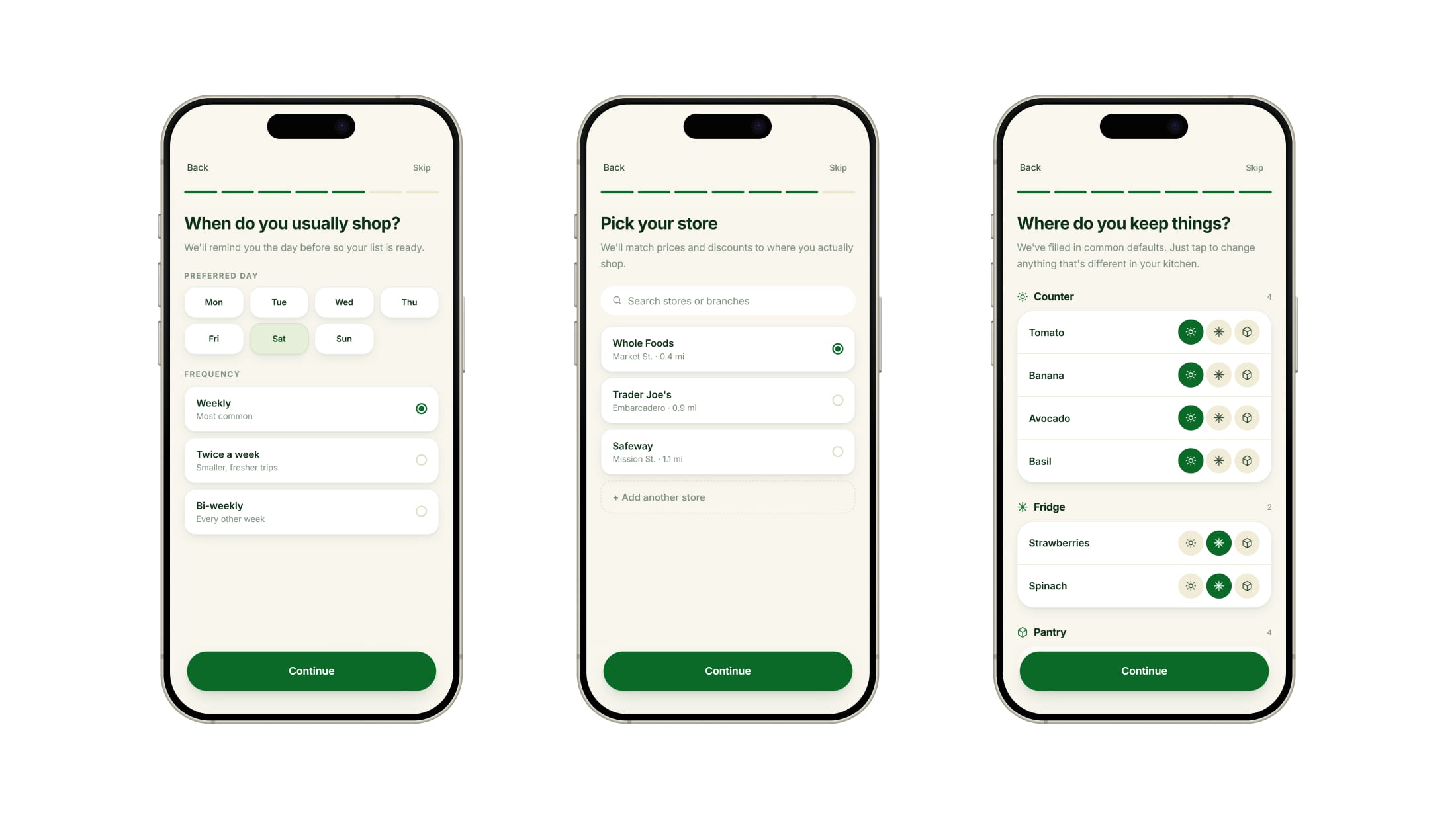
Three onboarding steps: choosing Saturday and a weekly rhythm as the shopping schedule, picking Whole Foods from a list of nearby stores, and confirming where each item is kept, grouped under Counter, Fridge, and Pantry.
Four steps of planning: the plan tab with a card to start next week, picking favorite recipes from a grid, the generated week laid out day by day with a swap on every meal, and one recipe open in full.
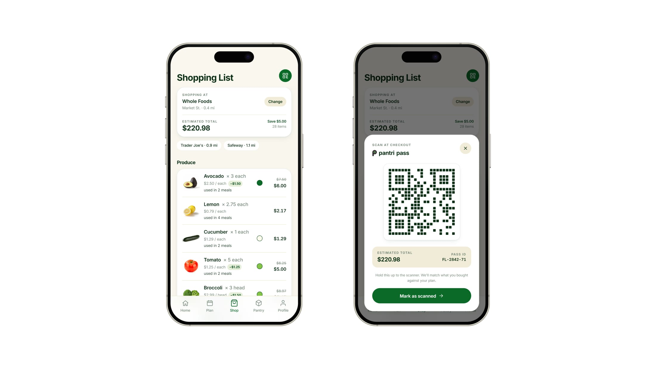
The shopping list grouped by aisle, each item carrying its price, its saving, and a ripeness dot, beside the same screen with the pantri pass open, a QR code to scan at checkout.
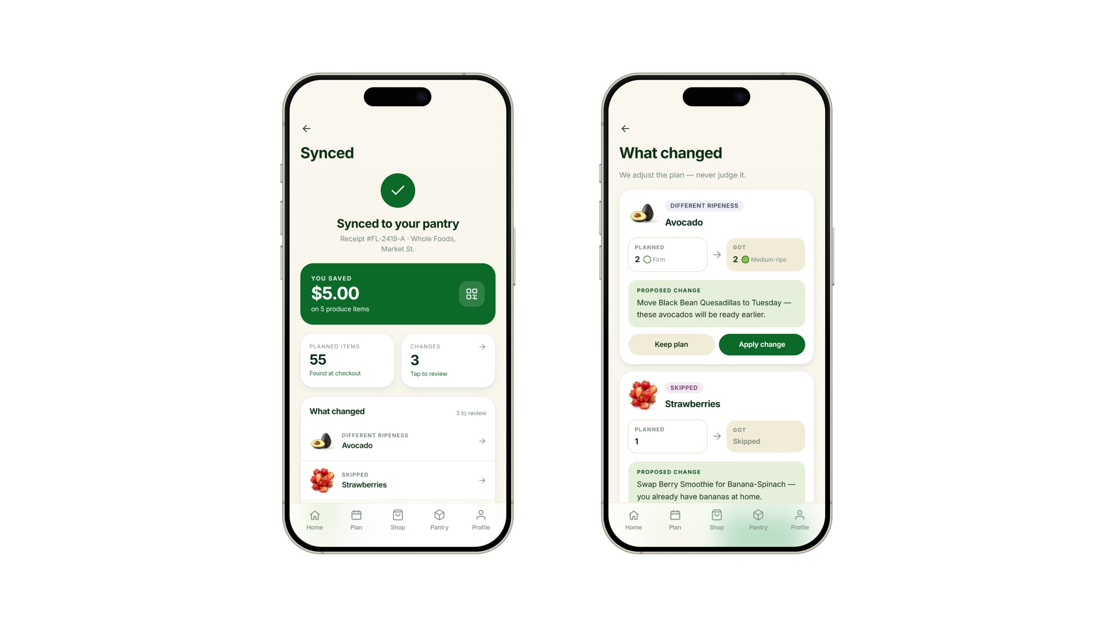
The synced screen confirming the purchase, with five dollars saved and three changes to review, beside the what-changed screen where a riper avocado and a skipped punnet of strawberries each carry a proposed edit to the week.
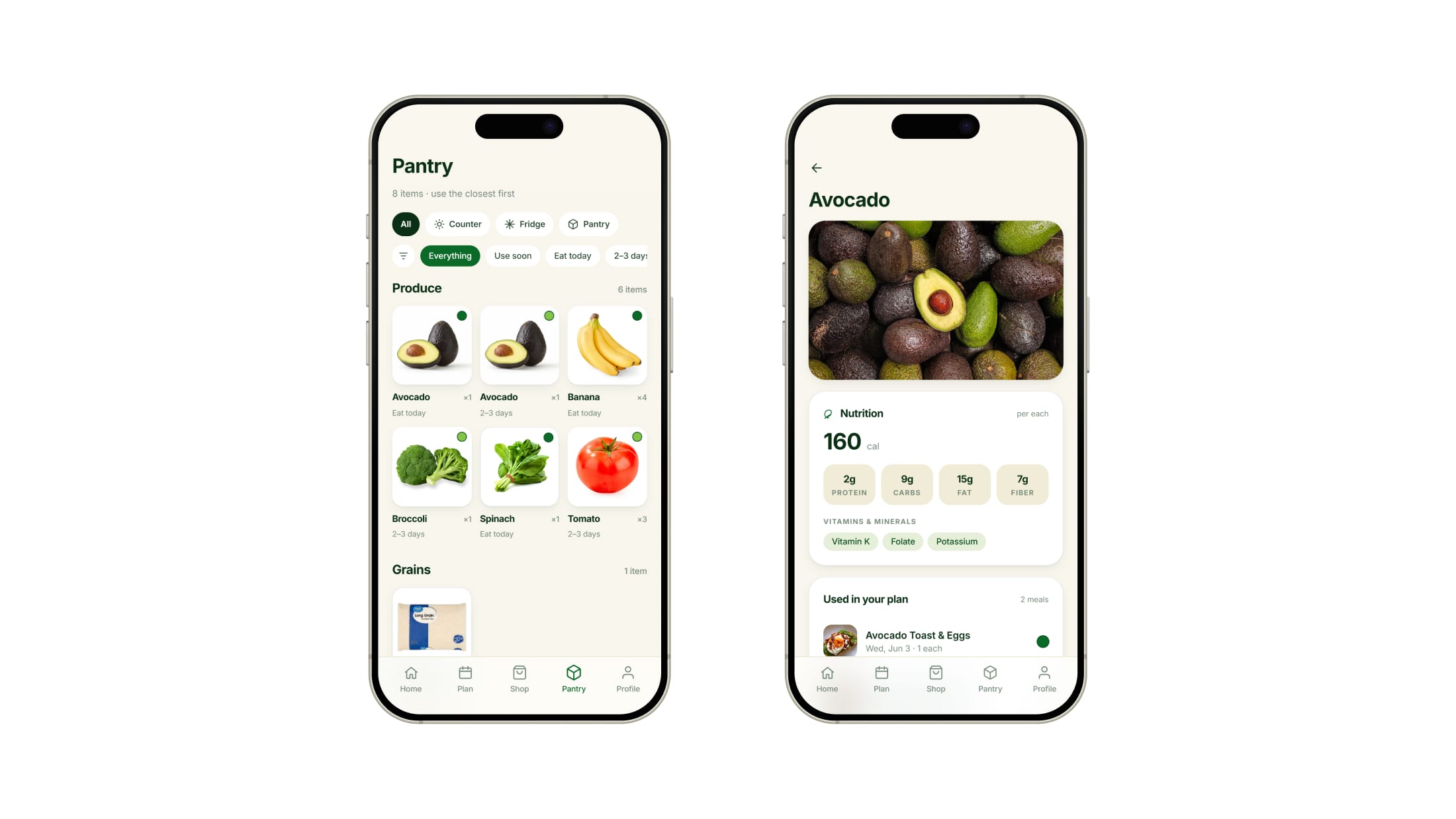
The pantry grid of produce photographs, each with a ripeness dot and a use-by label, beside the avocado detail page with its nutrition panel and the meals it belongs to.
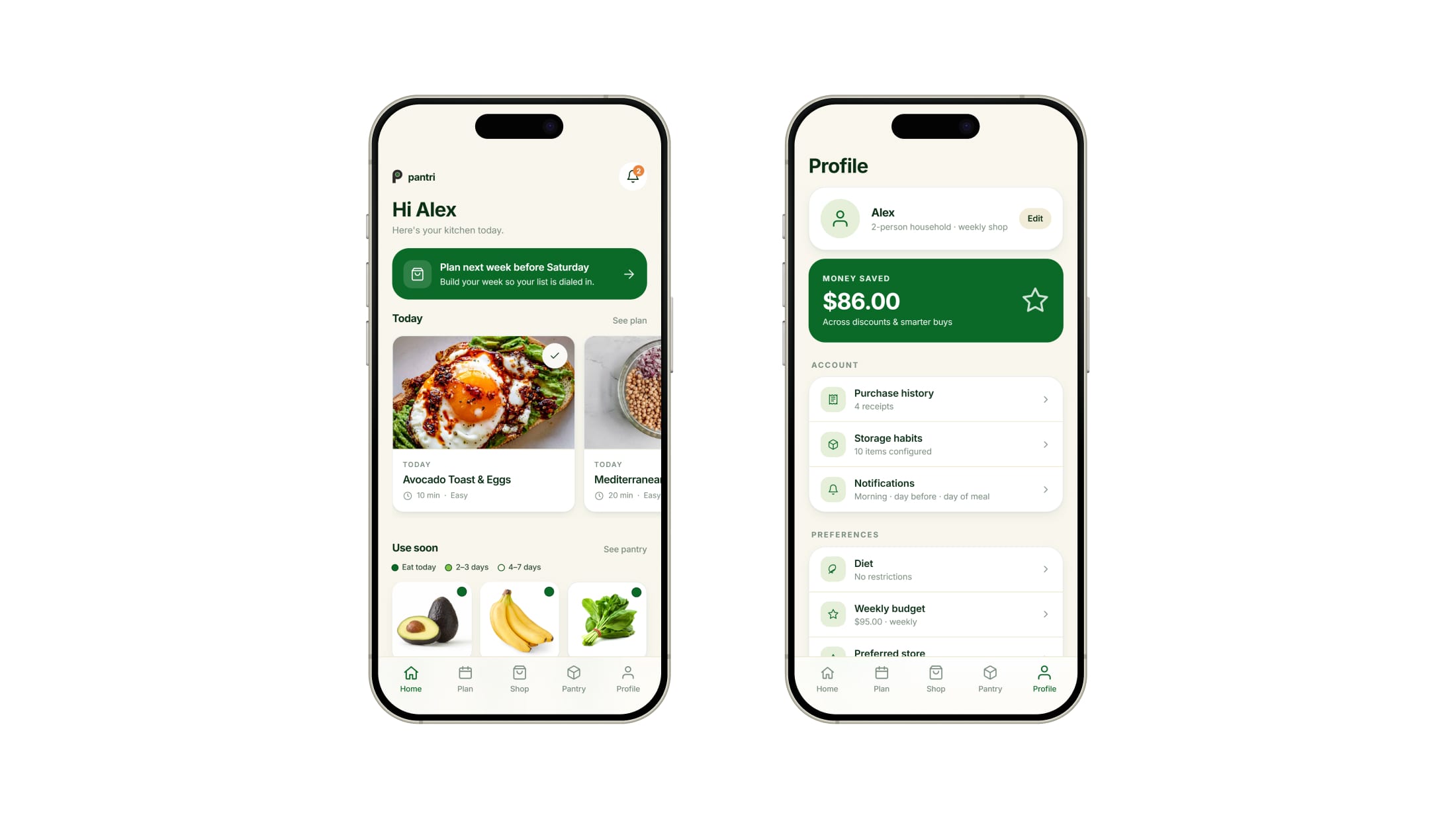
The home screen with today's meals and a use-soon row, beside the profile screen showing eighty-six dollars saved above account and preference settings.
01 Onboarding Diet preferences, shopping schedule, local store, and where everything is kept are set once, and the app plans around them.
02 Plan Pick the week's meals; every ingredient gets a ripeness. Tuesday's Buddha Bowl needs produce peaking Tuesday, not Saturday.
03 Shop & checkout The plan becomes a grocery list with a sticker color and any saving on every item, so you match the color instead of standing in the aisle checking each one. The QR at the top goes to the register.
04 What changed The scan syncs everything to the pantry at its ripeness stage, and any differences become updates to confirm or dismiss.
05 Pantry Everything you bought, in the same three colors as the stickers, closest to spoiling first, grouped by where it lives.
06 Home & profile Home keeps today's meals and use-soon alerts together, so nothing is forgotten after the shop. Profile totals the money saved on discounts and on buys that help clear a store's produce before it is thrown out.

Designed with Rafael Sanchez · Generated with Claude Code

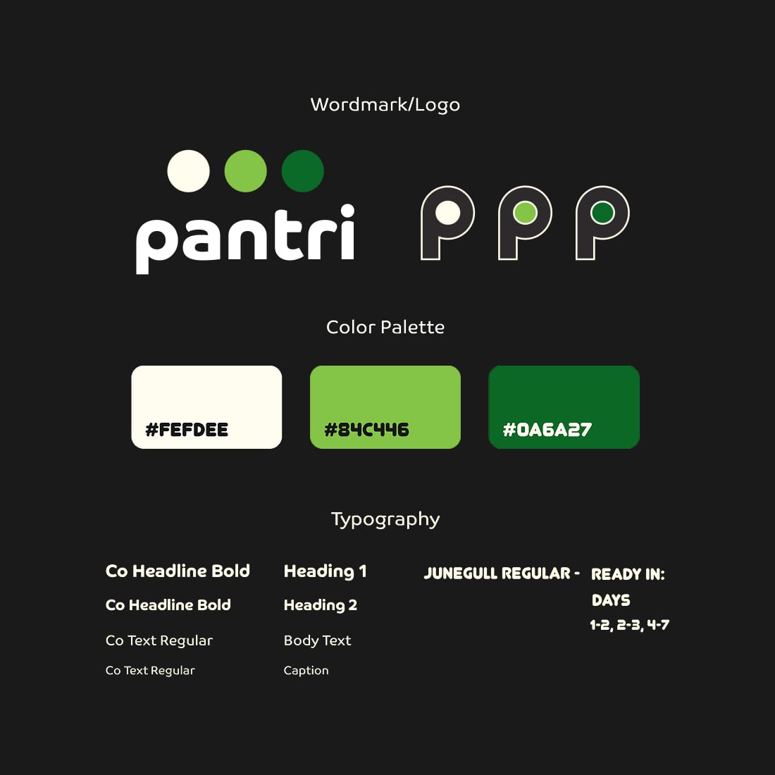
Ripeness indicator sticker & visual identity

The sticker reads the ethylene produce gives off as it ripens, deepening from white to light green to dark green, with days-to-ready around the P that doubles as the logo. Real ones exist only in labs and pilots, so ours is a mockup. Stores apply them at stocking and read their shelves back, seeing what is ripening and when to discount it.

Designed by Cory Cantrell
Results & Reflection

Results

Judges backed the concept and looked for what comes next

  • Judges recognized it from their own kitchens: avocados for the guest judge, overnight strawberries for the program lead
  • Judges supported the goal of stores and shoppers both acting on food waste
  • Judges wanted the store's side built next, and asked how far the idea could expand

Four team members presenting Pantri in a classroom. Two stand at a desk mid-sentence, two wait beside the screen holding notes, and the title slide behind them shows the pantri wordmark in white on green above three dots.
Reflection

The prototype settled what the discussion could not

Testing gave two equally logical readings on the color sequence, so more debate could not settle it. The way out was a third option that removed the question. I proposed the three shades of green, and we built them into the app and the stickers. That settled it faster than another round of comparison.

The final panel asked who applies the stickers, a question no tester or classmate had. We had drawn the shopper's side of the service completely and left the store's side implied, and in a service the actor you do not control is the one that needs showing most.

Image credits

More projects

UX & Product Design

Pawdle app screens arranged on the brand yellow.

app concept · academic · Summer 2024

Pawdle

Connecting dogs, and their people

NAVI wordmark beside two phones: the app splash screen and the Ocean View Park place page.

app concept · academic · Fall 2025

NAVI

Mobility for visually impaired users and their caretakers