UX & Product Design
O1 Journal (Overview)
A holistic wellness journal for everyday health, low-pressure enough to actually keep up with.
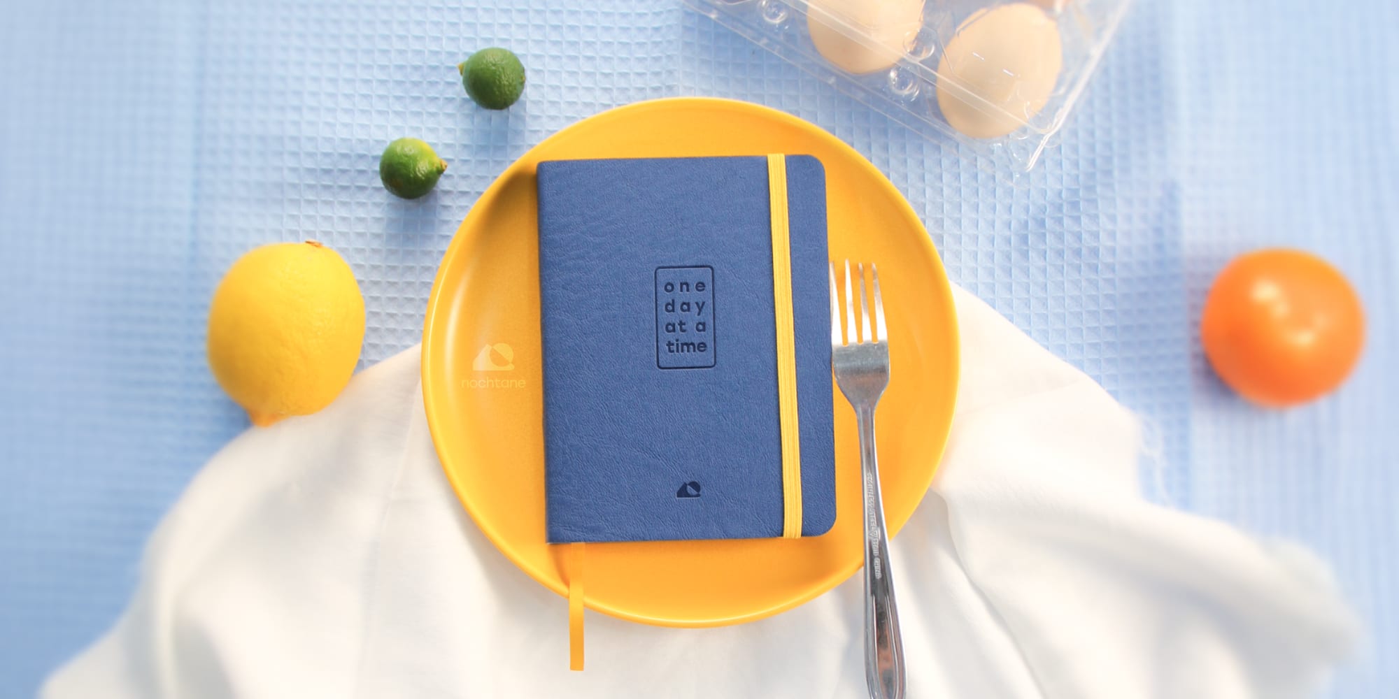
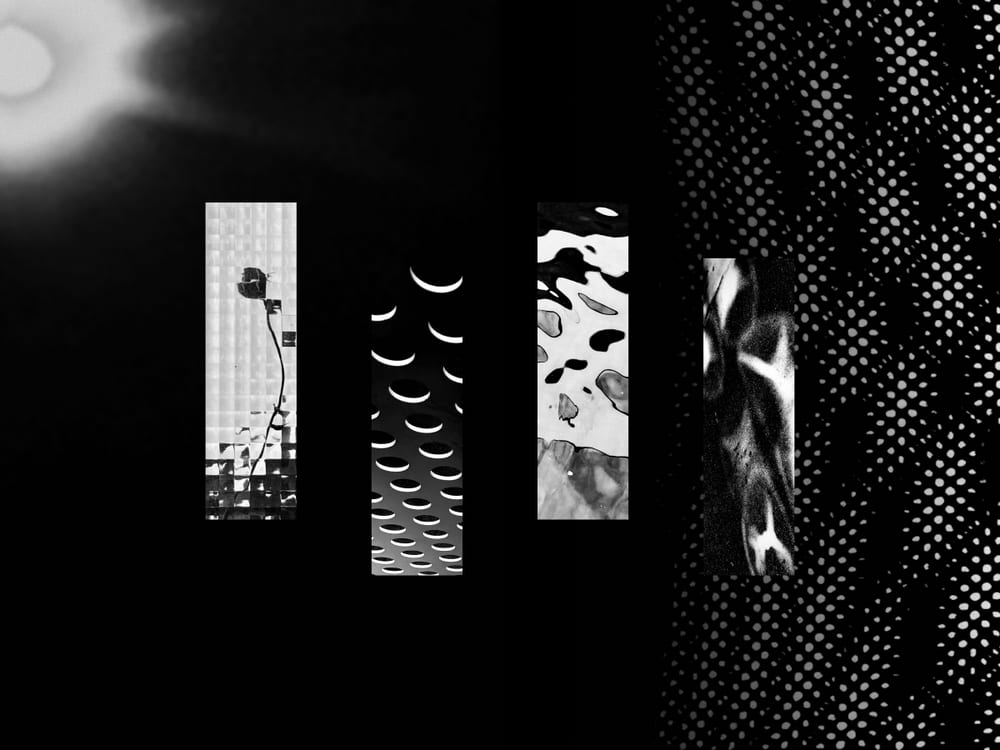
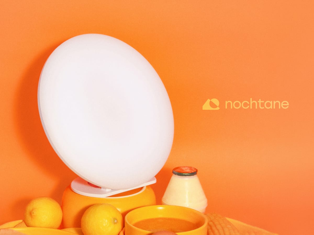
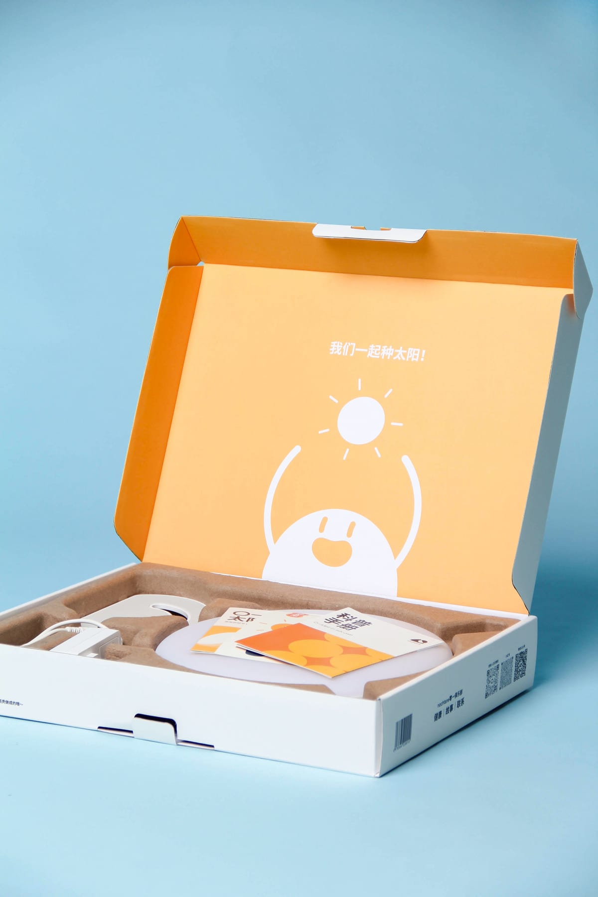
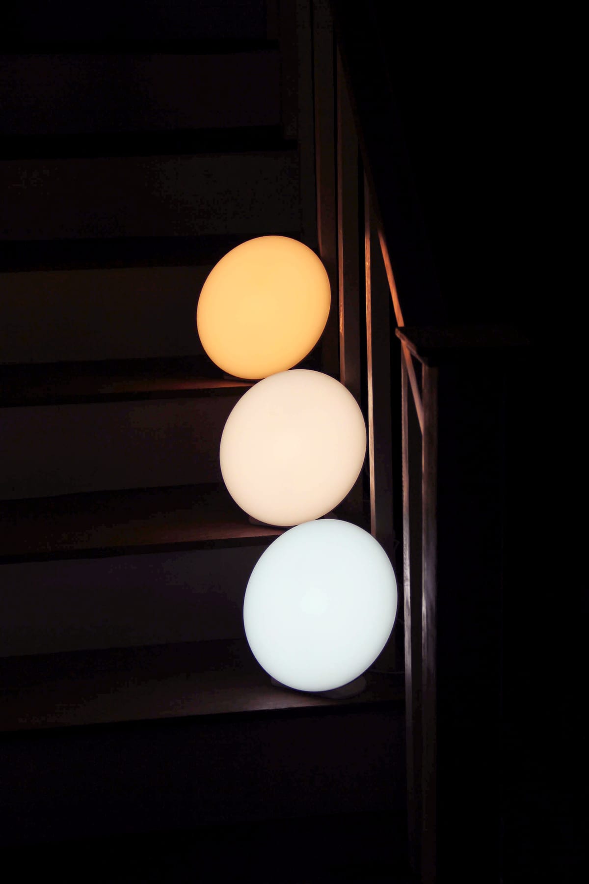
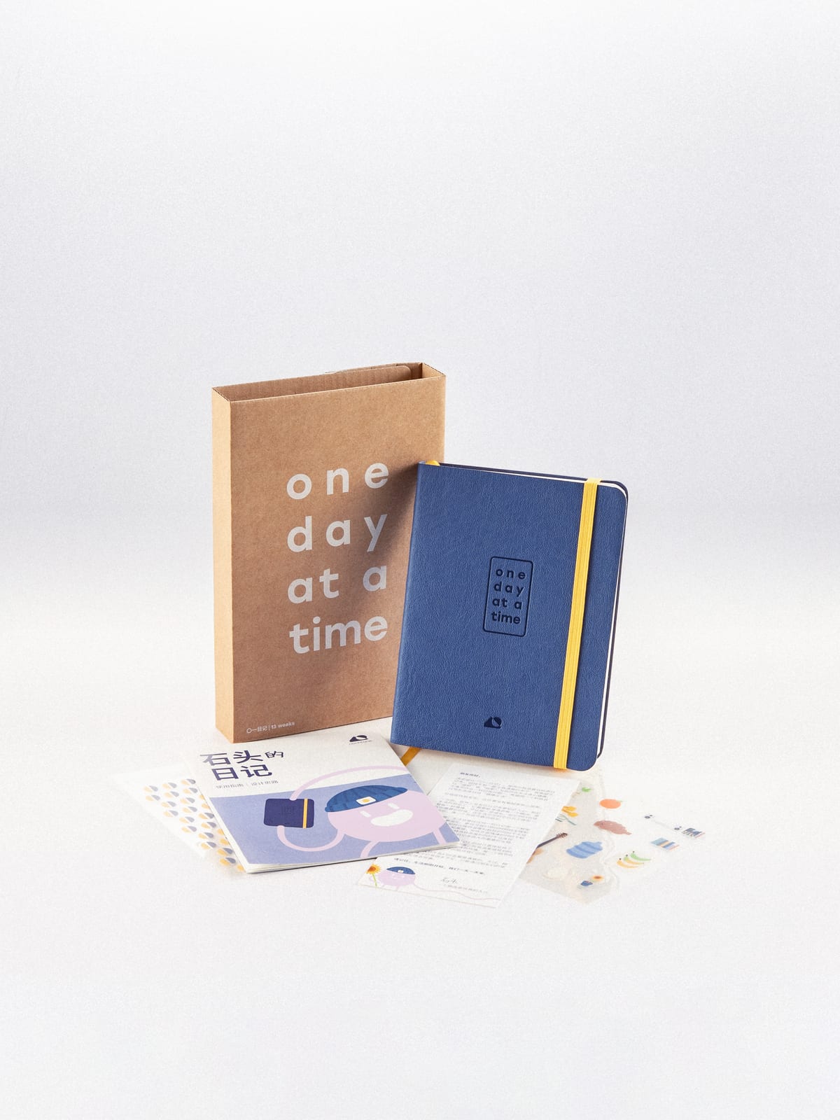
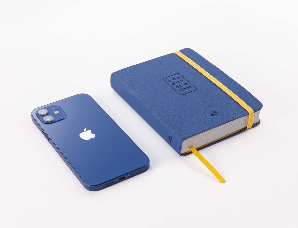
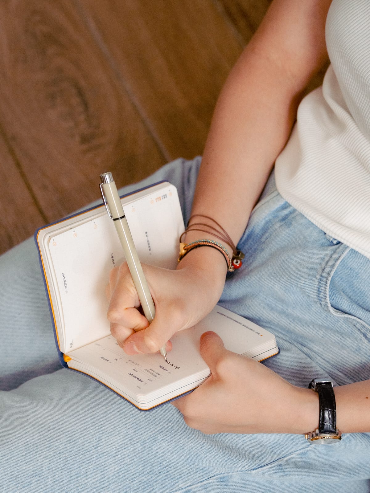
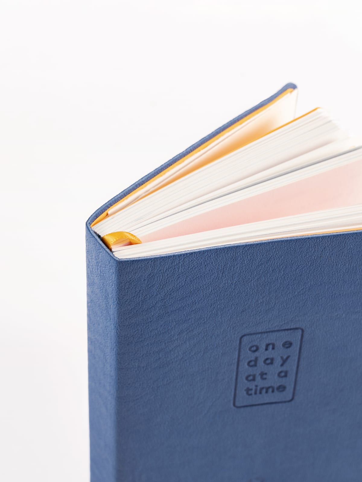
nochtane needed a product beyond its debut winter light therapy lamp. This began as a health tracker I made for myself, and consulting lamp fans grew it into the full 13-week journal. It is UX in analog form: structure, prompts, and rewards guiding users toward healthier habits. Our founder handled manufacturing in China, and I designed it remotely from the US. I'm now leading design for nochtane's first smart lamp and its app.
The whole thing had to fit in ten minutes a day
Stressed young adults in urban China want healthier habits, yet nearly 40% of the 150 we surveyed could not keep even one. Wellness journals across East Asia are built on toxic positivity, productivity, or dieting, and filling one in feels like homework.
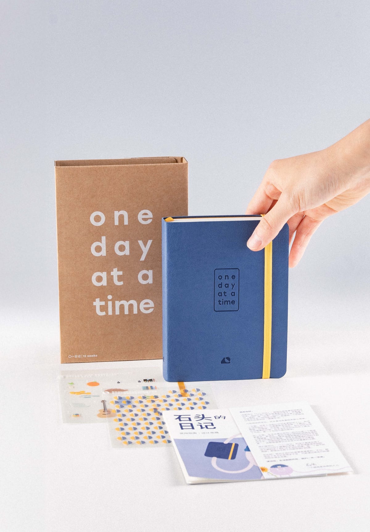
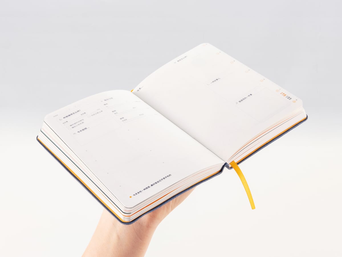
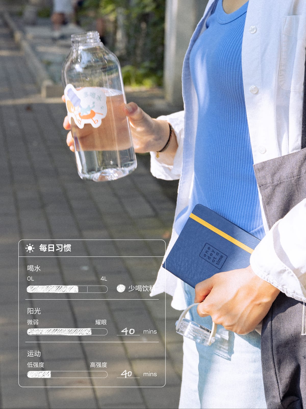
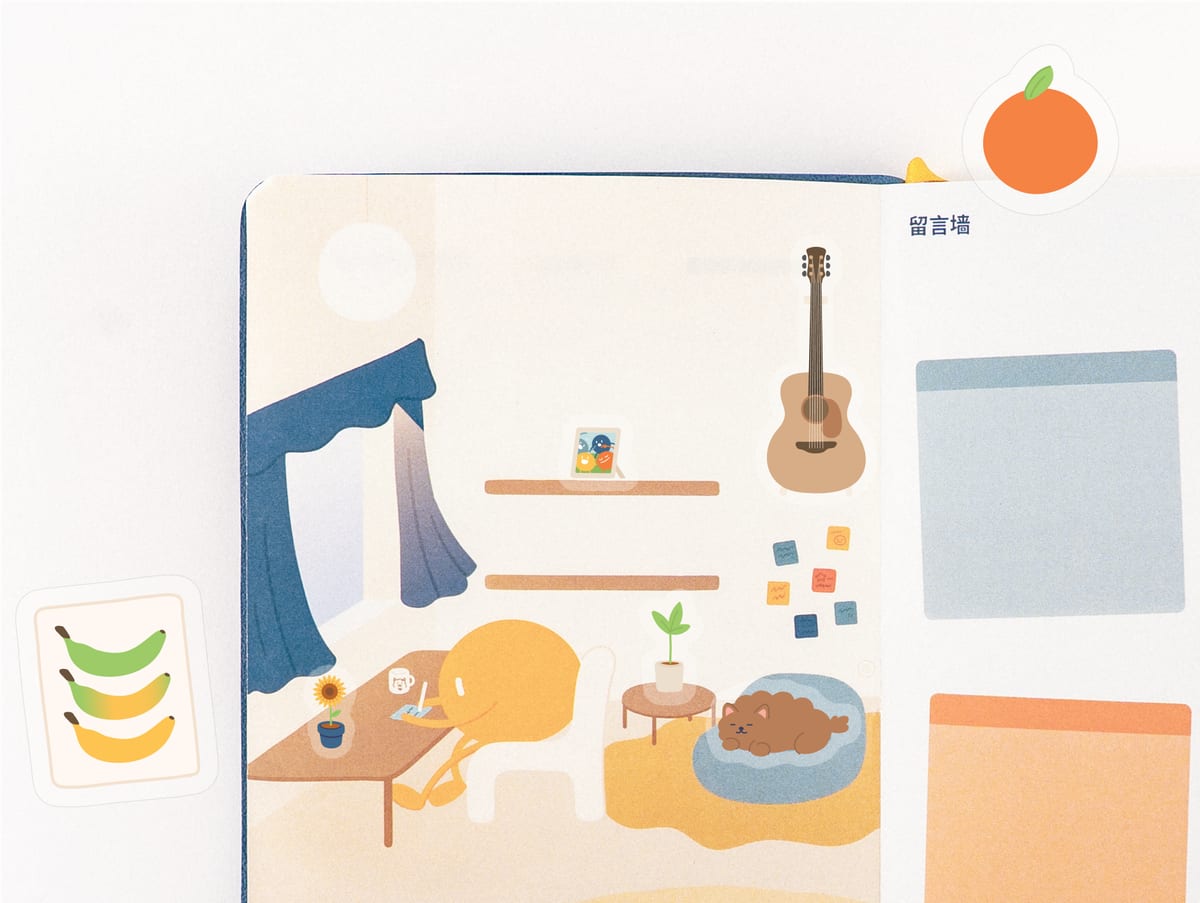
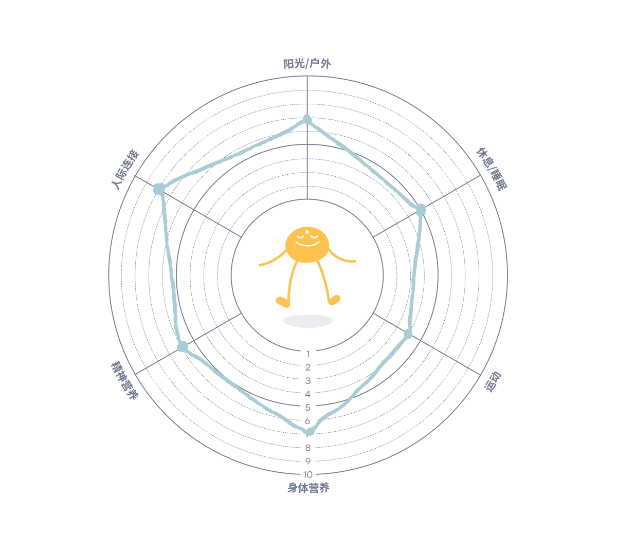
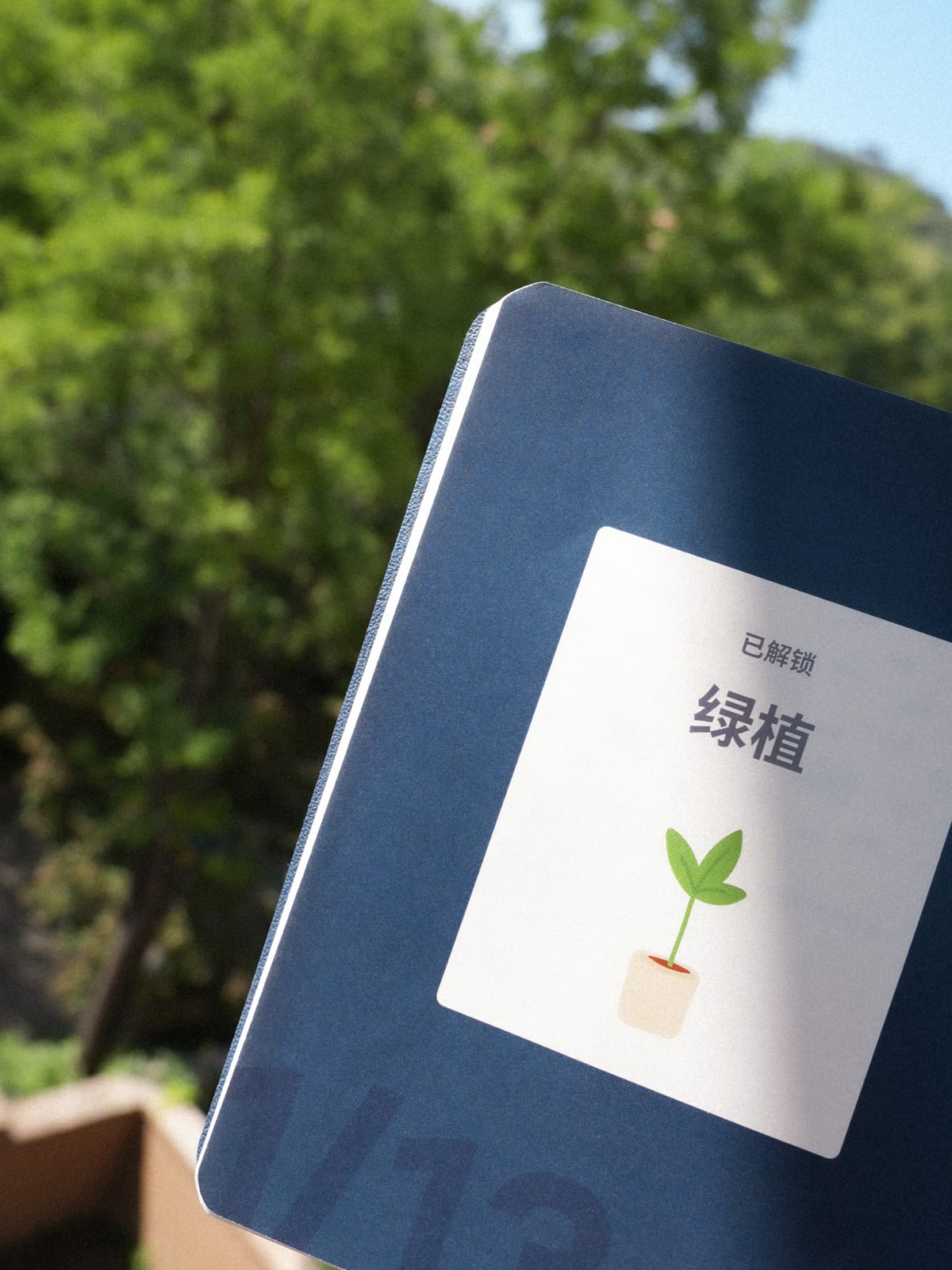
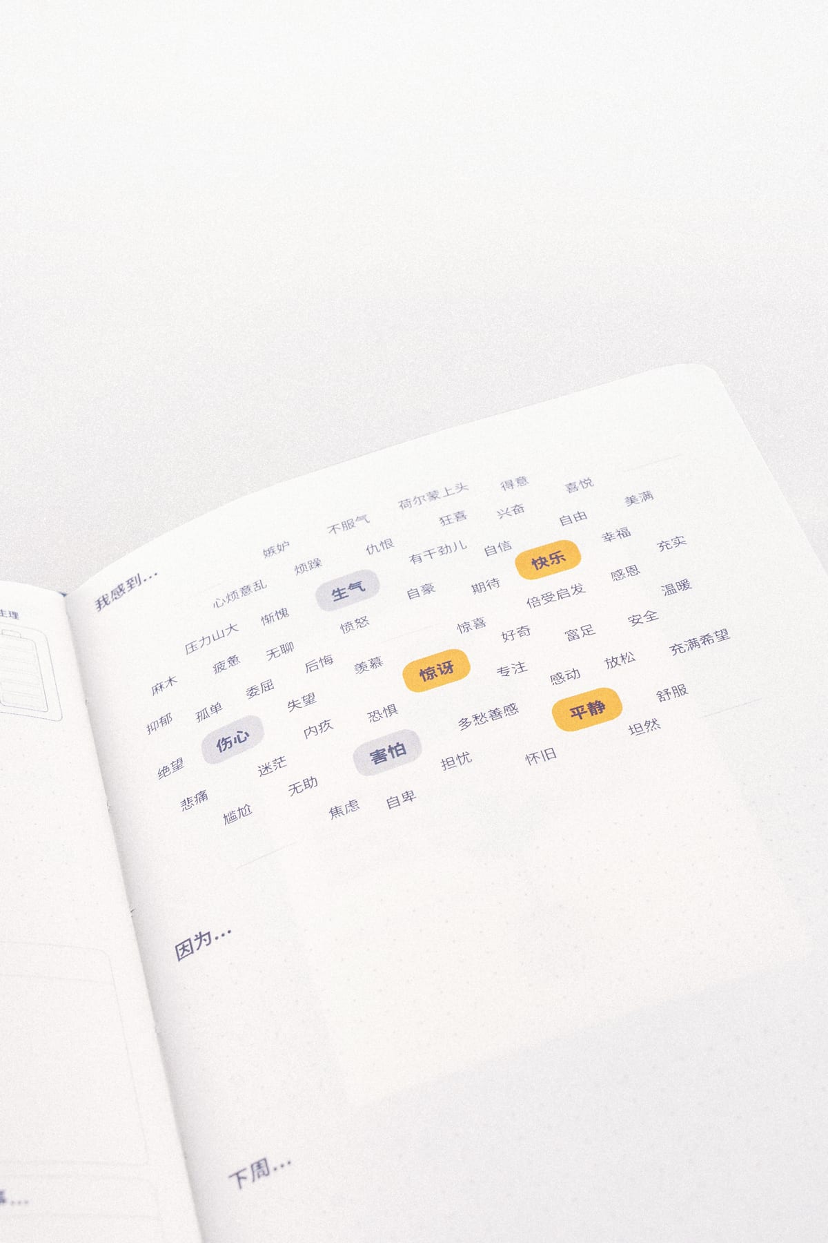
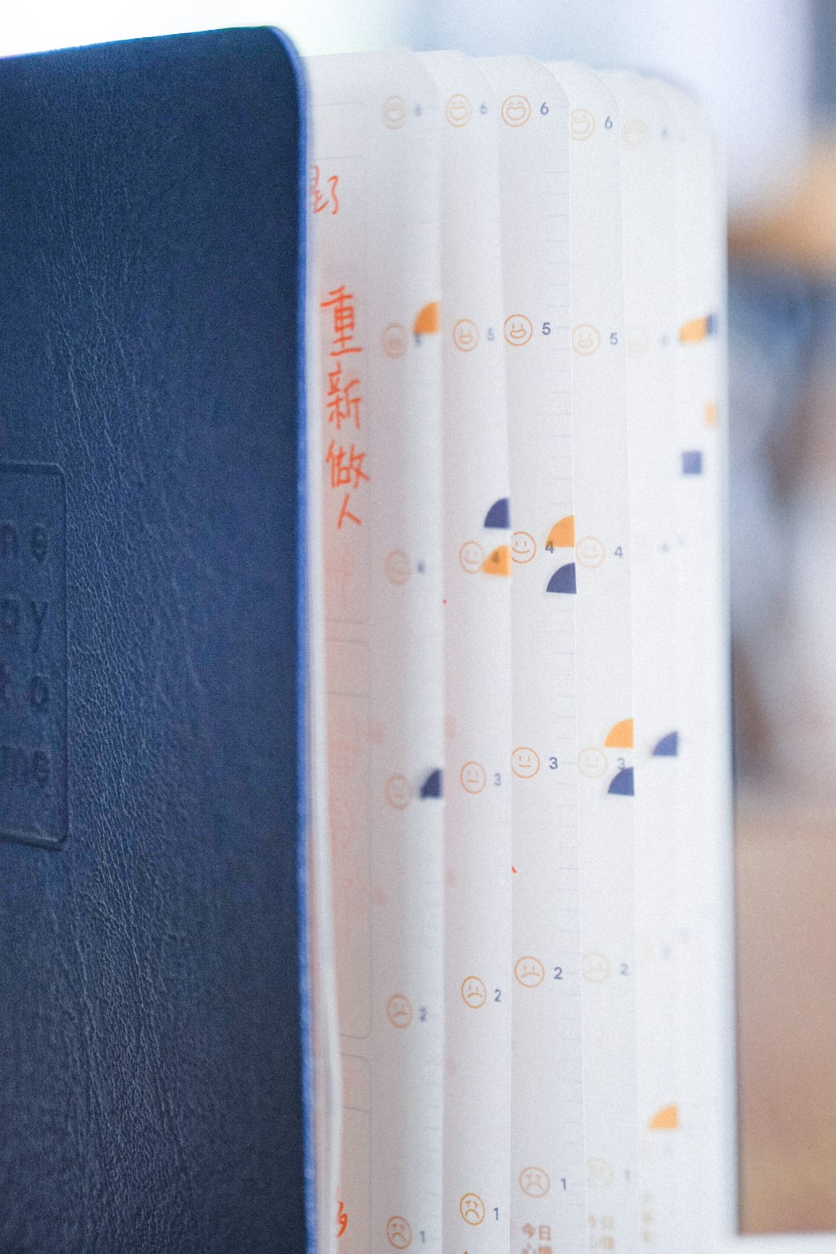
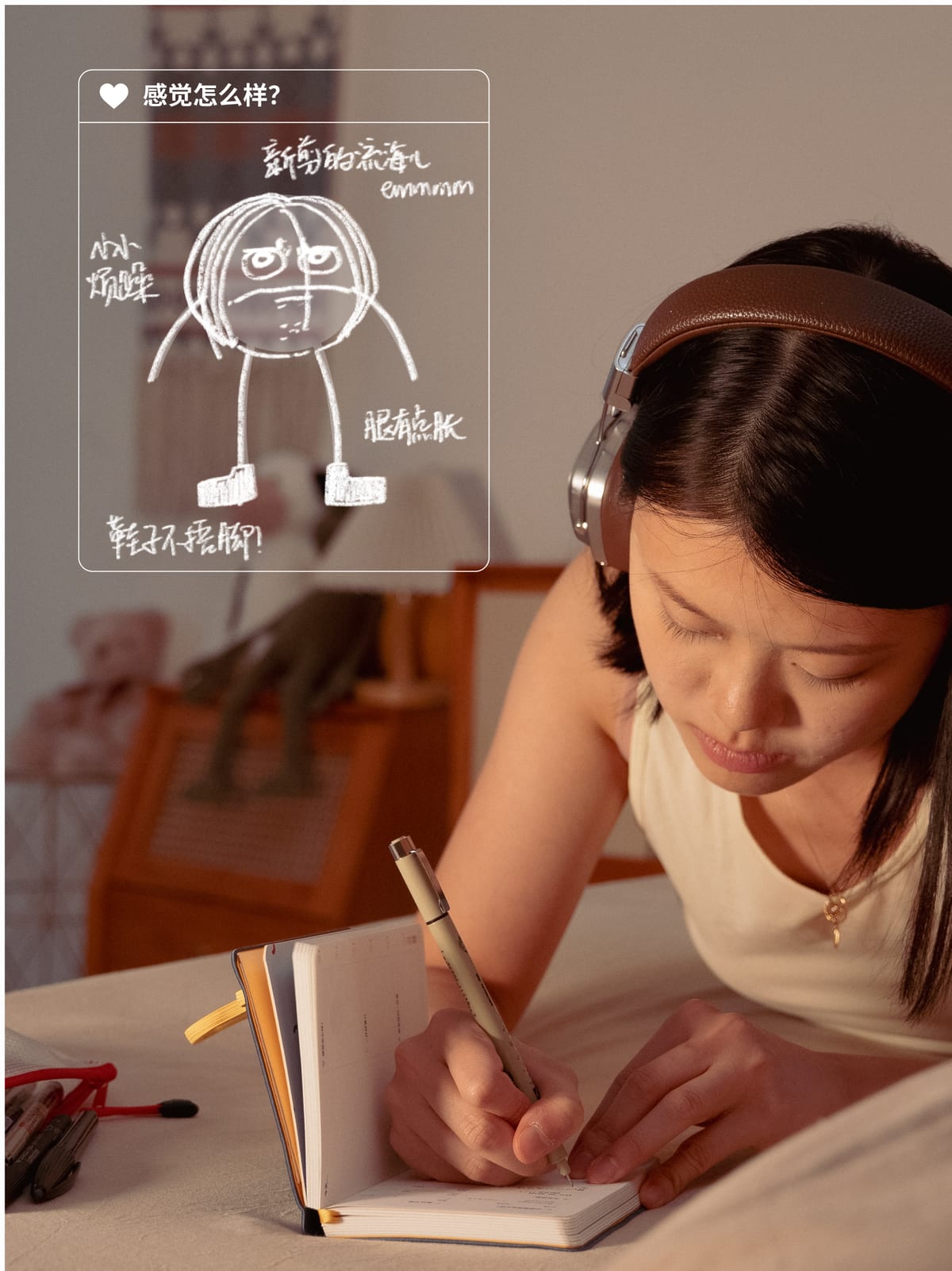
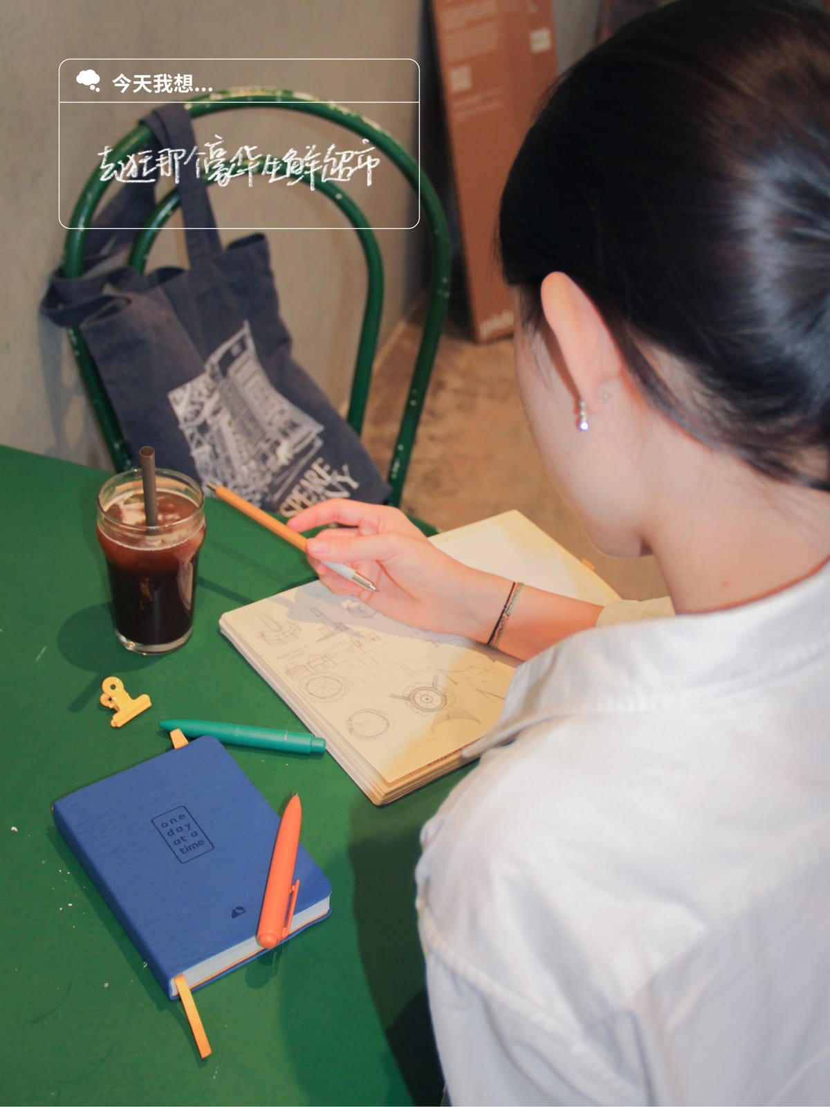
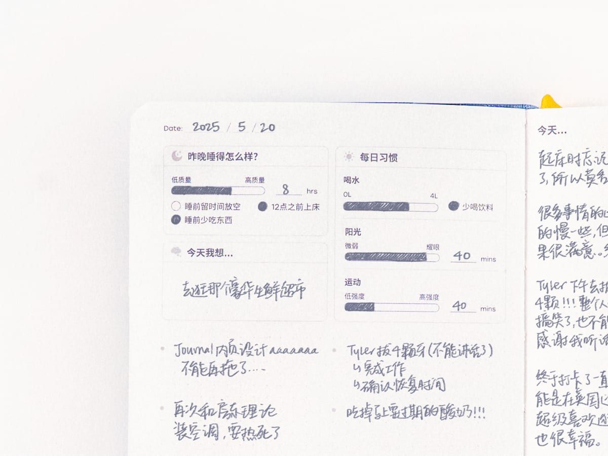
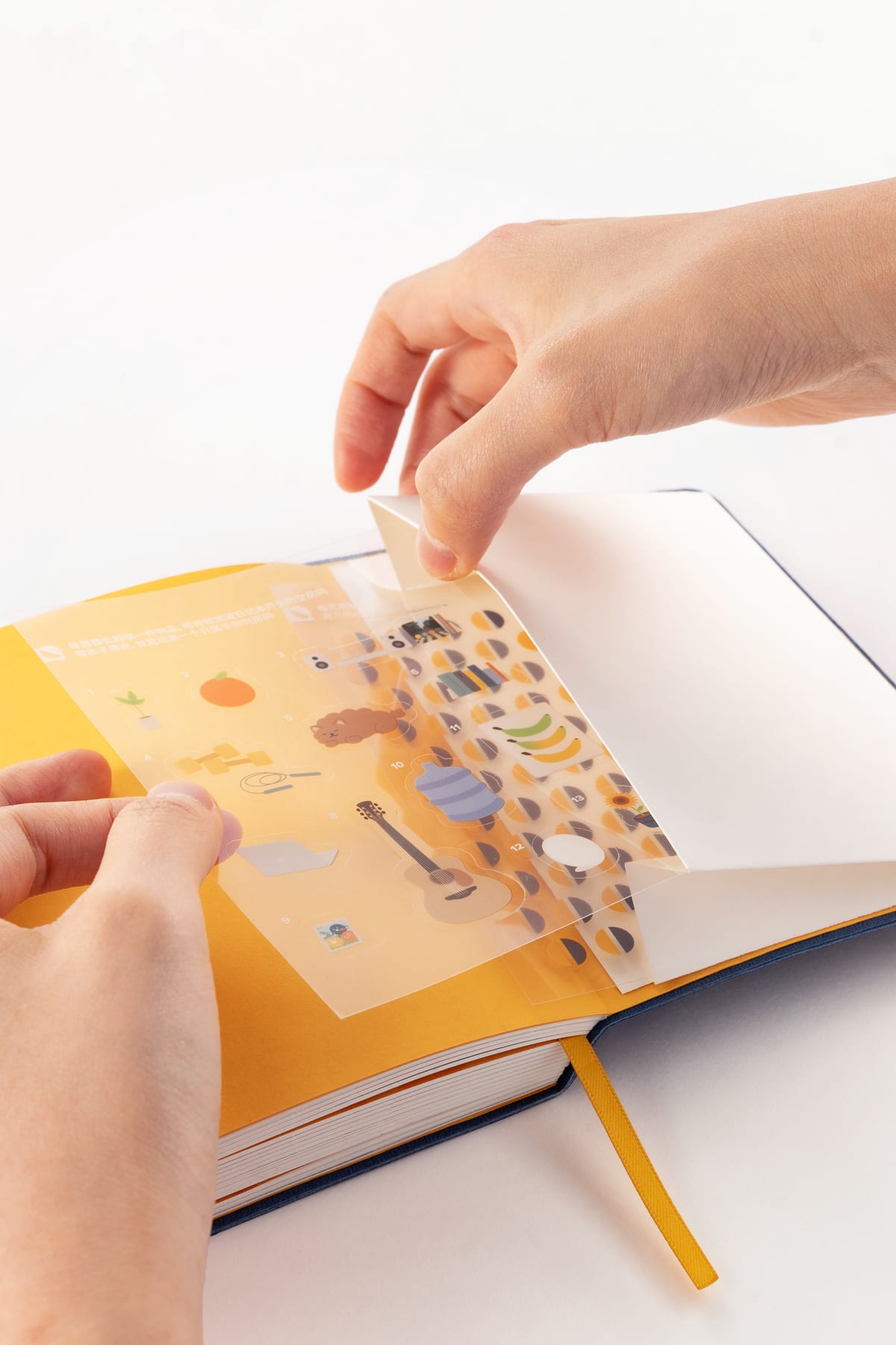
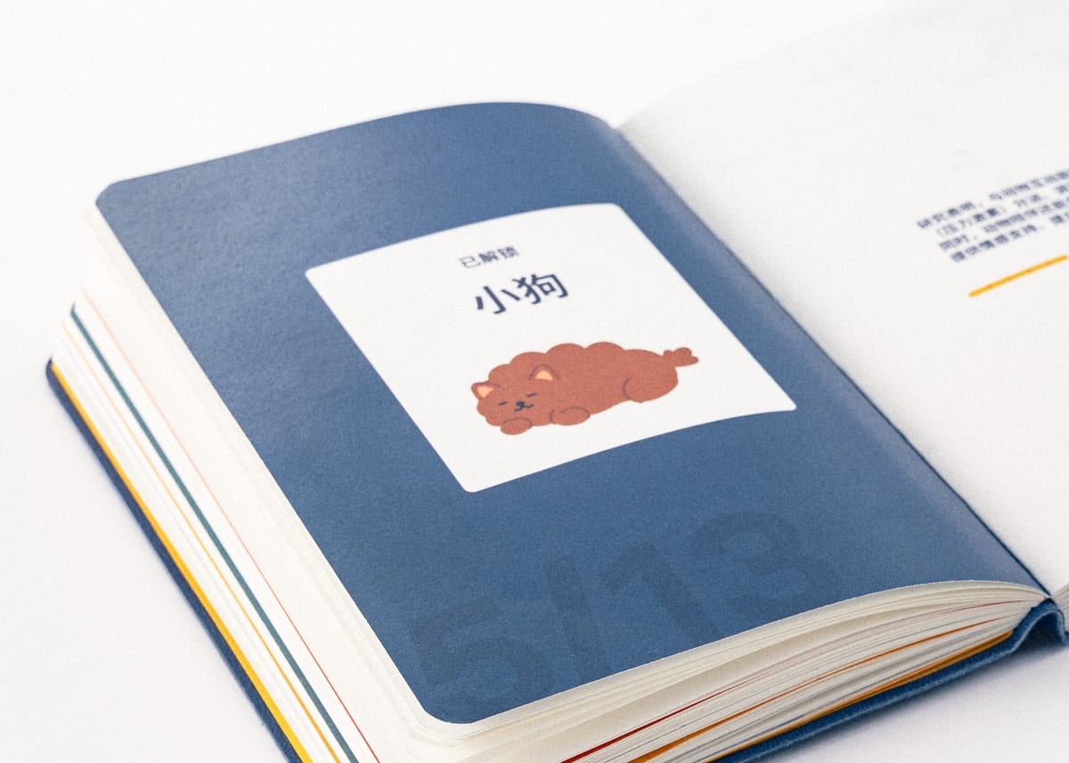
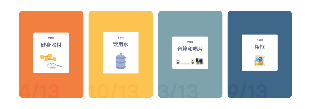
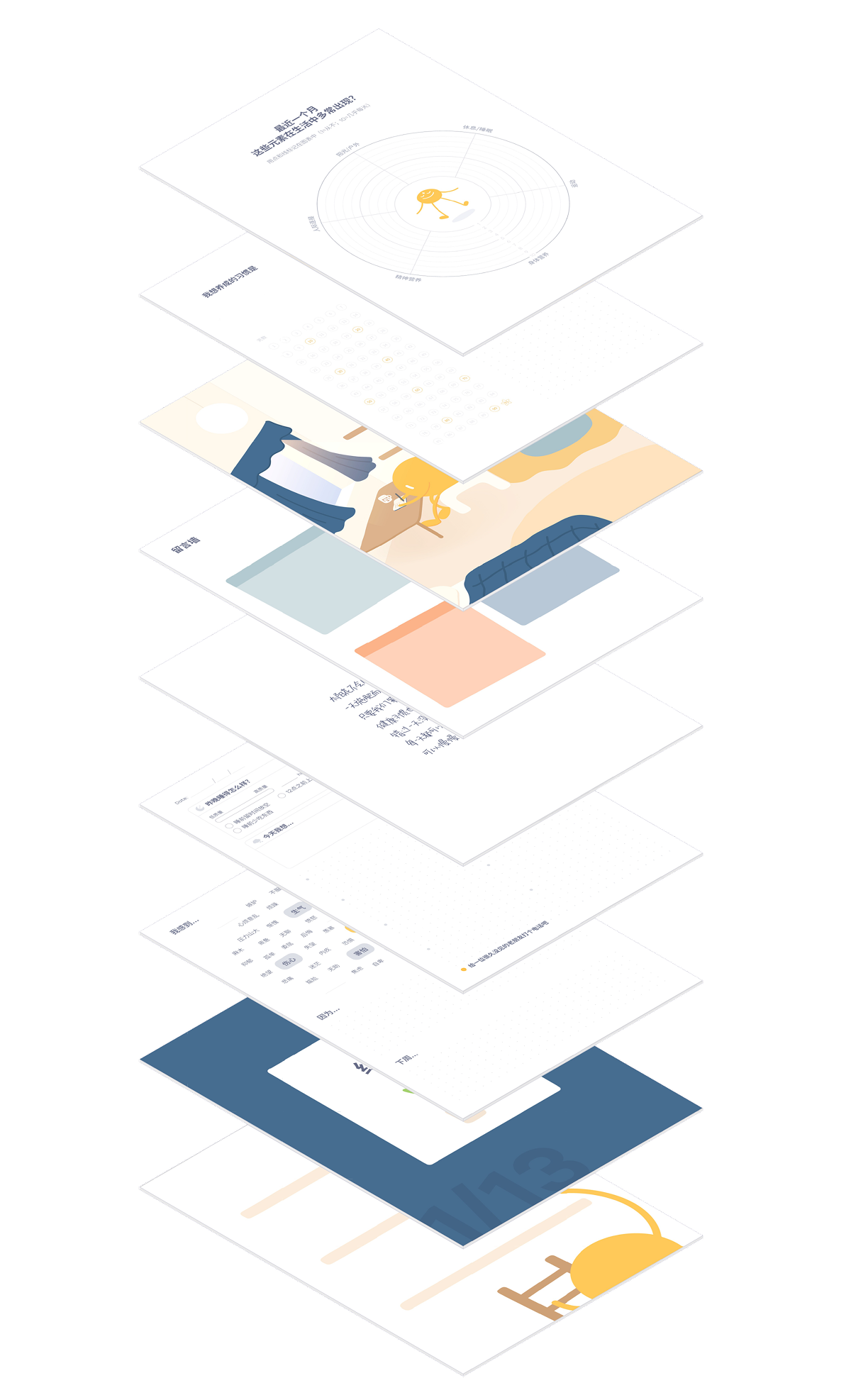
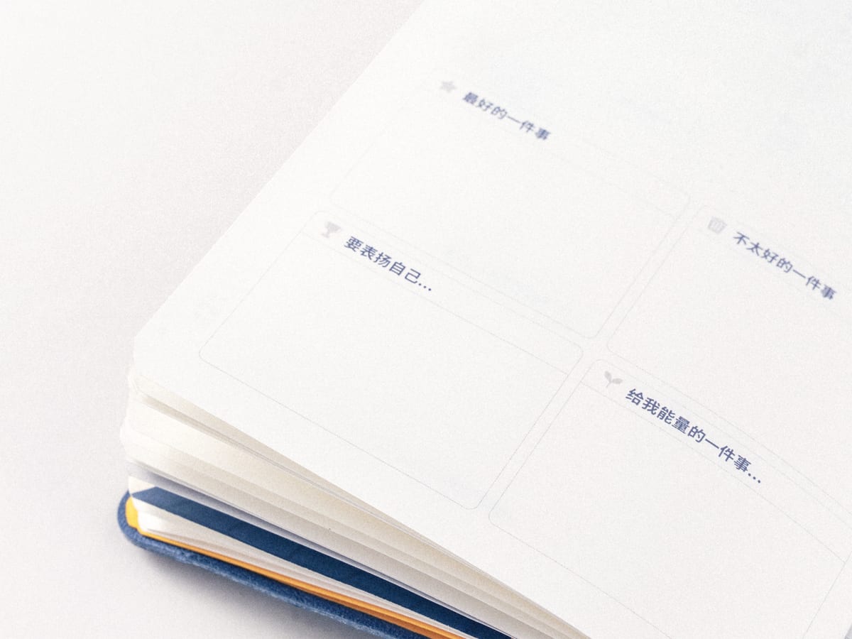
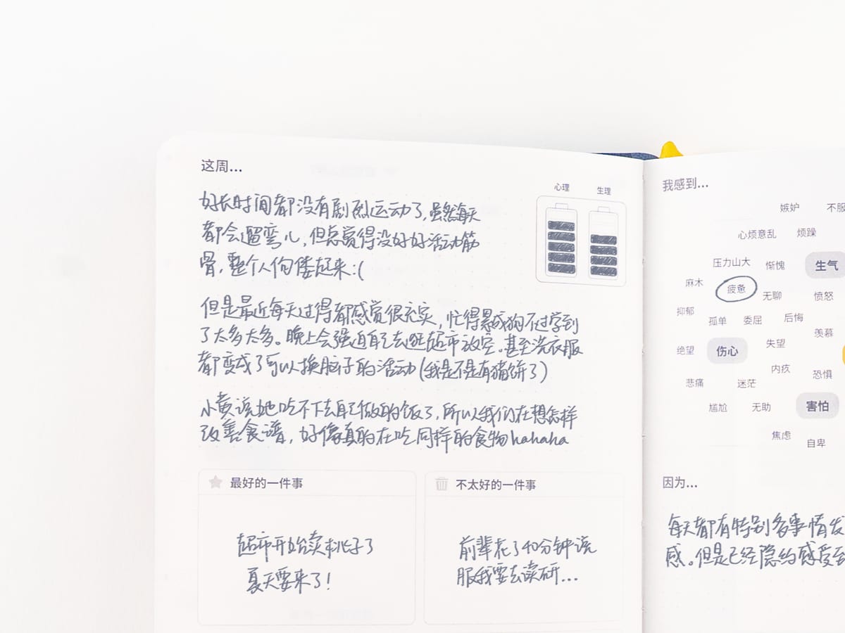
O1 is a 13-week system built on a six-pillar health framework: gentle prompts, visual trackers, and playful weekly sticker unlocks guide achievable daily practices in five to ten minutes. Long venting can worsen a bad mood, so reflection stays short.
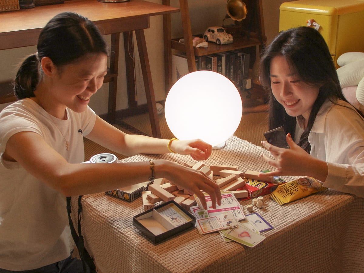
- A fan who is a psychologist called it a fitting therapeutic complement to our light therapy lamp
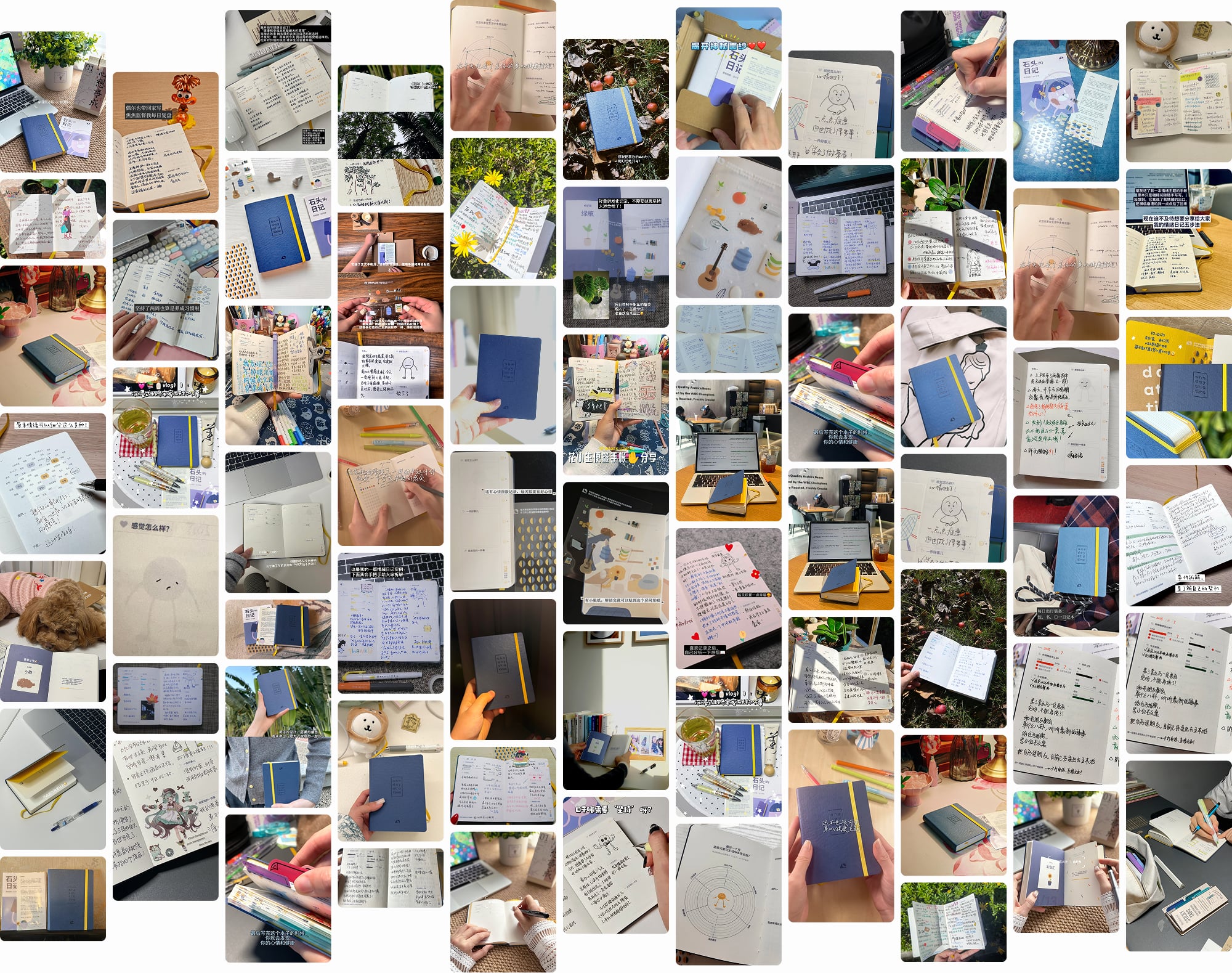
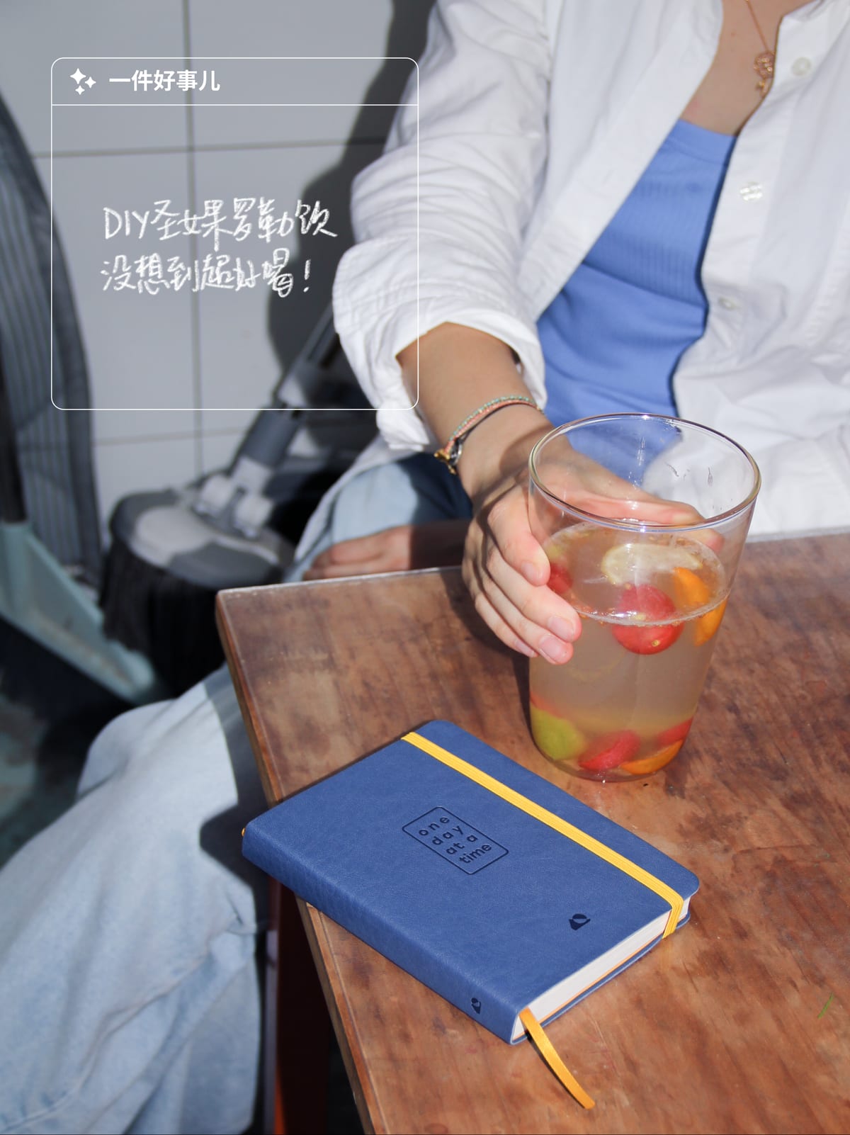
- MBTI "P" types on RedNote, who usually struggle with consistency, enthusiastically shared their progress
- A tester for our next lamp knew us only through the journal, and chose a second journal over a free lamp
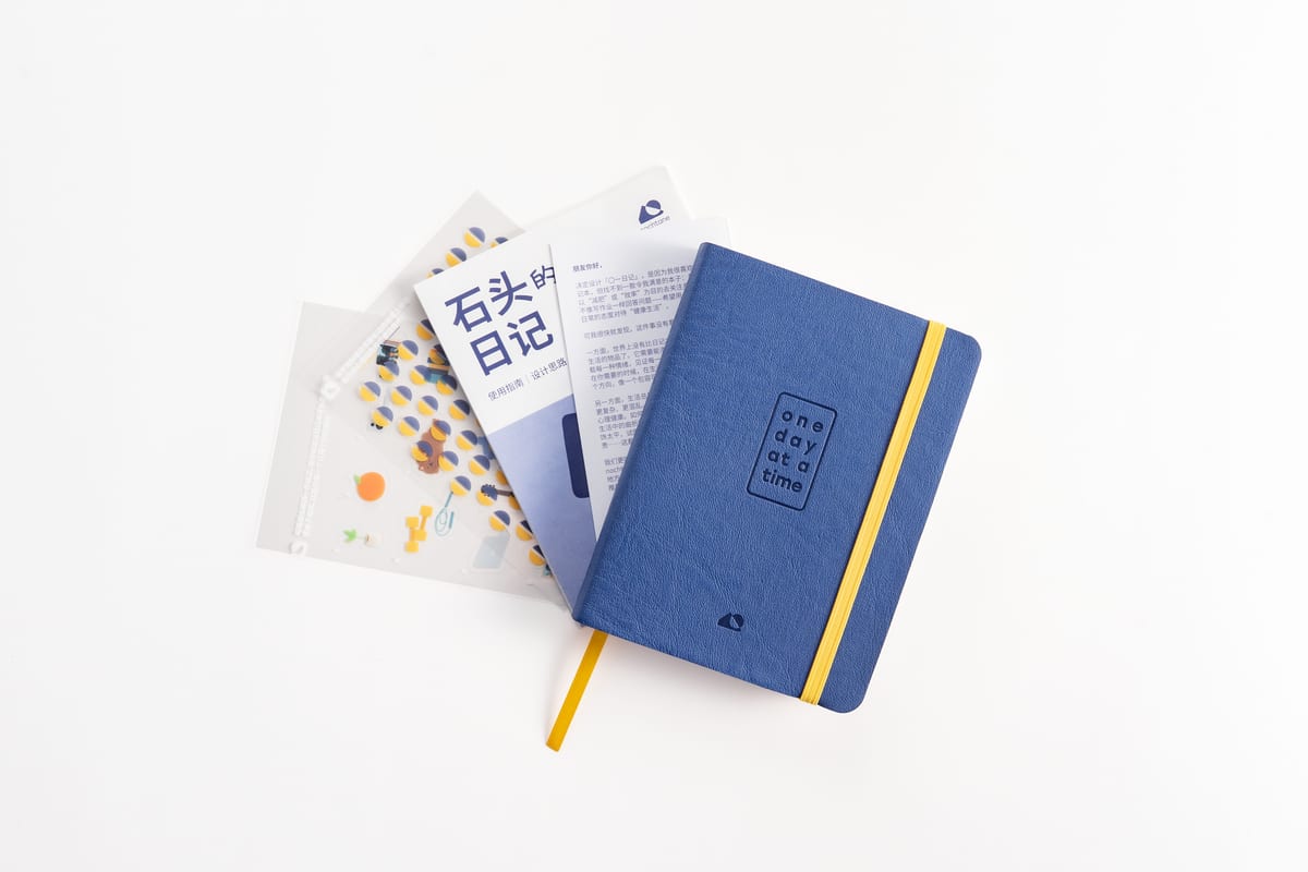
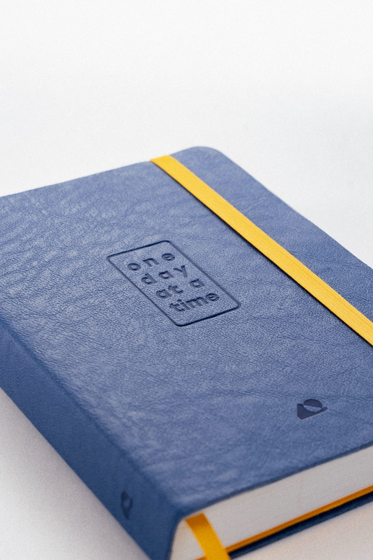
Final Product
The Community