UX & Product Design
Pawdle
A social app connecting dog owners and their dogs through tailored events and communities.
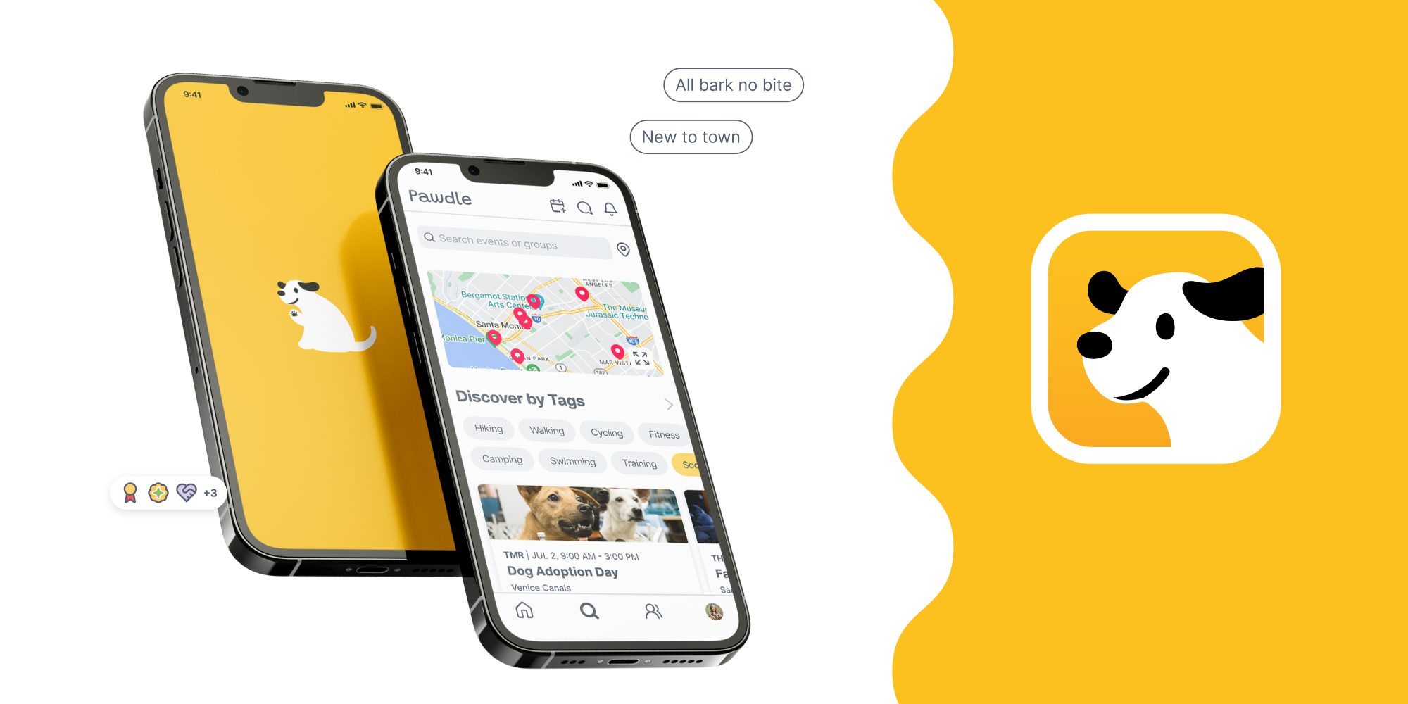
An eight-week brief: design a social app for a specific audience. I picked dog owners because I am one, and mine is anxious, so I already knew how much a dog's temperament decides where you can go and who you can meet. It was my first mobile app, and only my second project in Figma.
Designed around the dog as much as the owner
A dog brings its own rules about who it can meet and how. Event apps show what is happening nearby and say nothing about the dogs who will be there, so you show up and hope.
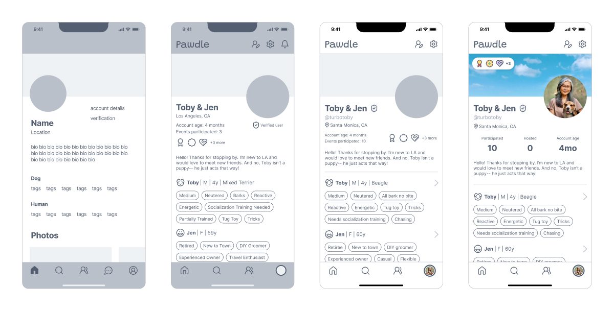
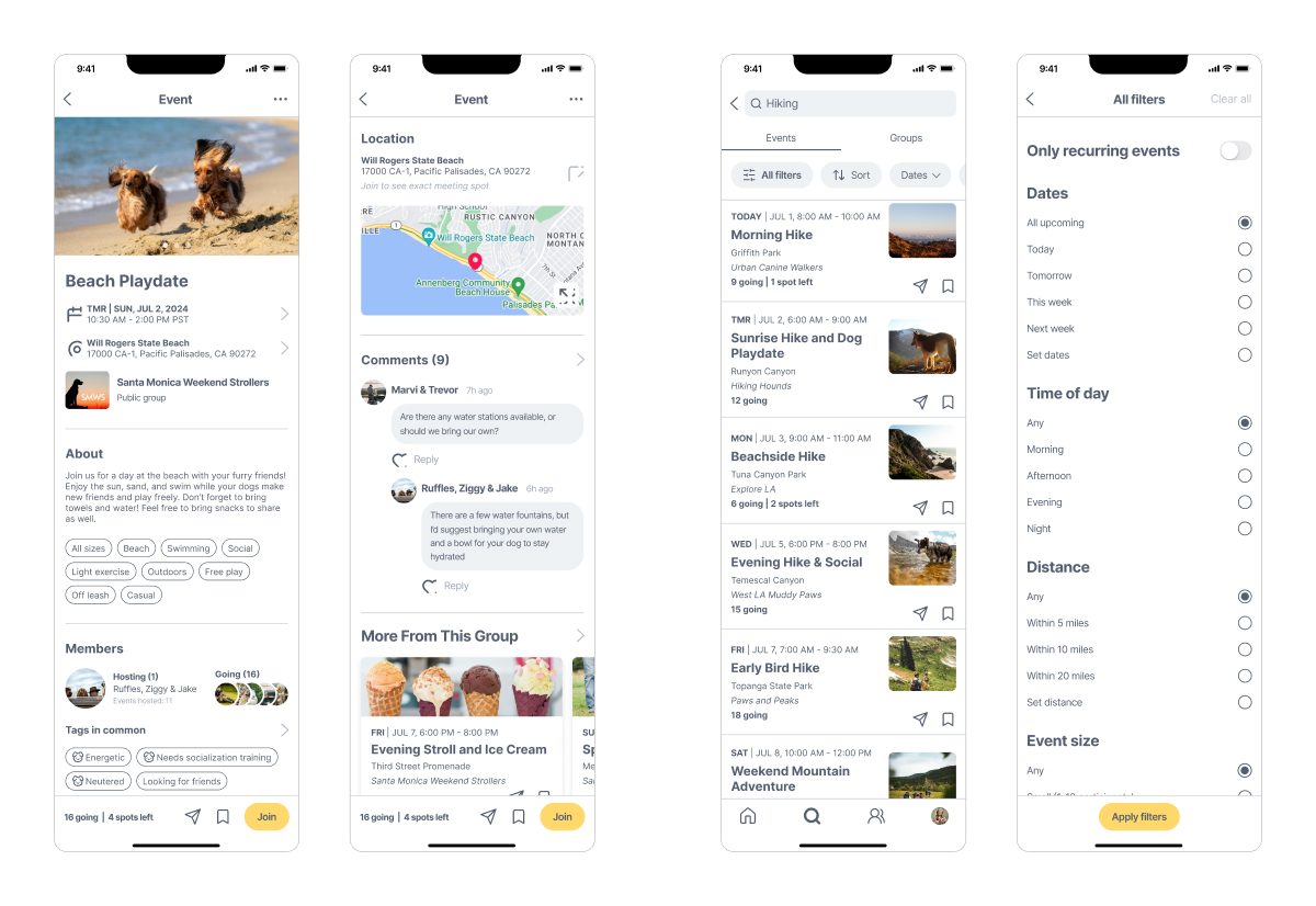
Pawdle puts the dog in the profile. Meetups, groups, and owners all carry the same tags for behavior, energy, and experience, so you can read the fit before you leave the house.
- Selected by my professor as an example for future classes
- Owners across age groups said they would use it
- The full UX process, research to prototype, on my first mobile app
Research
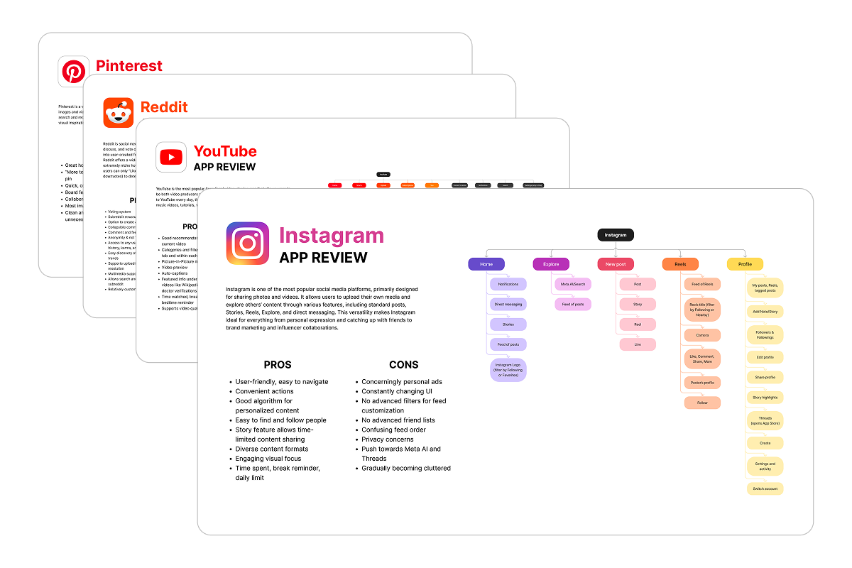
No platform carried the detail that decides the meetup
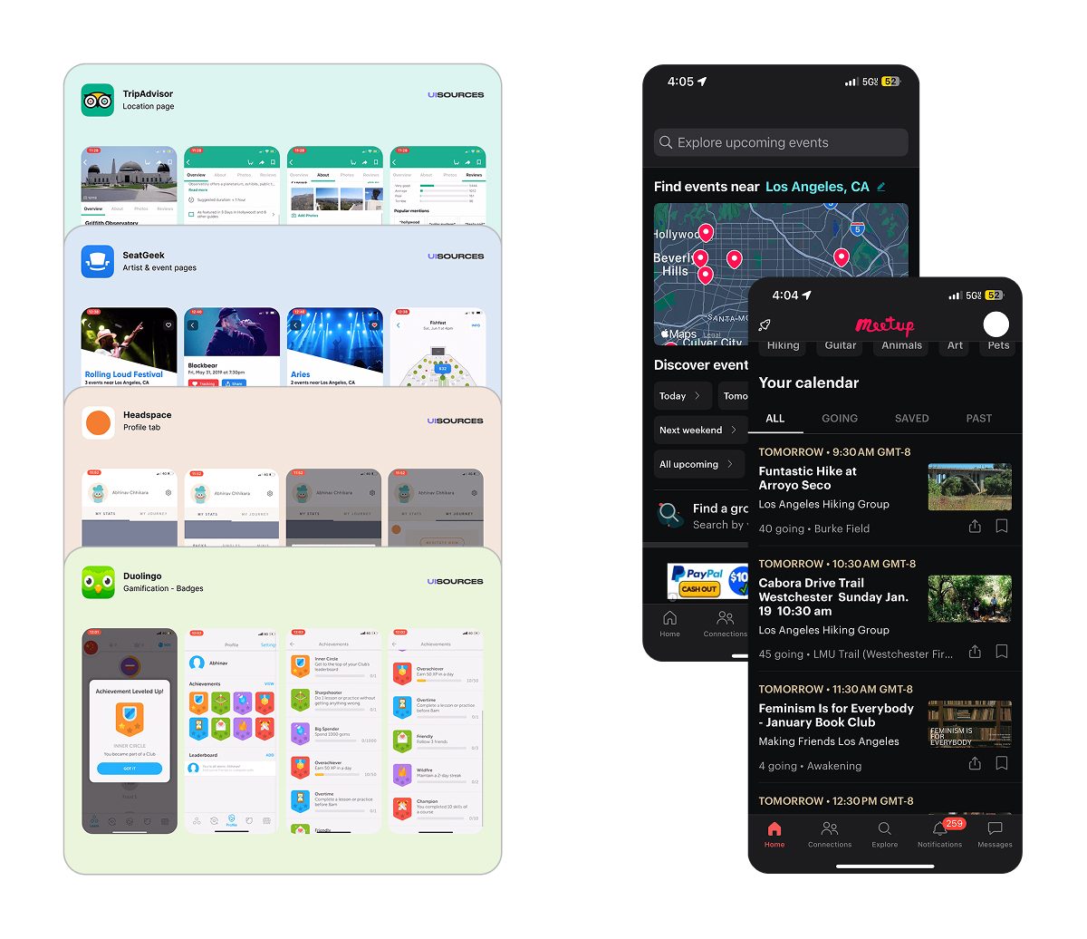
- Instagram, Reddit, Pinterest, and YouTube taught me how discovery and feeds are built, and where they stop: none of them move people into real life. Meetup and Eventbrite do, but their profiles never mention the dog.
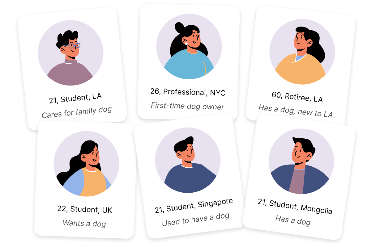
- Compatible playmates, dog-friendly spaces, and advice they trusted were what owners wanted, and a busy schedule or a dog's behavior made each one harder to find.
- All six liked the concept, problem to solve or not, though each put safety and trust first for meeting in person.
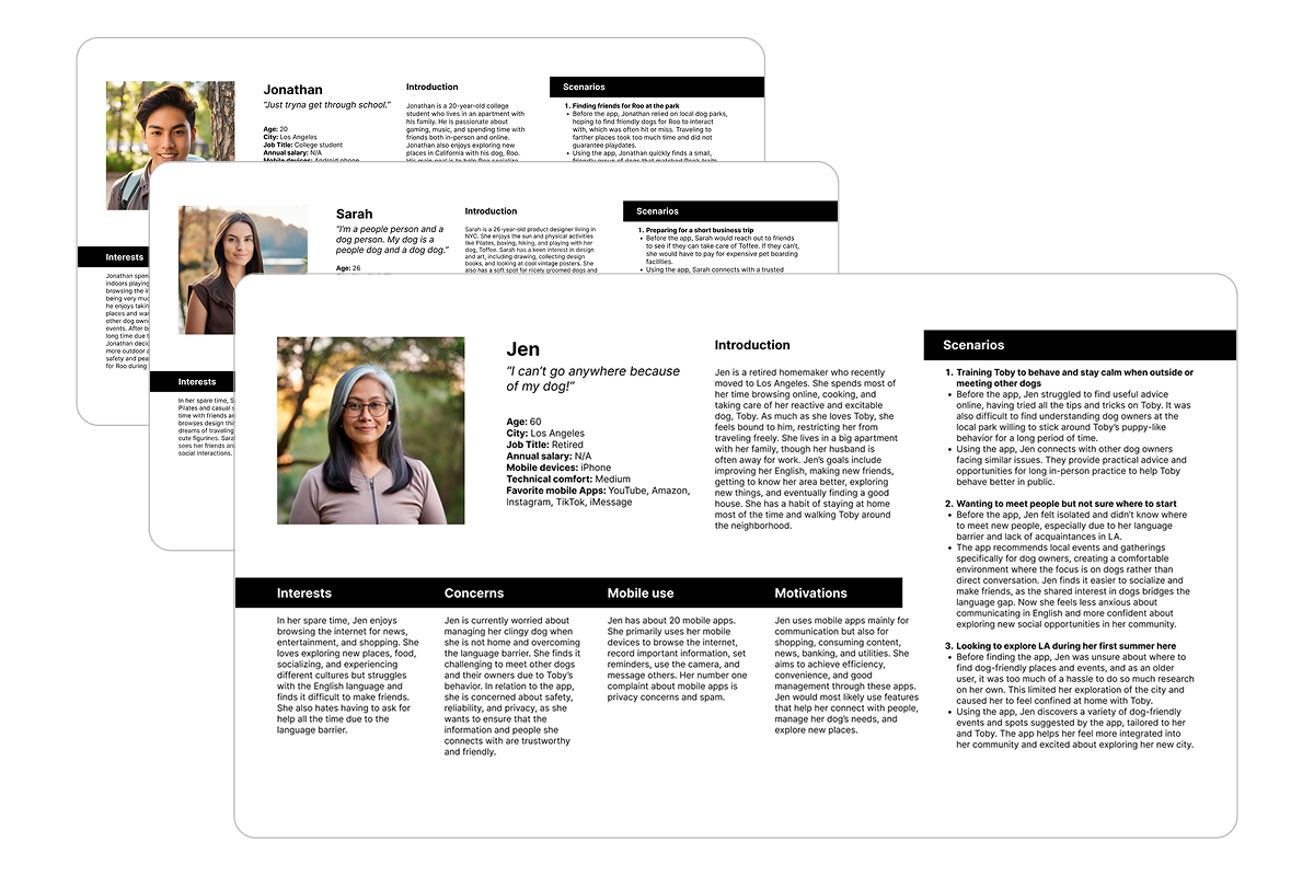
Different lives, same bridge: the dog
- Jonathan, a college student, needs safe socialization for a timid dog and supply recommendations he can trust, neither costing time or money he does not have.
- Sarah, a young professional and first-time owner, is in it for the dogs as much as the people: exercise groups, dog-friendly events, every cute dog she can meet.
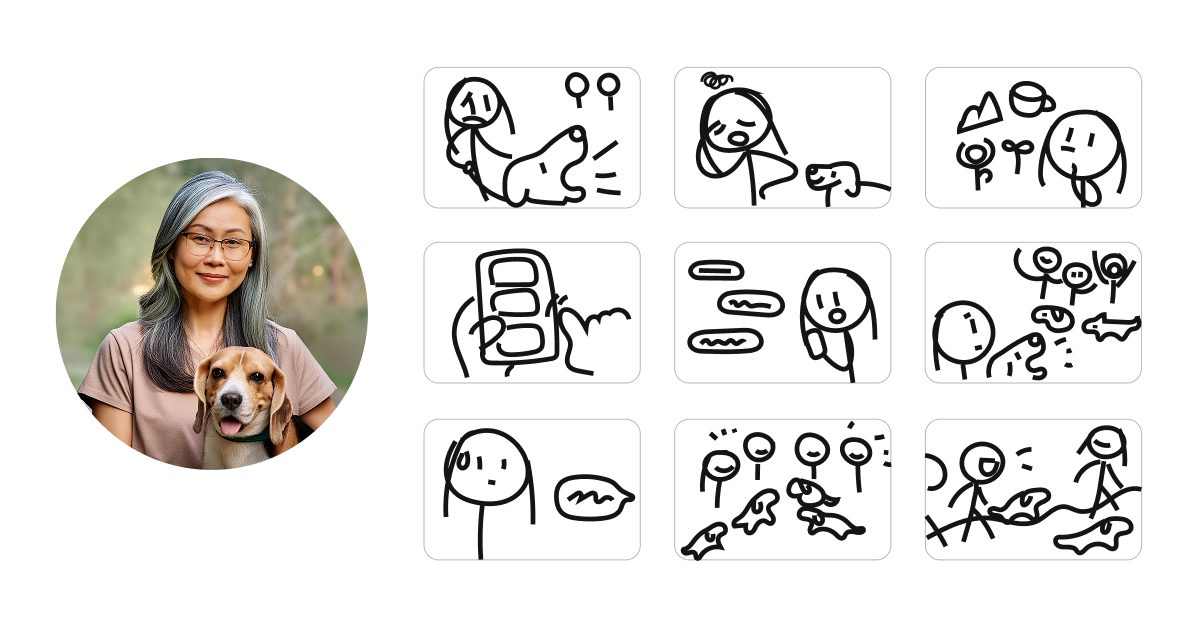
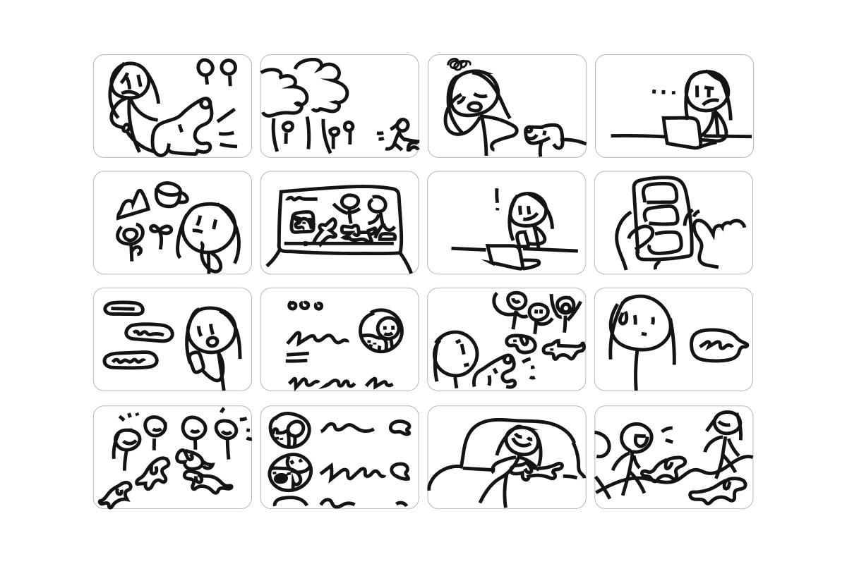
- Jen, a retiree new to LA with a reactive dog and a language barrier, wants a low-pressure way in. I built the prototype around her.
Prototyping
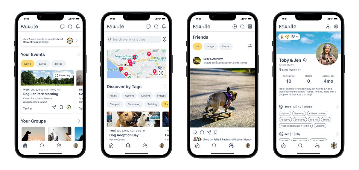
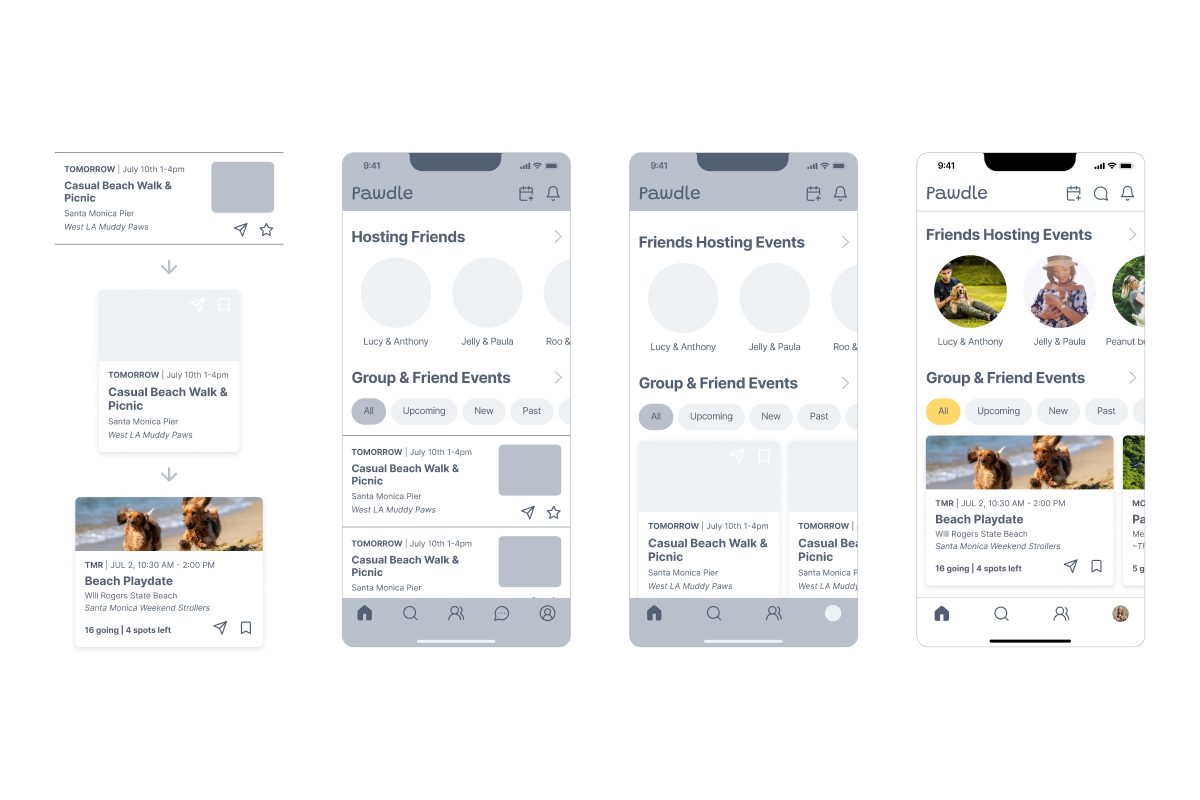
I started from conventional design patterns, taking onboarding, search, and event listings from social and event apps like Meetup. Those showed me how to organize dense information and where to put the tags so they would actually be read. I built the wireframes around Jen in Figma, mirroring the file to my phone as I went to refine hierarchy and spacing.
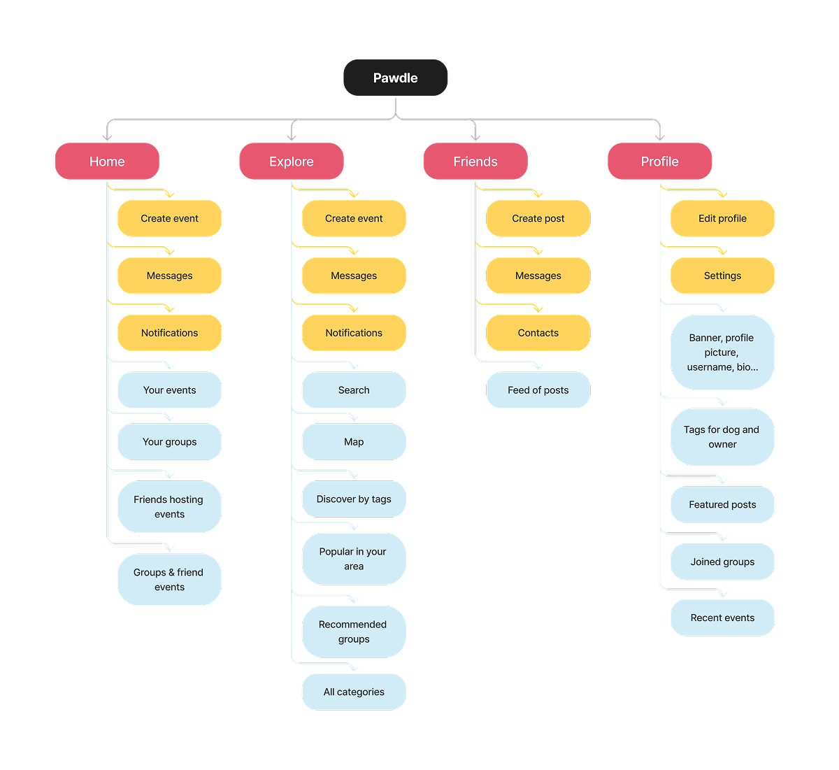
The structure only settled once I drew it
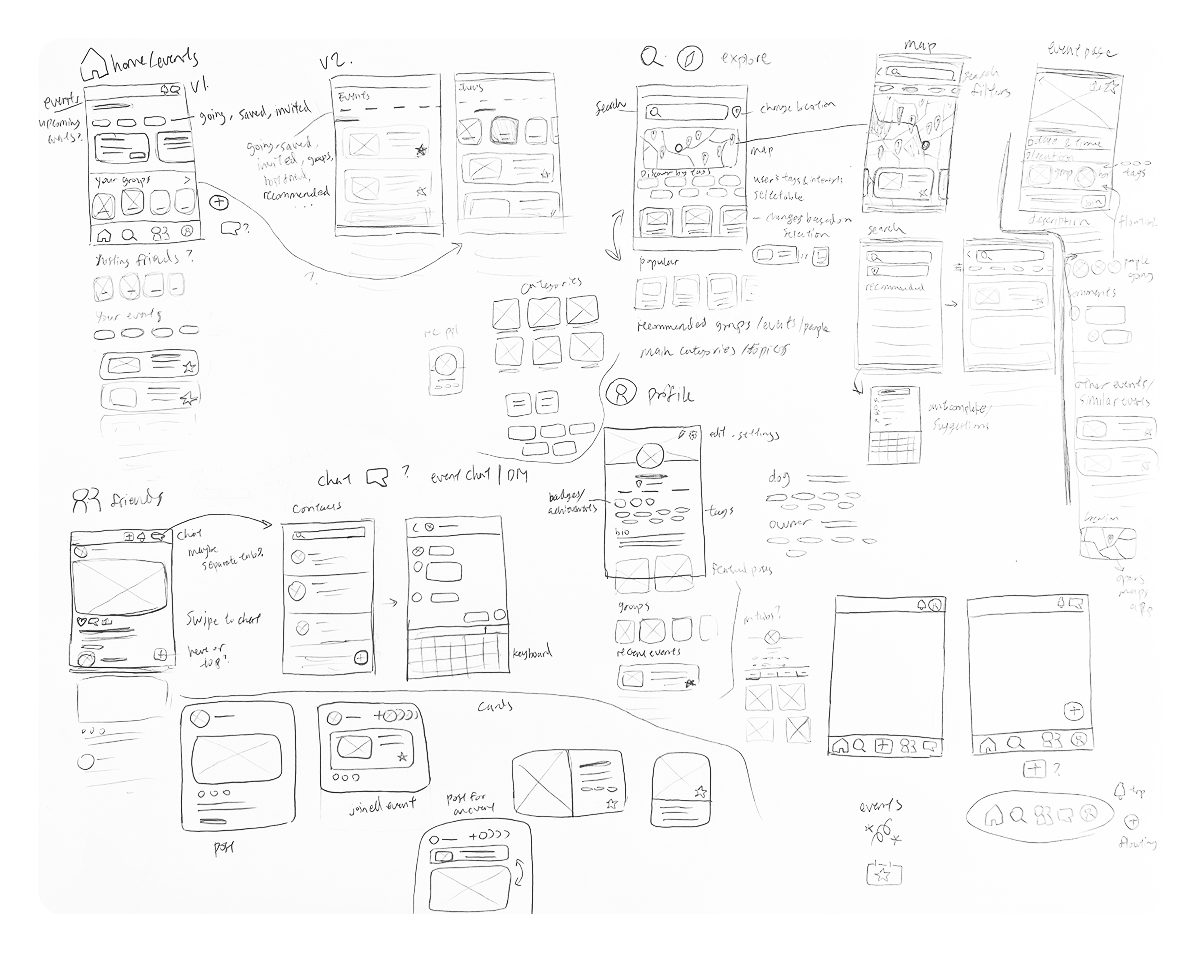
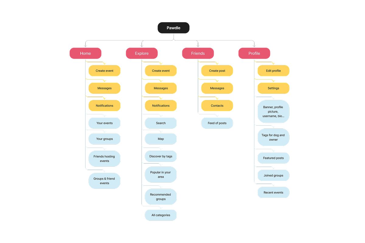
Planning the sitemap settled plenty and gave interviewees something to react to, but it could not tell me whether the structure held up. Drawing it out did. Several rounds later: four main tabs, home, search, friends, and profile, with messages demoted to the top bar.
Testing sent me from layout to language
Testing showed the interactions already felt intuitive. What tripped people up was the language, so the late rounds went into words: rewriting headers, reordering sections, and asking testers which tags they would actually want before widening the set.
Final Design
Visual identity
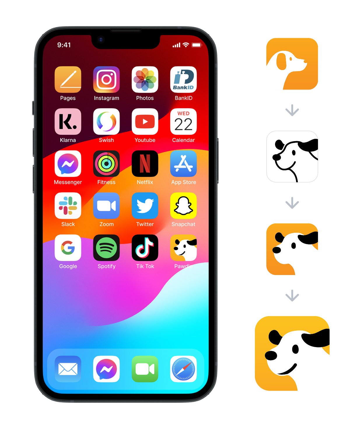
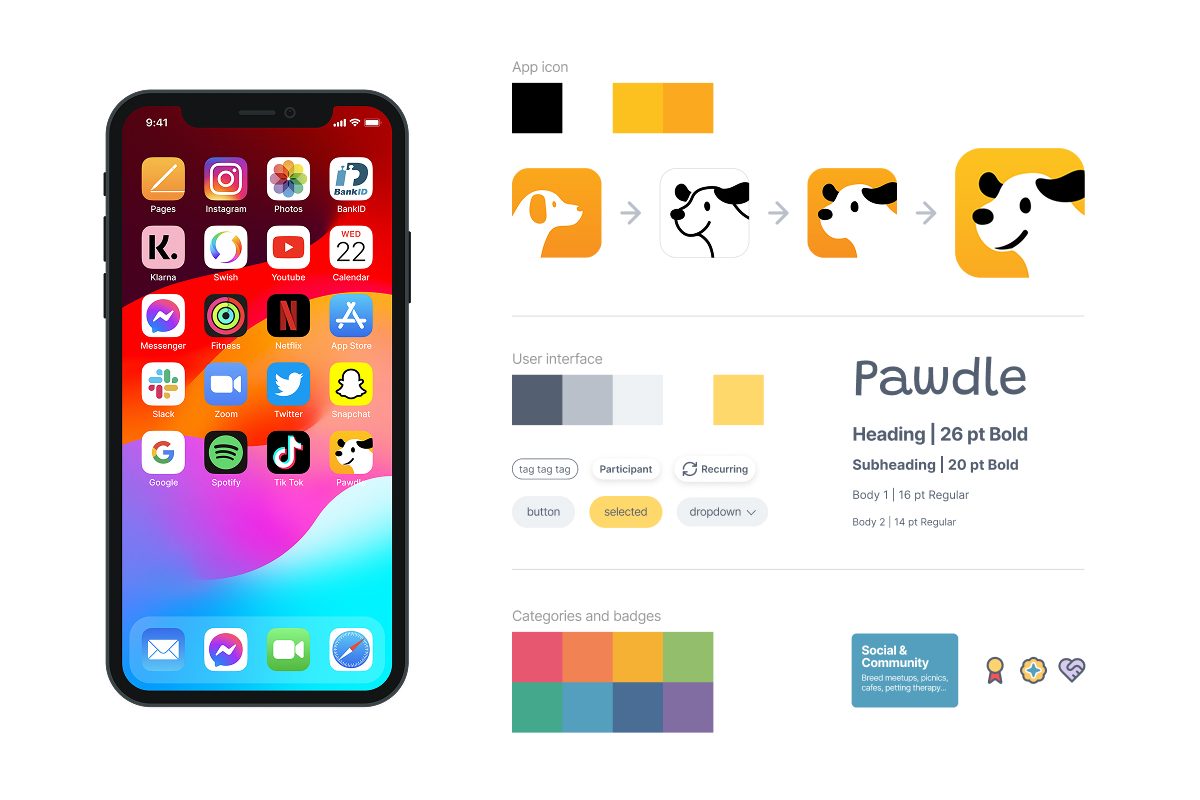
Clean, bright, and playful without tipping into childish. The dog mascot became a strong emotional anchor, resonating with testers consistently and holding the app's identity together.
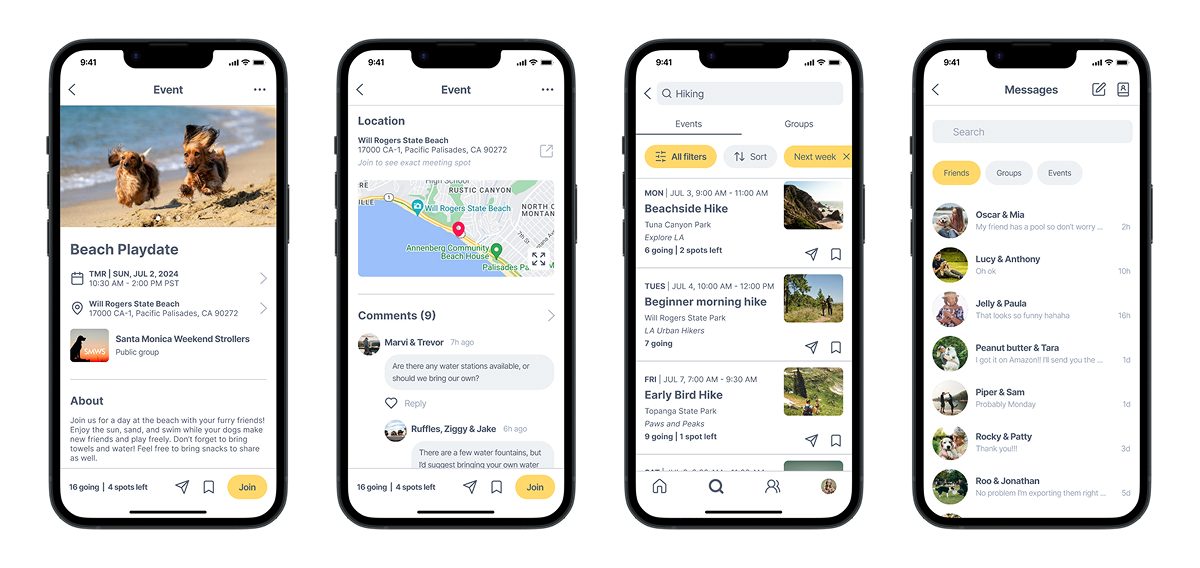
App walkthrough
Results & Reflection
Testers could tell a fellow dog owner made it, and that is why it fit
- Selected by my professor as an example for future classes
- Owners across age groups said they would use it
- Praised as thoughtful and detailed by the dog owners it was built for
It's so detailed. You really considered everything!
I would totally use this! Why is it not a thing yet?
Soo cute, I love the dog! Can't believe you made this.
Designing for someone specific beats designing for everyone
Every platform I had studied was built for everyone, or at most for a broad age range. Designing for dog owners instead is what made this project clear: the tags, the filters, and the profile each had an obvious job. As my first mobile app it also taught me how much established patterns and a clear narrative do to make a complex system understandable and credible.
It is still a concept. Verification, moderation, and the rest of what makes strangers safe to meet in person would each need real work before this shipped to anyone.